windows concept - New Start

gala sheep

New member
Jul 14, 2017
3
0
0
Visit site
Hi! :love:


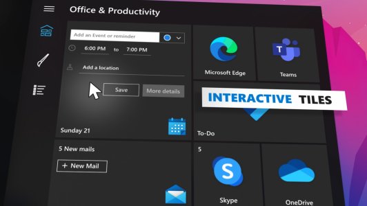
i created this concept, and i would love to share it here

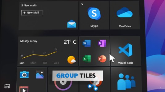
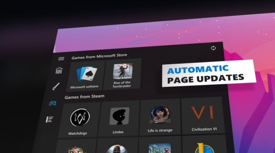
I have so many ideas how to make the start menu on windows 10 better and I got inspired by the new designs so I wanted to make a concept showcasing some of my visions.

So I took the windows 10 Start menu a couple of steps forward.
hope someone up there can hear me :)

Thanks
Gal
 

Attachments

  • Annotation 2020-07-02 124819.jpg
    Annotation 2020-07-02 124819.jpg
    110.5 KB · Views: 10
  • Annotation 2020-07-02 124840.jpg
    Annotation 2020-07-02 124840.jpg
    108.3 KB · Views: 10
  • Annotation 2020-07-02 124913.jpg
    Annotation 2020-07-02 124913.jpg
    114.8 KB · Views: 10

RTGent

New member
Jan 24, 2013
654
0
0
Visit site
It sure looks nice, which is big. It looks like you have better tile-sizing in your design, and increased accessibility and functionalities there as well, which can be more useful than live tiling. I'm yet not sure how much fresher it is than my adjustable tablet mode: (Qualifier/limitation: I use W10 only on Surface tablets -I still run W7 on my NUC.) Maybe a video illustration of functions, etc. would be helpful when you're ready. Also, I especially miss the accessibility and functionality of the old Start button, and its flexible/adjustable menus: In two or three clicks (touches?), I could access most anything. Maybe it could be designed into your left-margin tools.

For your next project, I'd also appreciate making Edge look and feel like Internet Explorer -particularly the always-there Menu and Favorites bars -and their full functionality, because a menu extension I've loaded is much too limited. Also, the ability to turn off tabs, Please! Keep up the good work.
 

bob lablao

New member
Sep 10, 2014
2
0
0
Visit site
Thanks! Actually I'm thinking of doing another video.
I thought about a tablet mode with a new charmsbar(win8) .
I have some ideas, and Maybe I'll take your advise.
 

naddy6969

New member
Aug 8, 2017
147
0
0
Visit site
I will never understand why some people are so obsessed with the start menu. Do you spend your whole day looking at the start menu? I don't spend more than a few seconds per day in it. Days can go by without me needing to even open it.

When I open the start menu, I just need to launch a rarely used app, and get out. If I have launched the app more than 3 times, then the icon is moved to the Quicklaunch area of the taskbar. Why? So I don't have to waste time with the start menu.

Your screens look way too cluttered to me. Info overload. I don't need to search, see how many emails I have or see the GD weather. I have apps for all of that.
 
Last edited:

nate0

New member
Mar 1, 2015
3,607
0
0
Visit site
I will never understand why some people are so obsessed with the start menu. Do you spend your whole day looking at the start menu? I don't spend more than a few seconds per day in it. Days can go by without me needing to even open it.

When I open the start menu, I just need to launch a rarely used app, and get out. If I have launched the app more than 3 times, then the icon is moved to the Quicklaunch area of the taskbar. Why? So I don't have to waste time with the start menu.

Your screens look way too cluttered to me. Info overload. I don't need to search, see how many emails I have or see the GD weather. I have apps for all of that.

Sad but true
 

gala sheep

New member
Jul 14, 2017
3
0
0
Visit site
I will never understand why some people are so obsessed with the start menu. Do you spend your whole day looking at the start menu? I don't spend more than a few seconds per day in it. Days can go by without me needing to even open it.

When I open the start menu, I just need to launch a rarely used app, and get out. If I have launched the app more than 3 times, then the icon is moved to the Quicklaunch area of the taskbar. Why? So I don't have to waste time with the start menu.

Your screens look way too cluttered to me. Info overload. I don't need to search, see how many emails I have or see the GD weather. I have apps for all of that.

I use the start menu about 10 to 20 times a day. This is the place where I organize all of my apps and search for stuff.
I really love this area because it helps me keep everything where I want it to be for quick access.

Think of it as your room, you can put everything anywhere or deside to dedicate a special place for every object.

I'm a man who like order, I like to know what I have and where it is.

BTW, I know couple of people who think like you, they don't feel like they need to use the start menu. gusse everyone have there way of doing stuff.
 

naddy6969

New member
Aug 8, 2017
147
0
0
Visit site
"I use the start menu about 10 to 20 times a day". Then you are wasting time. Pin those apps to your taskbar.

"This is the place where I organize all of my apps and search for stuff."

Why are you searching for anything? They can all be right in front of you. On the taskbar.

I find the start menu to be a huge waste of time. I have not used it for literally decades. Everything I need daily is in the Quicklaunch area of the Taskbar. I don't need to be wading thru the same menu to launch the same apps over and over.

"Think of it as your room, you can put everything anywhere or deside to dedicate a special place for every object."

The start menu is more like a closet. My room is where I am working. I don't run to the closet every 10 minutes to get something that I had yesterday, and will need again tomorrow. And every day after that. Because that would be a huge waste of time and effort.

I would rather have it right in front of me every day. The Taskbar is always there. I don't have to go searching for anything.
 

RTGent

New member
Jan 24, 2013
654
0
0
Visit site
I will never understand why some people are so obsessed with having everything on their taskbars, and everything out in their rooms. :winktongue:
 

gala sheep

New member
Jul 14, 2017
3
0
0
Visit site
I don't use the same apps everyday, I do many things and each one require different combination of apps.
If I needed to put it all in the Taskbar I'll need 10 rows hh

In the Taskbar I want to see only apps I'm using right now.
 

nate0

New member
Mar 1, 2015
3,607
0
0
Visit site
Microsoft should just open source bits and pieces of W10. The parts they would allow a community to basically build add-ons for and submit them to the store. Or allow them to use an add-on for such aspects of windows that are only approved. This way for instance. If the task bar itself was the only open source item from windows or would allow open source api's to interact with it you could run a utility to completely change how you interact with it, its style, or anything. However then I snap back to reality and realize Microsoft is just not that cool yet...
 

Members online

Forum statistics

Threads
326,483
Messages
2,248,426
Members
428,500
Latest member
soggy poptart