luk3ja
New member
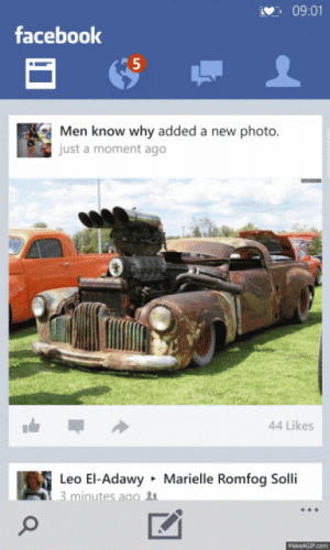
I also think the circle buttons look better on the app bar but the circle outlines are burnt into my phone dislay!!! :O

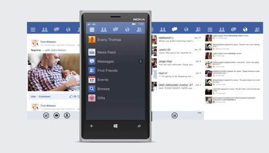
Looks good. I love these concepts. Been thinking maybe we should have a subforum for them?Made a FB mockup awhile ago for another thread. Thought it would be relevant here as well.
View attachment 50033
I think Conner Monsees (UI designer for 6tag and 6sec) Conner Monsees on Behance has a really good grasp on all the variances of the Modern UI style. I really like his Verge and Pinterest concepts.
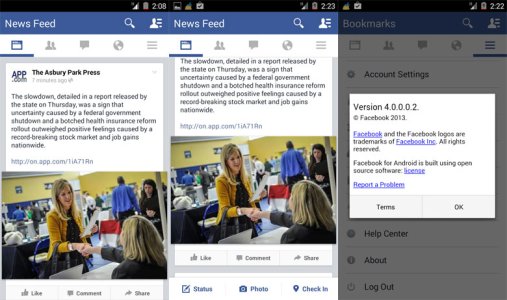
I think the pivot style works from some apps and allows for easier design porting from iOS and Android. The Modern UI allows for a lot of leniency for a lot of variance in design so I hope not every app starts using the pivot style (it'll get boring quick). As for the older header style, it has become quite an eye-soar in some apps, it makes it kind of messy (dark backgrounds w/ white text more so) *cough *cough ESPN *cough *cough. With all that said I'm really looking forward to see what the final official Instagram app will look like and how it will function.
Looks good. I love these concepts. Been thinking maybe we should have a subforum for them?
Looks good. I love these concepts. Been thinking maybe we should have a subforum for them?
Yea that would be great. Put me down for a +1 as well. I love looking at concepts and mockups. Doing this would make it that much easier to do so.+1 A subforum or at least a sticky thread for concepts would be awesome!
Yea that would be great. Put me down for a +1 as well. I love looking at concepts and mockups. Doing this would make it that much easier to do so.
Good to hear there's interest!+1 A subforum or at least a sticky thread for concepts would be awesome!


