Modern UI Concepts

willybraatlund

New member
Oct 18, 2012
271
0
0
Visit site
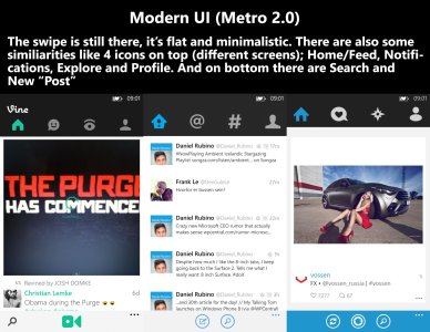
Hi! After the vine app I thought to my self, this is kind of the new Metro UI. It has the same look and feel like the twitter app and also 6tag. I really like this new style, maybe more than the original metro. So I'm not a developer, I'm only an amateur ++ photoshopper. But let's start with some examples of the design trend.

BLOG1.jpg
BLOG2.jpg

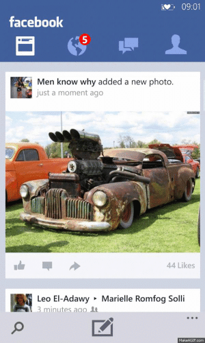
So I simply made some examples. Because todays facebook is a copy of the iOS and android one, AND the spotify just simply sucks. I wanted to make a youtube one, but too hard to make all the details with video player, but if you look at the other two you might understand what I'm aiming on with the youtube app.
http---makeagif.com--media-11-15-2013-FhSOd9.gifhttp---makeagif.com--media-11-15-2013-gZVyKQ.gif
(These two are actually GIF's, but they doesn't work, you have to open them in new tabs :D )

SORRY FOR BIG PICTURES, AND SOME BAD GRAMMAR/SPELLING.

What do you guys think? Do you like the "new" UI better then the original metro?
 

WanderingTraveler

New member
Dec 23, 2012
4,974
0
0
Visit site
I personally like the old Metro design more, bar the wasted screen space by those massive headers. On landscape, that is a very large waste of screen space.
Perhaps, this is the reason behind why WP doesn't really support landscape mode.

However, the new Metro is more open for designers to work with. It's a smart move by Microsoft to do this, as it eases more users into the transition.

Simply put:
New Metro is more suitable for WP, as it provides more freedom (and space) for designers to work with.
Classic Metro is more suitable for Win8/RT, as it already has a lot of space, and it is much closer to the design direction Win8 is going with.
 

Al_2

New member
Nov 19, 2012
259
0
0
Visit site
Looks great. I really wish they'd implement that design for Facebook. It looks so much better than the current Android look-a-like.
 

manicottiK

New member
Nov 24, 2011
660
0
0
Visit site
What if there's a fifth panel in the app? Your mock-up provides no indication that there's additional content to swipe to. To me, the mockups look like a standard iOS/Android tab control rather than a Metro-inspired design.

That said, it would be nice if more developers would think more outside of the initial UI framework that Microsoft has provided.

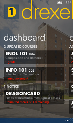
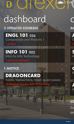
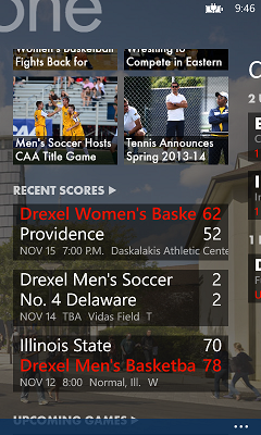
In the new update to our university portal app, we've switching from pivot to panorama. In doing so, we didn't want to sacrifice too much space for the header at the expense of the content and we wanted to continue to support landscape layouts. We came up with "compressible" headers. Here's our app normally, compressed, and compressed while scrolled a bit:
Normal.png Compressed.png Scrolled.png

The compressed header is slightly transparent to allow the status bar to be visible. The text simple slides up and partially off the screen while the graphic element in the header scales downward so that the entire logo is always visible.

The space between the header and the page headers also contracts and the header is part of the scrolling portion of the panel so that there's more room for content. (MIcrosoft's own pano apps like Games and Music do this with the panel headers, but the default templates for pano apps do not.)

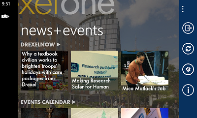
By minimizing the size of the header, it becomes reasonable to offer a landscape panorama app:
Landscape.png

Users can compress/expand the header through a toggle switch on the Settings page or by simply dragging the header up or down.

Overall, this design keeps a Metro feel (we think), but lets the user get more space for content if they wish. However, like other Metro-y pivot/pano apps, does not provide direct access to all panels at once. Unfortunately, I don't yet have a suggestion for both. (The app above has up to six panels; even MS won't put six icons across the Start screen or app bar.)
 

willybraatlund

New member
Oct 18, 2012
271
0
0
Visit site
I personally like the old Metro design more, bar the wasted screen space by those massive headers. On landscape, that is a very large waste of screen space.
Perhaps, this is the reason behind why WP doesn't really support landscape mode.

However, the new Metro is more open for designers to work with. It's a smart move by Microsoft to do this, as it eases more users into the transition.

Simply put:
New Metro is more suitable for WP, as it provides more freedom (and space) for designers to work with.
Classic Metro is more suitable for Win8/RT, as it already has a lot of space, and it is much closer to the design direction Win8 is going with.
I agree that the classic metro works very good with Win8/RT. That style is more like the rest of the OS. But the new metro is perfect in wp8 when it comes to, let's say, social apps. I don't think this UI works with every app. But with twitter, facebook, instagram, vine etc. it's perfect. It's our own style. Personally I don't want ported apps on win8, so IMO I liked the old facebook app better in looks (not in performance tho')
 

willybraatlund

New member
Oct 18, 2012
271
0
0
Visit site
Looks great. I really wish they'd implement that design for Facebook. It looks so much better than the current Android look-a-like.
Thanks! Yeah, that was my first thought when I made that example; this should really be how the facebook app should look. I really don't like "copy-paste" apps on wp8, like the facebook app.
 

willybraatlund

New member
Oct 18, 2012
271
0
0
Visit site
What if there's a fifth panel in the app? Your mock-up provides no indication that there's additional content to swipe to. To me, the mockups look like a standard iOS/Android tab control rather than a Metro-inspired design.

That said, it would be nice if more developers would think more outside of the initial UI framework that Microsoft has provided.

In the new update to our university portal app, we've switching from pivot to panorama. In doing so, we didn't want to sacrifice too much space for the header at the expense of the content and we wanted to continue to support landscape layouts. We came up with "compressible" headers. Here's our app normally, compressed, and compressed while scrolled a bit:

The compressed header is slightly transparent to allow the status bar to be visible. The text simple slides up and partially off the screen while the graphic element in the header scales downward so that the entire logo is always visible.

The space between the header and the page headers also contracts and the header is part of the scrolling portion of the panel so that there's more room for content. (MIcrosoft's own pano apps like Games and Music do this with the panel headers, but the default templates for pano apps do not.)

By minimizing the size of the header, it becomes reasonable to offer a landscape panorama app:

Users can compress/expand the header through a toggle switch on the Settings page or by simply dragging the header up or down.

Overall, this design keeps a Metro feel (we think), but lets the user get more space for content if they wish. However, like other Metro-y pivot/pano apps, does not provide direct access to all panels at once. Unfortunately, I don't yet have a suggestion for both. (The app above has up to six panels; even MS won't put six icons across the Start screen or app bar.)

Sorry about not showing, but I thought that most wp users knew about at least how twitter and/or 6tag works. But I see you point!
Totally agree that developers need to think outside the UI framework. WP as an operation system should have it own style, windows phone should be the "hipster" :D

The app you are showing are the original metro. For me, I like it minimalistic so I would drop the picture (of the school I suppose). But like I answered to Wandering Traveler, the "new" metro doesn't suit all kinds of apps imo. But especially the social apps should be based on the same platform. This will bring a red line for new users to understand the apps really quickly.

But one thing I've noticed is that MS isn't so fan of landscape mode.... But the school app you are referring to keeps the metro look, I like it. (I would like to have this kind of app from my own school haha). Also the way you've compressed the header is great to make more space, this should really be a standard.
 

sumton

New member
Apr 21, 2013
257
0
0
Visit site
No. i don't like it at all if they are going to continue with that design i might leave to android :|
imo this look way better than the current app Note: Picture taken from google store
cYBMjtY.png
 
Last edited:

willybraatlund

New member
Oct 18, 2012
271
0
0
Visit site
I don't know how the android app works, do you know if there is swipe or do you have to push those "feed", "activity", buttons?
But I still think vine for wp looks better then ios and android imo.

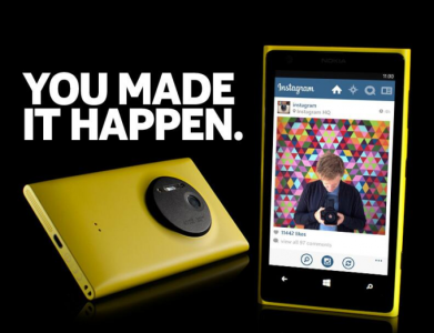
But how about the official instagram that are coming to wp? (at least the one they showed on the press conference?
Nokia_Instagram_App.png
It's kind of the same a the modern ui I showed in my first post. But just moved the four icons higher, at the same height as the instagram logo. This gives more screen space too.
 

Forc3

New member
Jun 13, 2012
31
0
0
Visit site
Most People in this thread dont realise that this Concept is a Pivot 2.0. It has nothing to do with Panorama controls or whatever. Those Icons are plain and simple static Pivot Header items.
 

manicottiK

New member
Nov 24, 2011
660
0
0
Visit site
Most People in this thread dont realise that this Concept is a Pivot 2.0. It has nothing to do with Panorama controls or whatever. Those Icons are plain and simple static Pivot Header items.
The existing pivot control supports this already. The default may be plain text, but the default can be replaced with any combination of controls.

The OP's mockup also drops the circles from the app bar buttons, making them just icons. Does anyone have comments on that?
 

MyNL822

New member
Jul 22, 2013
330
0
0
Visit site
Hi! After the vine app I thought to my self, this is kind of the new Metro UI. It has the same look and feel like the twitter app and also 6tag. I really like this new style, maybe more than the original metro. So I'm not a developer, I'm only an amateur ++ photoshopper. But let's start with some examples of the design trend.
View attachment 49727
View attachment 49728

So I simply made some examples. Because todays facebook is a copy of the iOS and android one, AND the spotify just simply sucks. I wanted to make a youtube one, but too hard to make all the details with video player, but if you look at the other two you might understand what I'm aiming on with the youtube app.
View attachment 49729View attachment 49730
(These two are actually GIF's, but they doesn't work, you have to open them in new tabs :D )

SORRY FOR BIG PICTURES, AND SOME BAD GRAMMAR/SPELLING.

What do you guys think? Do you like the "new" UI better then the original metro?
First I am so happy I found someone who actually likes the UI of the Vine app. It seems so unique to windows phone, and everything is much easier to access than in 6sec. Next, WOW, you are a great photoshopper, and I thought I was sort of an amateur, but I'm not even close to that. (Best thing I ever made was a poster of Kendrick Lamar, using PhotoShop and photo illustrator. You should definitely teach me that.) Next, those pictures look like the perfect UI design for these kind of apps. I love them, and they are so unique to windows phone. Maybe you could hint your designs to Microsoft and Spotify. It would be nice if they finished this design.
 

sumton

New member
Apr 21, 2013
257
0
0
Visit site
I don't know how the android app works, do you know if there is swipe or do you have to push those "feed", "activity", buttons?
But I still think vine for wp looks better then ios and android imo.

But how about the official instagram that are coming to wp? (at least the one they showed on the press conference?
View attachment 49836
It's kind of the same a the modern ui I showed in my first post. But just moved the four icons higher, at the same height as the instagram logo. This gives more screen space too.
I don't know because I never used android before as for instagram its the same idea
 

AndreStudart

New member
Apr 29, 2013
310
0
0
Visit site
I prefer much more metro 1.0 than metro 2.0...

I'm ok with that design for twitter, since you still have plenty of space to read, but I HATE wp8 vine version, these UI's seems to me an easy solution, like if the devs don't wan't to waste their time so much designing an app..

I love flixster design, spotify and etc with those big lyrics, that's unique for me.. vine version for android/ios is so much more beatiful than wp8, I don't like the idea of a giant bar with crazy big icons stealing so much space, I wish they had a better design for those apps.. =/

But instagram, at least on the photo, it seems ok, it isn't stealing much space and pratical as always, hope it feels personally just like it looks on the photo..
 

DHHSMichael

New member
Dec 15, 2012
44
0
0
Visit site
Personally, I'm not a fan. I have a Nexus 7 and those concepts look just like the core design language of android with the slidable buttons up top. One of my favorite design elements of Windows Phone is the panorama design, it just makes the whole application look clean without any interuption.
 

willybraatlund

New member
Oct 18, 2012
271
0
0
Visit site
I prefer much more metro 1.0 than metro 2.0...

I'm ok with that design for twitter, since you still have plenty of space to read, but I HATE wp8 vine version, these UI's seems to me an easy solution, like if the devs don't wan't to waste their time so much designing an app..

I love flixster design, spotify and etc with those big lyrics, that's unique for me.. vine version for android/ios is so much more beatiful than wp8, I don't like the idea of a giant bar with crazy big icons stealing so much space, I wish they had a better design for those apps.. =/

But instagram, at least on the photo, it seems ok, it isn't stealing much space and pratical as always, hope it feels personally just like it looks on the photo..

Personally, I'm not a fan. I have a Nexus 7 and those concepts look just like the core design language of android with the slidable buttons up top. One of my favorite design elements of Windows Phone is the panorama design, it just makes the whole application look clean without any interuption.

For me the twitter design, 6tag and vine are all the same, and I love it. But when I used wp7 the panorama design was awesome, but now for me it looks not that elegant, looks cheaper in a way. But of couse, not all apps should have the Metro 2.0/Pivot design, basically I think just the social apps you should have it, twitter, vine, insta etc. At least the facebook app should get an update. I don't want a copy of android and ios. Personally I would like it to be like the mock up I made, or it should have its own design, maybe more like the old facebook app for wp.

The new instagram, I might like more, it seems that it gives more space like you've said.

I think that as long as the apps have swipe as the main priority in the apps, it's our (windows phone) design style. And like I said, I don't think every apps should have the Metro 2.0 design, because different apps different design needs. But I really loved the vine app (at least the design, the performance could be better). But imo the panorama design looks cheaper (not in all apps like spotify), and I think this design fits windows 8 more than wp.
 

Bodrik

New member
Nov 15, 2013
8
0
0
Visit site
The OP's mockup also drops the circles from the app bar buttons, making them just icons. Does anyone have comments on that?

I think the default "circled" buttons look better. It provides uniformity to the rest of the OS. Considering he is using the ". . ." already, it seems odd to use a mix of custom and default selections.

My suggestion for the header thing would be this. Consider a icon/text hybrid scheme:
(Supposed the First panel is what we are viewing)
[icon 1] First panel header text [icon 2] [icon 3] [icon 4] [etc.]

(Suppose we swipe to the left to move to the 2nd panel)
[icon 1] [icon 2] Second panel header text [icon 3] [icon 4] [etc.]

And so on. I imagine the text has to be smaller then typical to support however many icons are in the header. Or perhaps this is just better for a 2nd level header. Even in 1.0 concepts the inactive headers were touchable to jump to that panel, so combining the icons and text in a smaller scheme allows headers normally not visible to be accessible even while using text on the active panel.

I also would suggest this for the Facebook/Spotify mock-up. How about incorporating the top icon headers into the background below? Only contain the brand title in the color of its branding, but allow the icons to be on the same background as the content below showing as either white on a black background theme or black on a white background theme. This reaches back to concept 1.0 in making the headers on the same level as the content.
 

Members online

No members online now.

Forum statistics

Threads
323,314
Messages
2,243,621
Members
428,056
Latest member
Carnes