[9/20] The definitive WP File Manager - Pocket Explorer
- Thread starter lagunacid
- Start date
You are using an out of date browser. It may not display this or other websites correctly.
You should upgrade or use an alternative browser.
You should upgrade or use an alternative browser.
ahmedromeo520
New member
- Apr 28, 2014
- 37
- 0
- 0
Re: Pocket Explorer - Beautiful, Full, File Explorer (Current Version: Beta 10)
it would be great to allow us to rename the memory card .. the last update is awesome
it would be great to allow us to rename the memory card .. the last update is awesome
ListenUpGuys
New member
- Sep 12, 2012
- 129
- 0
- 0
Re: Pocket Explorer - Beautiful, Full, File Explorer (Current Version: Beta 10)
I'm disappointed with the recent UI changes. Having a "phone" heading and two styles of tile isn't to my taste. I was hoping today's update would improve things. The current design is complex.
Sent from my RM-875_eu_euro1_211 using Tapatalk
I'm disappointed with the recent UI changes. Having a "phone" heading and two styles of tile isn't to my taste. I was hoping today's update would improve things. The current design is complex.
Sent from my RM-875_eu_euro1_211 using Tapatalk
kishorekumar_a
New member
- Feb 22, 2012
- 168
- 0
- 0
Re: Pocket Explorer - Beautiful, Full, File Explorer (Current Version: Beta 10)
First of all, I love this app. I only came to know about this app today while browsing the forums. It looks great and has most of the necessary features. It has so much potential. However, I would like to suggest some changes.
1. Make it so that 'Phone' in Libraries page can be minimized. So people can open it only when required.
2. You could also change the icons for 'Phone', 'SD Card' & 'One Drive'. The current icons represent Call, Save & Web.The share icon also is different but it's ok because it is icon for attachment (you could change this also). If any help needed in icons design, I can help.
3. Change or Give option to change the All Caps in 'Libraries' page & Page Headings to First letter Caps (I would suggest giving the option in settings so everyone can be satisfied).
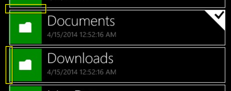
4. Multiple file selection is not consistent with OS. Consider changing it. Also the current selection box does not fit around the File. While not a deal breaker, it is slightly off putting (find attached image). This is on a Lumia 820, I imagine it will more visible on large screen devices with same resolution.

5. Consider changing the tray animation when selecting a file. All the icons seem to merge into one before moving down and new icons are arriving at various times. You probably should make it the default OS animation, although I am not sure what the Windows Phone default animation is.
Suggested new features:
1. Opening & extracting file formats such as .zip, .rar, .7z, .tar and other archive formats.
2. Creation of .zip archive.
That's it for now. Congratulations on the great app and keep up the good work.
P.S: I love developers who actually ask for and fix the feedback.:smile:.
It's difficult to please every design taste, unfortunately. Any feedback on making it less complex?
First of all, I love this app. I only came to know about this app today while browsing the forums. It looks great and has most of the necessary features. It has so much potential. However, I would like to suggest some changes.
1. Make it so that 'Phone' in Libraries page can be minimized. So people can open it only when required.
2. You could also change the icons for 'Phone', 'SD Card' & 'One Drive'. The current icons represent Call, Save & Web.The share icon also is different but it's ok because it is icon for attachment (you could change this also). If any help needed in icons design, I can help.
3. Change or Give option to change the All Caps in 'Libraries' page & Page Headings to First letter Caps (I would suggest giving the option in settings so everyone can be satisfied).
4. Multiple file selection is not consistent with OS. Consider changing it. Also the current selection box does not fit around the File. While not a deal breaker, it is slightly off putting (find attached image). This is on a Lumia 820, I imagine it will more visible on large screen devices with same resolution.

5. Consider changing the tray animation when selecting a file. All the icons seem to merge into one before moving down and new icons are arriving at various times. You probably should make it the default OS animation, although I am not sure what the Windows Phone default animation is.
Suggested new features:
1. Opening & extracting file formats such as .zip, .rar, .7z, .tar and other archive formats.
2. Creation of .zip archive.
That's it for now. Congratulations on the great app and keep up the good work.
P.S: I love developers who actually ask for and fix the feedback.:smile:.
ListenUpGuys
New member
- Sep 12, 2012
- 129
- 0
- 0
Re: Pocket Explorer - Beautiful, Full, File Explorer (Current Version: Beta 10)
I wonder if there's some merit in using different colours or icons for phone, SD, and OneDrive folders? I haven't thought this through yet, but it might be a nice approach if it can be made to work well. It could help distinguish folder locations throughout the app.
I'm still very pleased with the app and I use it frequently. I haven't made use of any if the recent features yet, but I'm sure I will
I think I asked before, but is it possible to let the user choose file type associations?
Sent from my RM-875_eu_euro1_211 using Tapatalk
ListenUpGuys
New member
- Sep 12, 2012
- 129
- 0
- 0
Re: Pocket Explorer - Beautiful, Full, File Explorer (Current Version: Beta 10)
...by which I mean, for example, all folders on the SD card could have a common icon. All folders on the phone could have a common icon that id different from the SD folder icon, and all folders on OneDrive could have a common icon that is different from the other two icons. Maybe.
Sent from my RM-875_eu_euro1_211 using Tapatalk
Re: Pocket Explorer - Beautiful, Full, File Explorer (Current Version: Beta 10)
Thanks everyone for the feedback! I super appreciate it all.
I've been trying out different styles for the home screen, and I believe you are correct in saying that it looks too busy. It seems like making the library text more in line with the regular folder style really helps. Any further thoughts?


Re: Pocket Explorer - Beautiful, Full, File Explorer (Current Version: Beta 10)
Regarding selection, I've changed it to be in line with WinP/RT style. It works way better in thumbnail mode and saves screen estate. The OneDrive app was using that style for a while, but it seems like they have reverted back?
I'll be fixing the border for the next update though
Icons will be updated as well! I've really just been using the built-in Symbols in order to save app space and time. Perhaps now it's time to mature a bit!
EDIT: Also, interestingly enough, the appbar button animation is indeed the default one. Not sure if I can change it.
Last edited:
Re: Pocket Explorer - Beautiful, Full, File Explorer (Current Version: Beta 10)
Zipping is coming soon! Delay in release because I'm flying around Asia at the moment
As for speed, some unique tricks to make it faster should also come in later updates. I've got some ideas in the pipeline!
Zipping is coming soon! Delay in release because I'm flying around Asia at the moment
As for speed, some unique tricks to make it faster should also come in later updates. I've got some ideas in the pipeline!
Re: Pocket Explorer - Beautiful, Full, File Explorer (Current Version: Beta 10)
Travelling around Japan now, going to Korea after
For those following at home, a new update was released yesterday that dramatically sped up thumbnail and file loading in larger folders. Animations are also way smoother now. Should be on par or faster than Files.
Folder icons were removed from home screen in order to make it look more streamlined, and to accommodate a future feature
Similar threads
- Replies
- 1
- Views
- 12K
- Locked
- Question
- Replies
- 2
- Views
- 3K
- Replies
- 2
- Views
- 6K
W
- Replies
- 3
- Views
- 3K
Trending Posts
-
Question Win-11 - Problem with moving files from C: to New Partition on E:
- Started by fasteddie01
- Replies: 0
-
-
-
Windows 10 Themes no longer working...
- Started by DocCovington
- Replies: 6
-
I'm looking for a CalDAV, CardDAV client for Windows
- Started by xandros9
- Replies: 1
Forum statistics

Space.com is part of Future plc, an international media group and leading digital publisher. Visit our corporate site.
© Future Publishing Limited Quay House, The Ambury, Bath BA1 1UA. All rights reserved. England and Wales company registration number 2008885.

