Anyone notice 8 column start screen in Project Astoria video from MS?
- Thread starter EMINENT 1
- Start date
You are using an out of date browser. It may not display this or other websites correctly.
You should upgrade or use an alternative browser.
You should upgrade or use an alternative browser.
Slovenix
New member
- Feb 24, 2014
- 878
- 0
- 0
Nice spot, looks like a 930/icon too, so not a huge screen size.
Posted via the Windows Central App for Android
EDIT: Looking again the corners aren't rounded enough to be a 930.
Lumia 830 has the same curve, but not buttons
Kram Sacul
New member
- Mar 4, 2013
- 750
- 0
- 0
I think it's going to be good on 5" too, maybe smaller.
On my 920's 720p screen, the gap is currently 19 pixels between tiles and a 21 pixel border around the tile area to the edge of the screen. Across the screen, that's 137 pixels of empty space across 6 mini squares. Once that gap is reduced, you don't have to scale down the tiles all that much to fit the new grid.
PS I hate myself for pressing Play on that screenshot
eusty
New member
- Jun 1, 2014
- 1,022
- 0
- 0
PS I hate myself for pressing Play on that screenshot
Phew! It's not just me then.......
Narciso Neto
New member
- Mar 30, 2014
- 118
- 0
- 0
Nice spot, looks like a 930/icon too, so not a huge screen size.
Posted via the Windows Central App for Android
EDIT: Looking again the corners aren't rounded enough to be a 930.
Definetly a 1520... see the size of those buttons.
Ma Rio
New member
- Sep 28, 2013
- 1,291
- 0
- 0
Phew! It's not just me then.......
It's easy to fall for it. I did also. Took me a few seconds to figure out what was happening.
PS: MOER TILES WOOOOO
TechFreak1
Active member
- May 15, 2013
- 4,627
- 21
- 38
8 Columns?? :grincry:
Guessing you meant 8 Rows? :winktongue:
No, columns. It'll make 14 rows of the smallest square, and 8 columns.
TechFreak1
Active member
- May 15, 2013
- 4,627
- 21
- 38
No, columns. It'll make 14 rows of the smallest square, and 8 columns.
Ah right, you meant 8 columns with small tiles, my bad.
Manoj Daran
New member
- Mar 2, 2014
- 81
- 0
- 0
neo158
Active member
- Oct 6, 2011
- 2,722
- 1
- 36
No, columns. It'll make 14 rows of the smallest square, and 8 columns.
Exactly, people seem to get confused between columns and rows. I remember when WP 8.1 was shown off with the third column (based on medium tile size) and people were stating it had a third row of tiles!!!
LondonLumia
New member
- Oct 4, 2014
- 81
- 0
- 0
The closer tile arrangement is starting to look a bit better. In that screenshot it's looking more like 'classic' WP (something I really hope Microsoft doesn't leave behind).
The 4-column arrangement isn't something I'd use on my 1020, the 3-column layout is just the right size, but I imagine this would be useful for phablet owners.
The 4-column arrangement isn't something I'd use on my 1020, the 3-column layout is just the right size, but I imagine this would be useful for phablet owners.
This kind of start screen layout (4 medium tiles per row, less space between tiles) can be seen in a number of demos and slides from build. Seems like they want to make better use of the screen real estate on phones. I guess that this specific layout will be available on larger phones only, but maybe the smaller ones will have the narrow spaces between tiles as well (but only 3 medium tiles per row). I wonder if the desktop version of Windows 10 will have that as well, so far we haven't seen this new layout on the desktop. Considering that Belfiore described the demoed start menu on desktop as near-final, I don't think it will change much.
Keep in mind that the start screen on phones is probably still more of a work in progress than the desktop start menu. For example, the tile grouping feature that is available on the desktop is not implemented yet (it was included in all of the official mockups we have seen so far).
Keep in mind that the start screen on phones is probably still more of a work in progress than the desktop start menu. For example, the tile grouping feature that is available on the desktop is not implemented yet (it was included in all of the official mockups we have seen so far).
Krystianpants
New member
- Sep 2, 2014
- 1,828
- 0
- 0
Definetly a 1520... see the size of those buttons.
1520 has camera on left side. 930/icon/830 have on the right side but also have a Nokia logo to the right of the camera. There's also no sensor on the left. It seems like something else. My bros 925 has a left side camera and a sensor on the right, but doesn't look like that for sure. No idea what that is.
Nevermind the right side is an at&t logo hehe. May be a 1520 after all
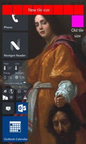
Proof that you don't need to cut the tile size too much:
As I said earlier, on the current TP build, on my Lumia 920 there's a 21-pixel gap all around the tiled area to the edge of the screen and there's 19-pixel gap between tiles. On a 6-column layout, that means the gaps are 21+19+19+19+19+19+21 = 137 pixels out of 768, which is huge.
I took one of my old screenshots to demonstrate the change in tile size if you maintain exactly the same gutter between the tiled area and the screen edge, but instead cut the inter-tile gap to 5 pixels. I darkened the screenshot to make the new shapes stand out more clearly. Once I'd shrunk the tiles to fit 8 of them across the screen, this is how they look:

As you can see, the difference between the size of the old small square tile and the new one is very small indeed. If I had made the gutter around the edge smaller and/or used a 3- or 4-pixel gap between tiles, the new tiles would have been a touch bigger and thus the difference would be a touch smaller again. I think any phone that is currently displaying a 6-column layout now ought to be able to handle an 8-column one without any problems at all.
As I said earlier, on the current TP build, on my Lumia 920 there's a 21-pixel gap all around the tiled area to the edge of the screen and there's 19-pixel gap between tiles. On a 6-column layout, that means the gaps are 21+19+19+19+19+19+21 = 137 pixels out of 768, which is huge.
I took one of my old screenshots to demonstrate the change in tile size if you maintain exactly the same gutter between the tiled area and the screen edge, but instead cut the inter-tile gap to 5 pixels. I darkened the screenshot to make the new shapes stand out more clearly. Once I'd shrunk the tiles to fit 8 of them across the screen, this is how they look:

As you can see, the difference between the size of the old small square tile and the new one is very small indeed. If I had made the gutter around the edge smaller and/or used a 3- or 4-pixel gap between tiles, the new tiles would have been a touch bigger and thus the difference would be a touch smaller again. I think any phone that is currently displaying a 6-column layout now ought to be able to handle an 8-column one without any problems at all.
Last edited:
Similar threads
- Replies
- 0
- Views
- 5K
- Replies
- 1
- Views
- 4K
- Question
- Replies
- 7
- Views
- 7K
Trending Posts
-
-
-
Question Win-11 - Problem with moving files from C: to New Partition on E:
- Started by fasteddie01
- Replies: 0
-
Windows 10 Themes no longer working...
- Started by DocCovington
- Replies: 6
-
I'm looking for a CalDAV, CardDAV client for Windows
- Started by xandros9
- Replies: 1
Forum statistics

Space.com is part of Future plc, an international media group and leading digital publisher. Visit our corporate site.
© Future Publishing Limited Quay House, The Ambury, Bath BA1 1UA. All rights reserved. England and Wales company registration number 2008885.

