Bring back longer battery icon (uservoice petition)

I'm sorry but it seems like everybody on this site just wants to complain about the finest and prettiest little changes in windows 10 for phones... so many people here just want EVERYTHING TO BASICALLY BE THE SAME...

"OH MY GOD CHANGE THE CONTACT SHAPES BACK TO SQUARES INSTEAD OF CIRCLES"
"OH MY GOD WHY ARE THE ROGGLES ROUNDER INSTEAD OF RECTANGLES"
"OH MY GOD THIS OH MY GOD THAT! I HATE THIS CHANGE! I HATE THAT CHANGE!"
some of you guys might as well just stay on windows 8.1 and let the rest of us enjoy the new and refreshing cosmetic changes windows 10 is bringing ....
No offense or direction towards you in particular..just the people around here in general
 
There are already a ton of these requests on the Feedback app. They know. They'll either change it or they won't, but little things like this are probably going to happen pretty late in development since they're hardly a priority - don't panic if they don't happen soon, and use perspective if they don't happen at all.
 
I don't mind the new battery indicator as long as I can accurately read the battery level off it.

If it's something tiny, that looks more like a box than a batery, and the levels aren't coordinated (batery is at 25% and the indicator looks like a half-full batery), then I don't want it.
But if it's something that looks OK and is usable, then I don't mind change.
 
OK I think this takes the cake.

Lots of stuff is a WIP, and I'm sure that includes the battery icons and sizing of them.
I think you're overreacting at this point in time.

Also, its just a battery icon!
 
OK I think this takes the cake.

Lots of stuff is a WIP, and I'm sure that includes the battery icons and sizing of them.
I think you're overreacting at this point in time.

Also, its just a battery icon!

It reminds me of when W10 for desktops came out and "the power button should be at the bottom" somehow made it into the top 10 requests with hundreds of votes.
 
Circle photos are awful for a photo of multiple people or more than a face shot. Plus, lots of my contacts are squares.
 
Circle photos are awful for a photo of multiple people or more than a face shot. Plus, lots of my contacts are squares.

Then use proper pictures for your contacts? If your trying to fit a picture of multiple people in that tiny contacts photo box its going to look horrible anyway
 
some of you guys might as well just stay on windows 8.1 and let the rest of us enjoy the new and refreshing cosmetic changes windows 10 is bringing ....

Good advice. Let us know how that works out.

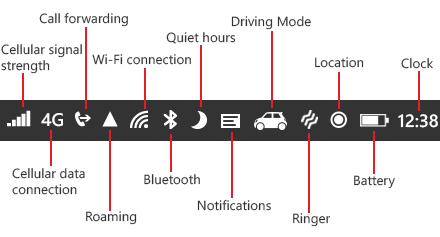
It's actually not just the battery icon that's a downgrade in W10. The whole system tray is badly designed with tiny wireframe icons making things really hard to make out. Compare them to the system tray in 8/8.1 which is clean, better scaled, and easy to understand. No wireframe garbage.

system-callout-order-icons_InvariantCulture_Default.png
 
Yeah.... No. This really is too much, I can understand why people would like the URL at the bottom for Spartan, but this? No, keep with the smaller icons so they take up less space on an already small screen. Heck, I wish the keyboard could be smaller, too. It takes up half the screen on my poor Lumia 920. :/
 
Then use proper pictures for your contacts? If your trying to fit a picture of multiple people in that tiny contacts photo box its going to look horrible anyway

Proper picture? How boring to only use a headshot for all contacts. I like using crops of good times with friends and family. The space lost around a circle will be useless for anything but a background. Two people in a square are easily seen or look great in 8.1.
 
Proper picture? How boring to only use a headshot for all contacts. I like using crops of good times with friends and family. The space lost around a circle will be useless for anything but a background. Two people in a square are easily seen or look great in 8.1.

well that's good for you, that's not the point of a contact picture though, they are to show you who it is by showing you a picture you'd recognize them by, I don't care to hear your counter argument because I already know what it is, but bottom line, you don't use it like most people, don't expect it to be catered to you.
 
Last edited:
Good advice. Let us know how that works out.

It's actually not just the battery icon that's a downgrade in W10. The whole system tray is badly designed with tiny wireframe icons making things really hard to make out. Compare them to the system tray in 8/8.1 which is clean, better scaled, and easy to understand. No wireframe garbage.

View attachment 103170

I think its looks almost the same on Windows Phone 10 and definitely there will be changes to the design.
icons.jpg
 
I agree with this. The new battery icon is terrible and I can never really know the battery life. Then again I'm already always swiping down on the action center to see the % because Microsoft refuses to put the battery % always visible while every other phone has that.
 
Oh please.... there are more important things to fret about then just the wireframe icons on the system tray - like the melting glaciers in Tibet.

Also circle contact pictures are here to stay, just look at Skype (desktop client) - which had circle contact pictures and group convo pictures for ages now.

So if anything with the tighter integration with Skype, it makes sense. However what I'm concerned about is how will the approach the fact that many have more than one skype login.

It reminds me of when W10 for desktops came out and "the power button should be at the bottom" somehow made it into the top 10 requests with hundreds of votes.


And now it's on the bottom of the start menu.
 
well that's good for you, that's not the point of a contact picture though, they are to show you who it is by showing you a picture you'd recognize them by, I don't care to hear your counter argument because I already know what it is, but bottom line, you don't use it like most people, don't expect it to be catered to you.

How about it taking profile (square) pics from Facebook?

Do I need to update everyone on my friends list to please use "proper" headshots for their profile pics so that some sketchy MS service can get it right?
 
Not going to waste a vote on this. Please vote instead for the petition to have the battery icon reversed in the southern hemisphere where batteries drain the opposite direction.
 
How about it taking profile (square) pics from Facebook?

Do I need to update everyone on my friends list to please use "proper" headshots for their profile pics so that some sketchy MS service can get it right?

"sketchy" ok bro.


haha hoosier thanks for the day maker.
 
Please vote instead for the petition to have the battery icon reversed in the southern hemisphere where batteries drain the opposite direction.

lol, please not when I have coffee in my mouth. That's not good for my monitor ;-)
 

Members online

Forum statistics

Threads
335,420
Messages
2,258,419
Members
428,732
Latest member
ajayking