I guess you've all seen the most obvious new features and design changes in build 9901 of the technical preview, so here's my collection of little things that I've noticed myself or that other people have pointed out.
Using WP apps with mouse
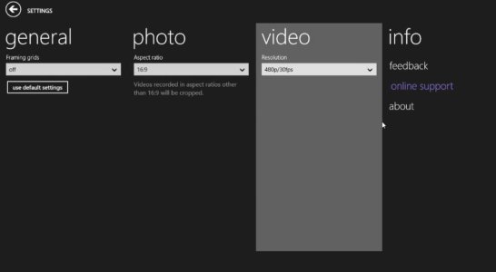
As you may know, there's a Windows Phone app included in this build - Lumia Camera. In this screenshot you can see how hovering the mouse over one of the pages of the panorama UI in the app's settings will highlight that page. I think that's a neat way of making the panorama UI look less confusing on a large screen. Having said that, I am pretty sure that panorama UIs will disappear from Windows with the new OS (this build is full of hamburger menus, which I suppose will be ubiquitous in the phone version of the OS as well.)
New toggle switch
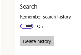
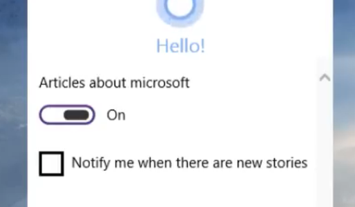
Most of the toggle switches in this build look the same as in Windows 8, but in some places there's a new toggle switch design. I've spotted it in the Cortana settings and the Maps settings so far. It looks consistent with the new icon designs in this build (thin lines). I'm sure that the old switch design will be gone in Windows 10.
Transparent app shortcuts
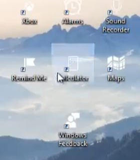
I was surprised to see that the redesigned and new apps have transparent app icons when pinned to the desktop. The icons and live tiles in the start menu still have a solid colored background (interestingly they are all blue). This all seems a bit weird to me, my personal guess is that live tiles will be transparent in Windows 10 (similar to WP8.1) and that most preinstalled apps will not all have a blue theme as in this build, but will adjust to the system theme color (as in WP).
Lots of circular elements
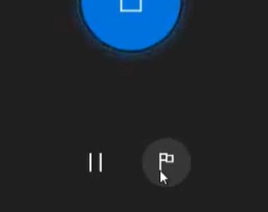
I've noticed that Metro is moving away a bit from the all-square design. There are new circular design elements everywhere in the redesigned apps. All kinds of buttons, icons and profile images are now circular. I guess that more of these circular design elements will appear in the final build.
Have you notice anything else?
Using WP apps with mouse
As you may know, there's a Windows Phone app included in this build - Lumia Camera. In this screenshot you can see how hovering the mouse over one of the pages of the panorama UI in the app's settings will highlight that page. I think that's a neat way of making the panorama UI look less confusing on a large screen. Having said that, I am pretty sure that panorama UIs will disappear from Windows with the new OS (this build is full of hamburger menus, which I suppose will be ubiquitous in the phone version of the OS as well.)

New toggle switch
Most of the toggle switches in this build look the same as in Windows 8, but in some places there's a new toggle switch design. I've spotted it in the Cortana settings and the Maps settings so far. It looks consistent with the new icon designs in this build (thin lines). I'm sure that the old switch design will be gone in Windows 10.


Transparent app shortcuts
I was surprised to see that the redesigned and new apps have transparent app icons when pinned to the desktop. The icons and live tiles in the start menu still have a solid colored background (interestingly they are all blue). This all seems a bit weird to me, my personal guess is that live tiles will be transparent in Windows 10 (similar to WP8.1) and that most preinstalled apps will not all have a blue theme as in this build, but will adjust to the system theme color (as in WP).

Lots of circular elements
I've noticed that Metro is moving away a bit from the all-square design. There are new circular design elements everywhere in the redesigned apps. All kinds of buttons, icons and profile images are now circular. I guess that more of these circular design elements will appear in the final build.


Have you notice anything else?

