- Dec 15, 2015
- 4
- 0
- 0
Theese are couple of fixes and features that i think Msoft should fix/implement into W10M:
1) messaging app should support same swipe gestures like outlook app. i often find myself swiping a SMS to delete it..but no luck haha.
2) icons of the apps in the notification centre in the latest build should be just a bit larger, they look odd so small.
3)sometimes i use an app and get back to start screen , the wallpaper seems to move, like its rearranging or something...wth is that?
4) in the notifications&action settings, please dont show all the quick actions tiles, make an expand button or something, its filling up all screen.
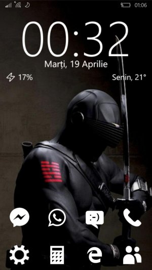
5)ability to leave more space between the tiles, that would make start screen even more customisable (i wanted a clean start screen just wit a weather and clock live tile in the upper area and some small tiles at the bottom and for that i had to download an app and create so called empty tiles and make them transparent) Many people i asked said that w10m start is to cluttered, especially when you pin lots of tiles different dimensions and colors.
6)secondary start screen the left> a swipe from regular start screen should bring a secondary start screen where you can pin whatever you want, contacts, web pages, etc, so the main start screen become more cluttered.
7)music controls interferes with windows hello. if i listen to music and i want to unlock my phone, the iris scanner starts up only after music controls goes off.
And theese are just from on top of my head.
My current start screen (about what i was saying at pt. 5):


