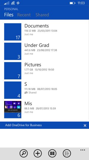
Nobody is complaining about the app becoming more functional. Everybody agrees that is a good thing and we're all happy for it.
Unfortunately, this issue can't be discussed if one side refuses to acknowledge that it even exists or just thinks people who dislike the new design are mad/crazy. I don't think that's helpful. Even if you don't understand the issue yourself, the fact that it garnered over 2300 votes on uservoice in just a few hours suggests it's not a small number of people that feel there is a problem. The fact that many people view it as an erosion of one of WP's core strengths should also be taken seriously. No product manager worth their salt ignores that. Instead, you acknowledge that there is a problem, determine exactly what it is, and then consciously decide if it can/must be addressed.
I suspect this issue is larger than any single app. I think it asks the question where MS is headed with metro design. Are these just exceptions born of necessity, or did MS fire too many people from QA who's job it was to ensure UI consistency? Is this developer sloppiness, or is MS deliberately moving away from metro? Are these exceptions, or the new norm for first party apps? Has MS moved to a policy where every team decides for themselves what an app should look like, or does MS still care about teams adhering to a consistent design language? If I'm developing a new app for WP, what design guidelines should I now be following (as MS says or as MS does)? I think those are fair questions to ask at this point, and it shouldn't be hard for anyone to imagine how some answers could disappoint many WP users.


