iOS vs Windows 10 Home Screen

IOS is like a prettier android (not saying a lot).
That said....Windows 10 is far better as a UI and I love it.

I do miss Windows Phone 8's metro design though
 
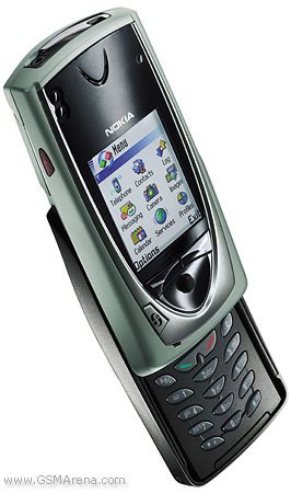
Me personally when I see static grid of icons, It reminds me of phones like this...
no7650_00.jpg


The 7650 which came out about in 2002.

One of the reasons I prefer live tiles.
 
Maybe it's just me, but I have a hard time finding the right app on cluttered Android and iOS home screens, and I have noticed others do too. Once you get a lot of apps the tendency is to have them all on the home screen. When I use Android I constantly cull my home screen back to just the essentials I use all the time, leaving plenty of space open. That allows me to instantly choose what I need for 90% of what I do, then I can swipe to another screen for the second tier of apps, etc.
I understand you, but to me, it's about the same experience. The only difference (at least in my experience) is that on Android (I only have experience with 6.0), it is added to the app drawer and not the home screen, and iOS adds it to the home screen (or at least one of them). For WP/WM, it's still added, you just have the choice to pin it to start screen or not.

When I tried Android, I set it up like my WP home screen. Not literally but basically the apps I use and open a lot are in the dock and on the home screen. Same for iOS really, so I feel like I can understand but I don't see it. I do like that with iOS, you can put all of the apps you don't use in a folder that you never have to open unless you want to.
 
That's what kept me on windows is the live tiles. It's something how just the simple things on this platform make all the difference. That is to me why this platform is superior.
 
I prefer the tiles hands down. But it isn't just about the simple grid of icons vs grid of tiles (live or not), you can get downright creative in creating your homescreen. From information overload tiles covering the entire screen to minimalist homescreens. Check out some of these BEAUTIFUL homescreens from the "Share Your WM10 Startscreens" thread, for example:

http://forums.windowscentral.com/windows-10-mobile/340515-43.htm

WP is just so much more customizable and fun to look at. You're not stuck. You can always change things up. With iOS, your'e pretty much stuck with a grid.
 
Personally I absolutely love the Windows 10 Live Tiles. I'd like to see the transition animation be the same at the animations on Windows 10 PC's. However, you can't argue with the stability of iOS and the performance of it. I'm just hoping that Windows Mobile turns a corner and continues to mature before the world writes it off.
 
I much prefer live tiles. The whole "old school" 90's style of desktop icons that iOS and Android use just seems so outdated and visually dull to me.

I'm a huge fan of the "picture in tile" look and remain convinced that had it been a customization feature when WP8 launched, it would have made a difference in the adoption rate of WP8. I loved solid colour tiles, but I remember when the Lumia 920 launched, many people complained that they loved the phone but didn't like the solid colour live tiles.

Part of the beauty of the Windows Phone start screen is the customization that we now enjoy. The accent colours, backgrounds, and arrangement of tiles can make a world of difference in the aesthetic appeal of Windows Phone / Win10 Mobile from one phone to another.

Photo attached of my Lumia 1520 from a few months ago.

View attachment 123777

Again, yes, I love the look of that, but I still have a problem
Or am I misunderstanding something?

To get it "LOOKING" like that, you are either installing Apps based on the design of their Icons (which would be a bit of a silly thing I'm sure we'd all agree)
Or you are not putting any of the apps that do have colourful tiles on your home screen, just leaving them under "app apps" and so making it more long winded to get to programs you wish to use all the time.

(That's my issue)

Unless I'm not understanding something?

I'm not disputing your issue. I agree that every app should have the option of a transparent tile.

In my case, my layout works perfectly for me. Everything transparent happens to be a core phone related thing or a tool of some sort - the kind of things that I want to be able to launch quickly if needed.

I do like scrolling the home screen to get the parallax effect with the background image, so it just works out that solid or photo tiles are below and I have to scroll to see them. Stuff like windows central, social media, photos, people, me tile, news, finance, etc.

I'm well pleased with the layout and transparent vs not transparent. I do like having some non-transparent tiles in the mix. It adds some variety and colour.
 
Me, I just like pining my favorite contacts on my start screen and watch the heads move about...

I want to see faces on my phone, not just icons
 

Members online

No members online now.

Forum statistics

Threads
339,834
Messages
2,262,865
Members
428,770
Latest member
Megg