- Feb 26, 2014
- 55
- 0
- 0
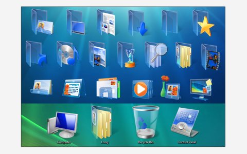
When Windows Vista came out, one of its main differences from Windows XP was its modern user interface.
Those someway cartoon-like icons, with strong strokes found in Windows XP were being replaced by the shiny and realistic icons in Vista.
Vista icons had shadows, lots of transparent glass materials, and everything else to mimic real-world objects in a visually appealing way.
The default desktop background also brought an image that resembled beans of light.
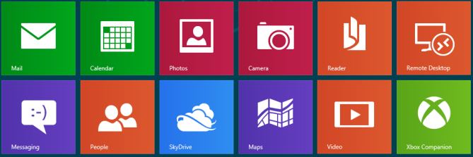
Some years after that, Windows 8 came, and the realistic icons still present in Windows 7 were being changed to flat icons.
The purpose of its "Metro" interface was a minimalistic design, bringing infographic icons that were there solely to represent what they had to.
They weren't there to be noted, or to amaze the user with shaders, shadows or a 3d aspect: their main purpose were to instantly guide the user to do its task.They are meant to be just signals, that can be recognized easily by who is looking at them.
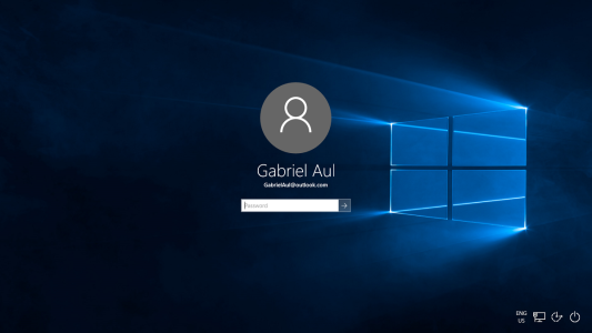
That trend continues in Windows 10, but at least for me, that Windows 10 Hero Desktop Image doesn't fit in with Windows 10, considering its minimalistic design context.
I'm not saying the image isn't beautiful, or that Windows 10 will be "another Vista".
The whole point is, the image causes you think you'll be seeing glossy / transparent / realistic elements throughout the interface, when that's not the case.
I tried, but I simply couldn't use that image for more than one minute.
And you, what do you think about that image?
Share your opinions!


