Live Tiles in Andromeda
- Thread starter mc_razza
- Start date
You are using an out of date browser. It may not display this or other websites correctly.
You should upgrade or use an alternative browser.
You should upgrade or use an alternative browser.
bleached
New member
- Dec 13, 2013
- 24
- 2
- 3
This is a fallacy, you're interpreting what is a coincidence between products that had Live Tiles and products that failed as that being the reason. There might be several explanations for the low sales, a lot of which are not even related to the quality of W10M or Windows Phone. But definitely Live Tiles wasn't one of them.
Is it a coincidence? Windows 8 was certainly hated because of the UI.
I think the chances of this product having Live Tiles is very low. Microsofts has made no improvements to them in years, Paul Thurrot has commented that it won't look like Windows Phone and Nadella himself said it won't look like anything before it. If it has Live Tiles, it will certainly look familiar.
Vincent McLaughlin
New member
- Jun 3, 2014
- 49
- 0
- 0
I would love to see a nice mixture of Windows 10 Mobile and MS Launcher, with Live tiles being part of that. However, I would also like to see that being an option that can be turned on for those of us that would want them. MS Launcher has an option to change the icon folders from square to round. No reason an option to have Live tiles can't be added with Andromeda. I also like the ability to create additional feed pages.
12Danny123
New member
- Mar 24, 2012
- 1,770
- 0
- 0
Live Tiles are certainly a thing that identifies Windows as Windows these days. However it should evolve into functions like Interactive Tiles. Another benefit that Live Tile design has is that it's easily scalable, compared to say Icons.
Avatar of Apathy
New member
- Jun 9, 2016
- 21
- 0
- 0
So long as thry actually FIX the Live tiles and make them actually change loke they are suppoaed to for longer than 3 days after a restart, then yes they should keep them.
I dont even know what to do anymore on my Andriod phone without a tile updating to show me something interesting, or having to utilize this crappy notification system.
I dont even know what to do anymore on my Andriod phone without a tile updating to show me something interesting, or having to utilize this crappy notification system.
Darutto
New member
- Oct 31, 2012
- 10
- 0
- 0
Yes and No. I absolutely think they should be an option but I also think they should allow them to be turned off for users who don't like them. Personally I don't like them at all and on both my old Windows Phones and on my desktops I would have to always make my tiles the smallest setting since that was the only way to turn off the "live" part of it most of the time.
I agree with this comment. Not because I don't like the live tiles, but most people is used to the dumb icons and if a live tile could be a turn off for them, then, they should not be there. Also, it might be time for a fresh thing to come.
Darutto
New member
- Oct 31, 2012
- 10
- 0
- 0
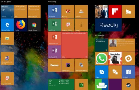
Maybe because not everyone has so little color in their start menu
 ...
...
 ...
...I don't understand how can people like this single coloured ugly square box UI
View attachment 138791
naddy6969
New member
- Aug 8, 2017
- 147
- 0
- 0
I agree with axone ten. Darutto's reply screen is even worse. So instead of 3 colors you have 9 colors? Is that supposed to be an improvement?
The fact that they all look alike means I have to read the text in the square to know what it is. With actual icons, I know just by looking at the icon what it is. Having a tiny icon in the middle of a large square that is exactly the same size and color of 8 other squares makes no sense to me.
The "live tiles" was a good idea, but in practice it simply does not work for many people. The constant blinking/spinning/"hey look at me" is just distracting. I realize everyone here loves them (of course), but this does not represent the world at large.
Provide an option to turn them off.
rodneyej
New member
- Nov 21, 2011
- 119
- 0
- 0
Who's screen looks like that?
Originally posted by axone ten
I don't understand how can people like this single coloured ugly square box UI

SteelSteve
Member
- Oct 21, 2011
- 308
- 0
- 16
Live tiles are one of the things that attracted me to Windows phones in the first place. Would hate to see them go.
Awhispersecho
New member
- Jan 12, 2013
- 278
- 0
- 0
Live - iles are pure genius and if Apple had been the 1 to use them, they would have been credited for saving the world. Live Tiles are a must and if it doesn't have them, I won't purchase it or any other device that runs a version of Windows without them. I would rather have Live Tiles than a huge selection of apps. However I am a little concerned that the Microsoft launcher for Android might be a hint at where they are heading with their Mobile OS in the future and I find that unacceptable for a Windows device.
caelironstaff
New member
- Feb 12, 2015
- 5
- 0
- 0
Pierre Blackwell
New member
- Nov 26, 2012
- 313
- 0
- 0
Live Tiles my have a little age on them, but they are still the cleanest looking UI out there. I think MSFT should definitely incorporate them with Andromeda in some way. In reality though if they don't make a push to market this device like they did the Surface when it first came out, Andromeda will be just another great idea that another company will expand upon.
EssThree
New member
- Dec 28, 2012
- 155
- 0
- 0
Maybe. They really need more personality, though. The new store tile introduced in the second creator's update was a step in the right direction, but most of the stock app icons are boring and hard to differentiate at a glance. The plain white icons just don't do it for me anymore.
Honestly, MS has clever UI people, and I bet they could come up with something cooler.
Honestly, MS has clever UI people, and I bet they could come up with something cooler.
Jeevan Pulluru
New member
- Oct 12, 2017
- 5
- 0
- 0
To be frank, I want live tiles to be evolved so that they can be interactive as much as possible. Just glancing the data is nice but a bit interactive is also perhaps the next evolution for live tiles.Who knows!
Tiles are still central to Windows 10 so it would be odd to totally change the experience, especially if it supports any Continuum mode.
My guess is it will be similar to the mobile menu or desktop tablet mode menu.
edit: I see this is in Ask Dan!! My answer remains but perhaps he'll let you know his thoughts too!
Similar threads
- Question
- Replies
- 0
- Views
- 9K
- Replies
- 0
- Views
- 1K
- Replies
- 2
- Views
- 36K
- Replies
- 3
- Views
- 6K
- Replies
- 0
- Views
- 22K
Trending Posts
-
-
Question Windows 11 and Linux on separate drives?
- Started by Verax
- Replies: 0
-
-
Question Win-11 - Problem with moving files from C: to New Partition on E:
- Started by fasteddie01
- Replies: 1
-
Windows 10 Themes no longer working...
- Started by DocCovington
- Replies: 6
Forum statistics

Space.com is part of Future plc, an international media group and leading digital publisher. Visit our corporate site.
© Future Publishing Limited Quay House, The Ambury, Bath BA1 1UA. All rights reserved. England and Wales company registration number 2008885.
