- Sep 28, 2012
- 159
- 0
- 0
I was thinking about branding today. Now that Nokia is out of the picture, Microsoft needs to figure out their Lumia branding. Now, I think we can all agree that the black Microsoft on the 535 is kind of terrible design. I really hope they reconsider this, for three main reasons:
1) The vertical alignment clashes with a smartphone's natural vertical position: you read horizontally on the vertical surface, thus making this logo's position unnatural. It should be horizontal.
2) The color. Seriously. It looks painted on with Crayola. This needs to be revised, design aesthetics 101 people.
3) Microsoft. Let's face it, if you're reading WindowsCentral you probably like Microsoft, like me. Guess what, most people DON'T. They think of them as evil dinosaurs of technology that bring them viruses and blue screens of death. Unfair, I know, but this image cannot be shaken at this point - they've tried for a decade with zero success. They went with the Lumia branding, now go all the way.
If you think about it, there's one phone that does branding wonderfully well - the iPhone (though I hate praising that overpriced piece of ludicrous adoration by mostly ignorant masses). It doesn't need to say APPLE, MADE BY APPLE, WE'RE HERE, APPLE, CALIFORNIA, WE DO MACS! No, it doesn't scream. The logo is enough, everybody knows who made it. It simply verbalizes the name of the phone line, the iPhone. Color is a nice gradient - since it's etched with laser - and it only makes a tiny reference to the company who made it. This is how you brand your phone: noticeable logo, subtler actual name, nearly imperceptible company name.
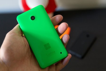
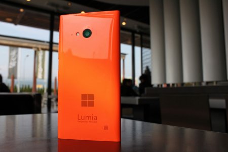
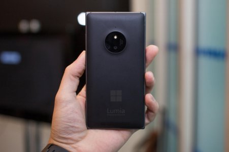
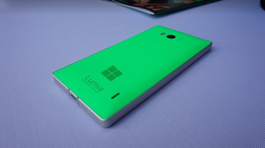
So in light of the terrible 535 design, I thought I'd give it a go:
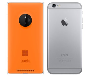
I paired it with the iPhone 6 to showcase how Microsoft can imitate it's simplicity, while still making their branding effective. Honestly I think this looks miles better than what we've seen on the 535. Microsoft doesn't need - nor should it want - for people to know that MICROSOFT made a specific phone. They shouldn't care in the least. They need people to know it's a LUMIA, a brand they already like. Those who care will be satisfied that it says it's made by Microsoft, but the masses don't care. Make Lumia the show and subtly remind consumers who made it by burning that 4 square logo in their brain. I think this is branding at it's most effective, just like Apple does it with the iPhone. No version numbers, just like there's no iPhone 4, 4s, 5, 5s, 6, 6 Plus... branding. There's just iPhone.
Let there just be Lumia. That's it, period. That's what consumers should remember. They want a Lumia. They'll buy a Lumia. No 620 or 635 or 735 or 830 or 1520 or Icon.
Just Lumia.
Thoughts?
1) The vertical alignment clashes with a smartphone's natural vertical position: you read horizontally on the vertical surface, thus making this logo's position unnatural. It should be horizontal.
2) The color. Seriously. It looks painted on with Crayola. This needs to be revised, design aesthetics 101 people.
3) Microsoft. Let's face it, if you're reading WindowsCentral you probably like Microsoft, like me. Guess what, most people DON'T. They think of them as evil dinosaurs of technology that bring them viruses and blue screens of death. Unfair, I know, but this image cannot be shaken at this point - they've tried for a decade with zero success. They went with the Lumia branding, now go all the way.
If you think about it, there's one phone that does branding wonderfully well - the iPhone (though I hate praising that overpriced piece of ludicrous adoration by mostly ignorant masses). It doesn't need to say APPLE, MADE BY APPLE, WE'RE HERE, APPLE, CALIFORNIA, WE DO MACS! No, it doesn't scream. The logo is enough, everybody knows who made it. It simply verbalizes the name of the phone line, the iPhone. Color is a nice gradient - since it's etched with laser - and it only makes a tiny reference to the company who made it. This is how you brand your phone: noticeable logo, subtler actual name, nearly imperceptible company name.
So in light of the terrible 535 design, I thought I'd give it a go:

I paired it with the iPhone 6 to showcase how Microsoft can imitate it's simplicity, while still making their branding effective. Honestly I think this looks miles better than what we've seen on the 535. Microsoft doesn't need - nor should it want - for people to know that MICROSOFT made a specific phone. They shouldn't care in the least. They need people to know it's a LUMIA, a brand they already like. Those who care will be satisfied that it says it's made by Microsoft, but the masses don't care. Make Lumia the show and subtly remind consumers who made it by burning that 4 square logo in their brain. I think this is branding at it's most effective, just like Apple does it with the iPhone. No version numbers, just like there's no iPhone 4, 4s, 5, 5s, 6, 6 Plus... branding. There's just iPhone.
Let there just be Lumia. That's it, period. That's what consumers should remember. They want a Lumia. They'll buy a Lumia. No 620 or 635 or 735 or 830 or 1520 or Icon.
Just Lumia.
Thoughts?

