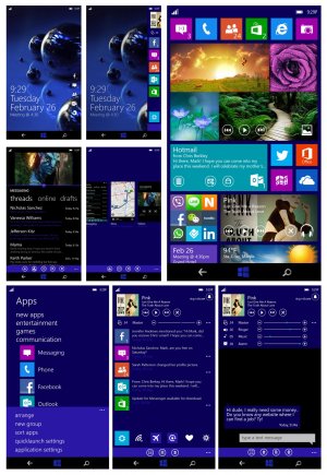
My concept UI for Windows 8.1 or 9.0

Interesting concept impressively thought through. Personally I'd rather have the notification centre to the left of the main screen rather than to the right. I also think the concept has too many bars and adjustments for the 'volume profile' screen when you press volume up or down - the idea is great and needed but I think the presentation of it could be better. I'm interested in the idea of making the live tile for music have controls on it, but that kind of makes the top volume down screen a bit redundant. I'm not sure you need the Blackberry-esque peeking notification centre - we already have one of those in the form of the start screen - plus you already made provision for this in the 'task manager'. Either way, the idea of interactive live tiles stands out and has some good potential. The start screen itself seems a little busy but I like the idea of having a bit more information available at a glance.

The idea of splitting apps across the screen, and making the OS work in landscape are great features and at least one of them is highly requested. Swiping down to close and app is a brilliant idea and goes along with their other OS's (RT, Windows 8 etc)

You've clearly done a lot of research - local search, coloured windows logo, volume profiles, 'snap' function. One of the best thought-through concepts I've seen. Some ideas are brilliant extensions of what we already see and I'd love to see them implemented. Nice work.
 
Very well thought out concept. Just tweeted the youtube link to joe belfiore and ben rudolph. Really hope they contact you ;) or atleast pick a few things from your design.
 
Some good ideas, but too polluted lock screen. And I don't think Windows Phone needs a notifications center. Live tiles concept make a good job.
 
great concepts.. even I was thinking other day interactive tile controls is really important idea.
 
I like many of the ideas (particularly the new ones), but not the execution. The UI has become far too polluted and too cumbersome. For example, why make me go through three clicks before I can change the volume? Also, some of the gestures would interfere with existing apps, not to mention that many wouldn't be discoverable without reading a manual.

As is, this would turn me off WP.

However, I think with some refinement, unification and simplification, a lot of these ideas have great potential.

Offering flexible and powerful features while keeping the UI simple is hard. I don't think you've nailed it, but I love your creativity.
 
This looks really good! I still think buttons on screen are ugly though, but shouldn't the normal touch keys also work with gestures? I think so..
 
Holy hell. Made me and wife want to email Microsoft and get you in a visual representation job.
 
i think that was very well done...ive seen some cool concepts but this is by far my fav of them all!!
 
One word "HELL NO" ...ooops that was two..dont want to be a troll but its just way too cumbersome...youve made a Frankenstein android/wp UI and it doesn't work. Having said that I do like some ideas like the app groups and buttons on some tiles to control them right on the homescreen but those aren't original ideas you came up with.
 
I would like a full notification center sorted by time - something like "missed calls", but for all app notifications. Accesable by swiping to the right, so opposite of "all apps" view. Second, i would like a control center that controls music, bluetooth, brightness etc. by swiping from the top. I like your bing improvements. But i don't think things like app side-by-side, switching by swiping or closing by swiping are realistic or needed. Also the more tiles on the startscreen, i know they are optimized for bigger screens, but for these form factors there is Windows 8 with >7" support in Windows 8.1
 
I like many of the ideas though think a few over-complicate things. The notification center idea is nice, as well as closing apps. Split screen interesting though don't know how practical. Folders needed and optional other sorting on apps list. Well presented.
 
I like many of the ideas though think a few over-complicate things. The notification center idea is nice, as well as closing apps. Split screen interesting though don't know how practical. Folders needed and optional other sorting on apps list. Well presented.

Actually, I think the split screen might be useful. Especially if your posting to a blog, website or writing an email and need to spell or fact check something.
 

Members online

Forum statistics

Threads
339,640
Messages
2,262,671
Members
428,761
Latest member
johnaw