My People hub redesign

anon5997296

New member
May 16, 2013
481
0
0
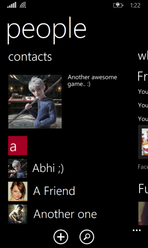
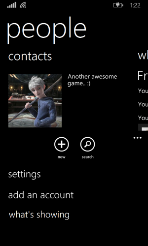
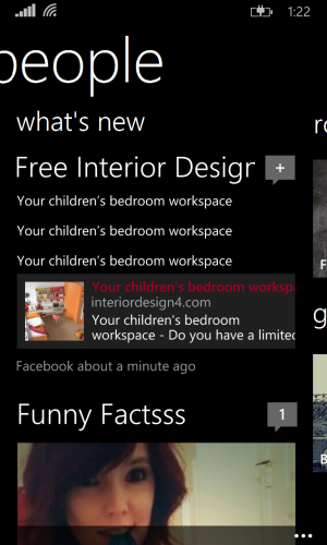
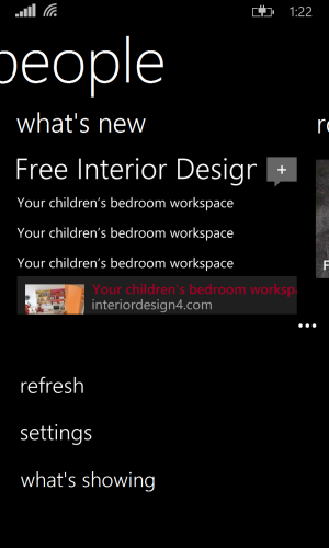
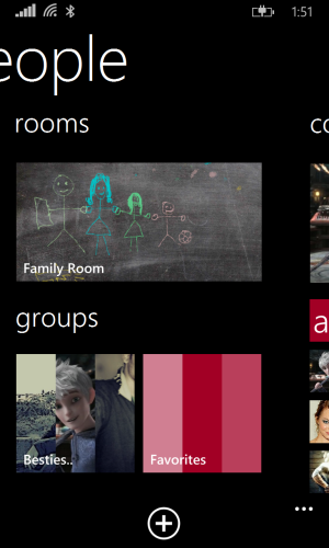
I, out of boredom, redesigned the people hub a bit, to make it a little bit more clean n yet not to lose a lot functionality.
I think mine looks better than what we have currently in Windows Phone 8.1 developer's preview. Feel free to share your thoughts on it. By the way, I did it all on MS paint and not on a photoshop, cause I don't have it n don't even know how to use it. So it's not much refined. BTW, the thread somehow got created in 'upcoming n rumours'. Please move it to suitable forum.
 

Attachments

  • people 1.png
    people 1.png
    301.6 KB · Views: 13
  • people 1 menu.png
    people 1 menu.png
    203.1 KB · Views: 12
  • people 2.png
    people 2.png
    315.6 KB · Views: 11
  • people 2 menu.png
    people 2 menu.png
    121.7 KB · Views: 12
  • people 3.png
    people 3.png
    534 KB · Views: 14
Last edited:
I've changed the font of the header 'people' a bit so it has somewhat more space like the header of xbox music or xbox games, and lowered it a bit as well. I made the sub header contacts somewhat bigger and moved the 'showing some accounts' to the menu under what's showing. Cause, who really is changing contacts from what account are showing every now and then? It's a setting thing n should be in the menu, not on foreground cluttering the UI like Android. Same goes for what's new page. Anyway, it's a good try of myself, I think.
 
Maybe you could talk us through some of the changes you made and explain why you made them, then we could critique for you?
 
basically, it looks like older integration of facebook and others.
it is definitely nice and much much better than the fiasco of current FB app integration.
 
Maybe you could talk us through some of the changes you made and explain why you made them, then we could critique for you?

I already explained that in the second post. I made this just remove the clutter.. And to make it look more like WP style. Minimalistic. Though it is minimalistic, it provides the same features as the new hub, but looks a bit nicer. In my opinion at least.
 
basically, it looks like older integration of facebook and others.
it is definitely nice and much much better than the fiasco of current FB app integration.

Thank you very very much for your opinion. This design kinda combines the 8.0 and 8.1 UI. And I'm one of those who hate the new people hub UI. On 8.0 it used to be my show off feature to my Android and iOS friends. Now it's just plain ugly in my opinion.
 
Thank you very very much for your opinion. This design kinda combines the 8.0 and 8.1 UI. And I'm one of those who hate the new people hub UI. On 8.0 it used to be my show off feature to my Android and iOS friends. Now it's just plain ugly in my opinion.

completely agree. its ugly.
 

Latest posts

Trending Posts

Members online

Forum statistics

Threads
341,417
Messages
2,264,486
Members
428,833
Latest member
dksdjkdjkdsjkds