Someone needs to send this to Microsoft

I dont know firsthand, but maybe they're saying the app has to many "layers"?

Although I don't really think the hamburger presence and back button use are correlated.

Except that's not how the app is laid out. You just use the hamburger menu to get to different sections. There's only two layers. Three at most if you count changing things in settings.
 
And the link that was posted earlier, where the guy from Apple said hamburger menus were awful? There's more than a few Apple-made apps on my iPhone that have hamburger menus in them, including their app store.
Except that the App store "hamburger button" graphic isn't a hamburger menu button at all, it's a button to get to a "wish list" of apps that the user wants to buy. In fact, it's not even a hamburger graphic, it looks more like the "select" graphic in the WP email or photos apps.
 
Putting aside where it should be there, I wish they'd at least decide whether the hamburger should be on the left or right.
 
Who is calling it a mistake?

*edit*

The hamburger is the universal visual cue for menu's and other functions. I've read a lot of "Microsoft is copying Android/iOS" sentiment the last few days, but it goes much further than those other 2 OS's.

[...]
And the link that was posted earlier, where the guy from Apple said hamburger menus were awful? There's more than a few Apple-made apps on my iPhone that have hamburger menus in them, including their app store.

It's common, but that doesn't make it good. It's a lazy UI device that got popular because it was so easy to implement. There was a post floating around here before by Redbooth who moved their main app navigation from a hamburger to a bottom-oriented icon tab strip and found that their app usage stats doubled and the engagement length went up 70%. That's why Apple and anyone who knows anything about mobile UX doesn't like them. This isn't just a matter of Windows Phone fanboys whining about change either. There's a lot of debate in both the mobile app and mobile web industries about how to handle mobile menus and whether hamburgers are a good thing or not. Previously, Windows Phone wasn't a part of this debate because it had a really well-thought out standard menu system.

If anyone wants to know why Microsoft is going for the idiotic hamburger button, it has NOTHING to do with it being a familiar interface for users. It's not. See the Redbooth blog post above. It's a lazy, junk-drawer, mystery meat UI pattern. The real reason is, at the moment, called ApplicationViewTitleBar. It's going to be a standard Page control for Windows 10. The idea is that Windows 10 and Windows 10 on the phone are the same operating system and will run the same exact universal app. At the moment, universal apps are two separate projects with two separate UI projects and a shared code project. The idea is that all apps would use this new control on the phone, desktop and tablet.

In any case, hats off to Microsoft for releasing a very raw look at Windows 10 and accepting feedback on it.
 
All that is needed is a retractable finger grips behind the phone for better one-handed operation.
 
I am an Onehand user and I support this topic! #onehanduser #onehandgate

When you need to touch the button at out of reach (hamburger button), you have to adjust your phone on your hand and balance it with other 4 fingers,
=> increasing the chance to drop your phone,
=> You have to buy a new phone,
=> Capitalist love this.
 
Because it's not selling well possibly?

The things that you guys love, varies wildly from what the general smartphone buying public is used to. Microsoft has the option of keeping you guys happy and staying at ultra low market share, or making WP friendly and familiar to the world, and increasing their numbers. You guys will get over it, you always do.

Oh.. Come on! You really think, why WP is not doing well is because of UI? Then you would be surprised to know, that it is not beause of UI, but the lack of apps and features. I'll show you a general conversation between me and my friends. I'm a college student and so they are. This will give you a basic acknowledgement of what young people think of WP and why don't they buy it.

My friend - Hi dude. I'm thinking of buying a phone.
Me - Wow. Great. Which phone did you decide on then?
He - Apple is out of my budget, guess it will be any Galaxy or Xperia or even HTC. Not decided yet.
Me - Well, you could try Windows Phone, a great OS!!
He - Ohh.. Let me see your phone.
Me - (show him my 920), I show him the cool Live Tiles, smoothness, soothing animations.
He - That's really great. But, Android is also smooth, my brother has a XYZ phone. It's very good. And Lollipop animations are also very good.
Me - Yeah, but Windows is also good. We have the best cameras.
He - Yeah, but, I've heard there are not much apps for Windows Phone. And Instagram and Twitter are plain bad compared to Android.
Me - (As, I don't lie and don't want my friends to be disappointed after getting the phone.) Well, yeah. You can't upload videos to Instagram yet. You can't edit your past posts on Instagram. You can't change your profile pic and cover photo on Facebook app. Twitter app doesn't show inline images and notifications are broken.
He - And what about Bluetooth?? I heard you can't send files over Bluetooth.
Me - Yes, we can now. Those were WP7 days.
He - And WiFi direct? And USB OTG?
Me - No, WiFi direct is not built into the OS, but there are apps, third party. And no USB OTG either yet, but things can change in future.
He - Dude, why do you think I will get this phone? Agree, it looks good, but no good apps. By the way, I heard there are no official Google apps.
Me - Yeah, no gmail, no Google Plus, no Hangouts, but we have Skype. No YouTube, but we have great third party apps.
He - I don't trust third party apps. And, I heard Skype is much better on Android than Windows Phone, as is Office and Outlook which is recently launched.
Me - (sadly) Meh.. Yeah.
He - Well, Android has more games too, and have variety of options. 930 doesn't have a microSD card and 1520 is very big. You can live with these much limitations, I can't. Sorry.
Me - Yeah, your choice. Good luck with your new phone.

See where the problem lies. Lack of quality apps, lack of features, lack of high end and good mid end phones and the perception are holding Windows Phone back. One positive thing in favour of WP was its UI which is being scraped. People would adore Metro if it had apps. It's not the UI which is holding back. Don't try to fix which is not broken.
 
Last edited:
The hamburger is the universal visual cue for menu's and other functions. I've read a lot of "Microsoft is copying Android/iOS" sentiment the last few days, but it goes much further than those other 2 OS's.

Pretty sad that a once beautiful and unique OS built on ease of use now takes inspiration from clunky mobile websites.
 
I love the complainers on this thread *cough* Praxius *cough*. Making sure the UX works as well as possible for one handed use does not make it more difficult for two handed use. Are there things that are only going to be done efficiently using two hands? Yes. Doesn't mean they shouldn't strive to make one handed operation as efficient as possible. Not sure why anyone would complain about people wanting the UI/UX to be as useful as possible but I guess a post about 2+2 equaling 4 would have complaining.
 
I love the complainers on this thread *cough* Praxius *cough*. Making sure the UX works as well as possible for one handed use does not make it more difficult for two handed use. Are there things that are only going to be done efficiently using two hands? Yes. Doesn't mean they shouldn't strive to make one handed operation as efficient as possible. Not sure why anyone would complain about people wanting the UI/UX to be as useful as possible but I guess a post about 2+2 equaling 4 would have complaining.

With windows 10 its not abt phones anymore, universal apps are for tablets and laptops/PCs with mouse. it does make sense to include menus on top for tablet/pc compatibility. now someone had previously suggested to have 2 UIs one for phones with bottom ellipses menu and one for PCs having hamburger at the top, but then that means double the development effort so we are back to square one where developers wont care to develop for WP. WP is not in the drivers seat so they have to adapt to what devs are comfortable rather than forcing devs to adopt their UI.
 
Except that the App store "hamburger button" graphic isn't a hamburger menu button at all, it's a button to get to a "wish list" of apps that the user wants to buy.

It's a hamburger button that opens another screen to perform a function. Feel free to call it what you want though.
 
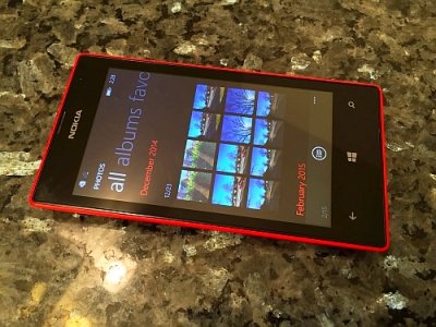
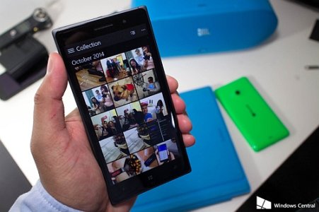
I don't have Windows 10 on my phone, but from what I've seen of the pictures, I think it's great. The regular 8.1 photos app has a bunch of wasted space, and the new design fixes that.

G6QlWZV.jpg

2Hxg8Oy.jpg
 
I don't have Windows 10 on my phone, but from what I've seen of the pictures, I think it's great. The regular 8.1 photos app has a bunch of wasted space, and the new design fixes that.

View attachment 97295

View attachment 97296

I agree with the wasted space on the actual photo app. It comes from the extremely large layouts at the top that have a secondary layout with the accent color. When using metro apps as the Skype or Zbox, you can see metro is working really great without that wasted space. Hope everyone will agree with that.
 
See, the way I view this image is that all of the important functions are down the bottom. I just jumped onto my sister's iPhone 6 and that button simply takes you to the wishlist, which isn't (in my eyes) a critical function of the app.


Please Calm down people for all we know the OS is under development. I am sure things will get sorted out over a period of time
Agreed, we're still in early days. That's why I believe now is the time to voice our opinions; there's a slight chance they will be heard and may somewhat shape further choices on the part of Microsoft's designers :)


I don't have Windows 10 on my phone, but from what I've seen of the pictures, I think it's great. The regular 8.1 photos app has a bunch of wasted space, and the new design fixes that.
Well, this certainly is illuminating. Definitely goes to show that there ARE improvements being made to the UI, and I DO applaud Microsoft's designers for that. Thanks for the heads up!

Honestly, I can't wait to get the preview installed on my phone, just so I can see how it functions in direct use (videos aren't always accurate in showing how it "feels", after all). I'll also be keeping my criticism as constructive as possible. I understand having to design a UI for millions isn't easy. But again, if people stay quiet, how will they be represented? :)
 
I don't even get the complaint here. I don't know how my hands compare to others, but I think they're on the large side of average, for a guy. The menu button there would be out of the natural reach of my hand, from a single-hand perspective. However, it's just barely. I can still reach the bottom right with my right thumb with ease though, so I don't know why that area's marked "Ow," it seems like a slight inconvenience of flexibility at worst.

Even then, there's a revelation to be had, in my opinion: WE HAVE TWO HANDS. If I don't like the stretching to the menu button with my right thumb, I'll two-hand the matter and have it resolved in a fraction of a second. I don't need an entire UI change to make it usable. Now, other instances could lead to a desire for change, but in the current WP 8.1 world, they've got the menu expansion often placed at the bottom-right, so it's in the hypothetical "Ow," zone as well. It's just in a different area that's easier for two-hand use, in my opinion. I suppose the "Natural," idea would be to keep the current menu bar at the bottom, but shift it as far left as possible, to try to keep all buttons and icons from the bottom-right, but that it's asymmetrical and awkward in appearance.
 
Hahaha, very enjoyable read!.....

Oh and I'm also left handed, yet i use both hands to do various things on my phone depending on the action, situation, my mood, etc.
I'm not in here complaining about the lack of left handed features am I?

I'm left handed too, and also on the 930, actually, that hamburger on the left top is reachable for you and me! Hahaha.
Maybe they should give the option for a double hamburger menu, for those who are complaining and always whining about everything......