Start Menu Design Inconsistencies

CrownedMartyr

New member
Jul 29, 2014
21
0
0
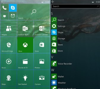
Anyone else bothered by the design inconsistency in the continuum start menu? The apps list is on the right where on the PC it's on the left, and there's no power, settings, file explorer buttons. I think this was done to make it behave more like Windows Mobile, where you swipe to the right for the apps.

I know this would be a significant change, but I propose Microsoft move the list of apps to the left on Mobile in order to match the PC. It's a small thing to nit-pick, but the Start Menu is a core part of the Windows experience and I think it should be as close to identical on every platform.

Windows 10 Start Menu
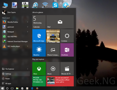
windows-10-start-menu.png

Windows 10 Mobile Continuum Start Menu
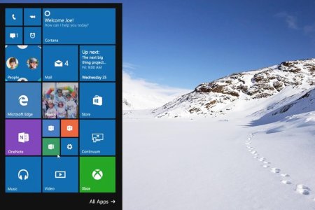
Windows-10-Continuum.jpg

Windows 10 Mobile Start Menu
10158-windows-10-mobile.jpg

*Edit* I realize maybe this would have been better off under the "Windows 10 Mobile" category. My apologies.
 
This is such a ridiculous thing to complain about, yet I agree with you so much. I just can't help but feel very annoyed at this. I think they should make the start menus to behave a bit more similar.
 
Maybe because they are different devices?

You can't compare a Phone UI to a Desktop UI, especially when people expect desktop windows 10 to have a similar UI to previous start menus. also the screen orientation is different, you don't use desktop in portrait mode, you use landscape, so how can you suggest they making the same UI on both?.
Microsoft tries their best to have consistent products now. but we don't even know how customizable continuum mode will be, but even if it stays like on the screenshot I don't see what's wrong about it. they are the same OS in theory, but it doesn't mean they should work and behave the same way. it would be horrible to people who use the OS with mouse and keyboard. but in the end, is obvious Desktop will have more options and buttons around, especially when people expect Start Menu to look and behave like previous versions of Windows. and those are settings that don't even exist on Windows Phone/Mobile like control panel, or powershell or command prompt, or the hibernation and change of users and such.

Only because they are Windows 10 and they use live tiles, it doesn't mean they should work the same, especially when we talk about Desktop vs Phone UI.
if you want a phone UI on your desktop/tablet, then use Android or iOS. I am sure they have a more "consistent" UI, by sacrificing the functionality of a proper mouse and keyboard support and be able to navigate fast around the OS.
because I liked windows 8, I didn't mind their hidden UI elements and such, but it doesn't change how Windows 10 is better just for the fact that it shows everything without actually having to do anything to show menus.

anyway your "suggestions" are not really great. Start menu on a desktop and start menu on a phone are totally different things, they just shouldn't work the same.
 

Forum statistics

Threads
342,697
Messages
2,265,775
Members
428,875
Latest member
Reneed