Transparent tiles, or naw?
- Thread starter Ma Rio
- Start date
You are using an out of date browser. It may not display this or other websites correctly.
You should upgrade or use an alternative browser.
You should upgrade or use an alternative browser.
ACynicalLamp
New member
- Jun 18, 2014
- 47
- 0
- 0
What the stance I've learned to take on this topic is: Make it toggle and everyone lives (it's a play on a quote from Charlie Wilson's War).
- Sep 28, 2013
- 1,291
- 0
- 0
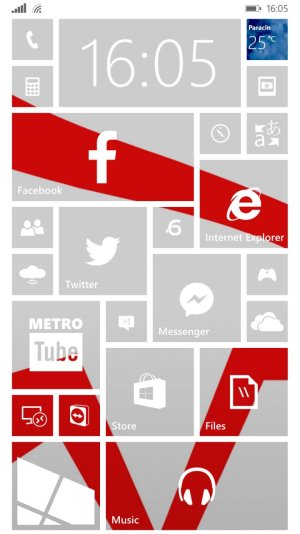
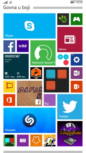
The pictures serve only as a visualization. However they are extremes. The left one is as transparent as you can get, and the right one is so colorful it's boardering messy.
But I want to know what do people imagine in their head when they think of Windows Phone. A minimal transparent screen, or something more colorful and filled with rotating live tiles everywhere?
But I want to know what do people imagine in their head when they think of Windows Phone. A minimal transparent screen, or something more colorful and filled with rotating live tiles everywhere?
bo_woods
New member
- Aug 14, 2014
- 1,449
- 0
- 0
The pictures serve only as a visualization. However they are extremes. The left one is as transparent as you can get, and the right one is so colorful it's boardering messy.
But I want to know what do people imagine in their head when they think of Windows Phone. A minimal transparent screen, or something more colorful and filled with rotating live tiles everywhere?
I would say the "more colorful and filled with rotating live rules everywhere"... It's what makes windows special IMHO
Nicholas Maguire
New member
- May 28, 2014
- 456
- 0
- 0
I prefer the new Windows 10 transparency  As long as you choose a good background picture that's not distracting, it can look amazing!
- Sep 28, 2013
- 1,291
- 0
- 0
I prefer the new Windows 10 transparencyAs long as you choose a good background picture that's not distracting, it can look amazing!
I'm all about dat transparent life, doe. We'll see how the Win10 transparency will work out. I hope it's good. If only you could make the tiles glass-like, floating on a background. That would be awesome.
Kram Sacul
New member
- Mar 4, 2013
- 750
- 0
- 0
It really depends on the use. Personally I prefer more colorful because the different colored tiles make them easy to differentiate from each other. It looks even better with some solid accent tiles mixed in. So a mixture looks best to me.
All transparent(8.1 style) to me looks extremely boring even with a nice picture behind it. It doesn't help that whenever I see a screenshot of it it seems like it's just someone trying to showoff their anime character/Batman/porn/etc background rather than a start screen that actually looks like some thought was put into it.
The W10 style (background behind the tiles) doesn't work for me as well. Too Android/iOS.
DalekSnare
New member
- Apr 4, 2012
- 273
- 0
- 0
I like what I have in Win10, with semitransparent tiles of my chosen theme color over a background. The transparent tile effect from 8.1 was neat for a while but this looks better I think.
snowmutt
New member
- Jul 4, 2011
- 3,801
- 0
- 0
I did the see-through thing for a while. It was fun. Then it just ..... wasn't.
I like to see the colors stand out. Your basic tiles are the color of your mood, the other tiles and the pinned websites interspaced so you can tell in a glance which is which. To me, that just feels like it is my screen and it is no one elses in the world. The transparent tiles just feels like a screen you can see on any Android out there.
Of course, I am in the minority so far. So the story of my life. I am a registered Republican in the state of Illinois. I am really used to being out voted. :wink:
gerzhwin
New member
- Nov 13, 2012
- 350
- 0
- 0
That's right. The tiles UI isn't just transparency or opazity, it's all about structure and visibility, which on the right folder setup wasn't taken into account as there are only the lower prioritised apps (I guess).Of your two, the left is better and the right one is a bit of a mess.
Aziz Abdurachman
New member
- Jul 31, 2014
- 181
- 0
- 0
I vote for colorful tiles, but not for all.
I like to see my start screen both color & transparent, I don't like full transparent and full color. Toggle to change it would be useful.
And I think if app tile can be transparent, option to customize tile background color is possible.
I like to see my start screen both color & transparent, I don't like full transparent and full color. Toggle to change it would be useful.
And I think if app tile can be transparent, option to customize tile background color is possible.
nohra
New member
- Jun 10, 2013
- 246
- 0
- 0
The only issue I really have with the 'transparent' tiles is that it doesn't uniformly force all tiles to be transparent. Which would be very difficult to do, which is why it can't happen. I just find I have a lot of tiles that don't use the theme background and so they don't show the picture. Thus, it becomes difficult to see what I have as the 'background' in places on the start screen. I guess the only way around that would have been a utility in the phone where you could either use an app's tile or use a generic theme-colored tile which would then be transparent. I had kind of thought that's what TileArt would do, but was disappointed.
Similar threads
- Replies
- 0
- Views
- 1K
- Replies
- 0
- Views
- 3K
- Replies
- 2
- Views
- 36K
- Replies
- 10
- Views
- 31K
Trending Posts
-
Flying a Drone in NJ – What Rules Should I Follow?
- Started by zenadrone
- Replies: 1
-
-
Question Win-11 - Problem with moving files from C: to New Partition on E:
- Started by fasteddie01
- Replies: 2
-
Question Windows 11 and Linux on separate drives?
- Started by Verax
- Replies: 2
-
I'm looking for a CalDAV, CardDAV client for Windows
- Started by xandros9
- Replies: 1
Forum statistics

Space.com is part of Future plc, an international media group and leading digital publisher. Visit our corporate site.
© Future Publishing Limited Quay House, The Ambury, Bath BA1 1UA. All rights reserved. England and Wales company registration number 2008885.


