- Aug 3, 2014
- 2,419
- 16
- 38
Good morning,
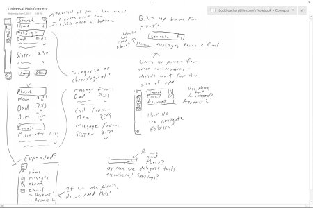
Okay, when I say "concept design" I mean it's a bunch of scribbles on a OneNote page that I've been messing with. Sorry guys, I haven't made some sexy new app design using Fluent Design that'll make you salivate. I wish I had though. I've just been playing with some ideas for the last twenty minutes and I'd like some feedback on UI and UX decisions I could make. Basically, this is an app that combines your messaging, phone, and email apps into one. This isn't the first time this has been done, haha, but it's a nice way to test your design muscles.
Basically, I want to know:
Hamburger menu vs. pivot menu?
I've been mulling this around and I keep coming back to the hamburger menu. Unfortunately, a pivot menu just doesn't offer me the power that a hamburger menu does. If I move the big categories (home, messages, phone, email) to a hamburger menu I can use pivot menus to separate different accounts, or maybe different SIM cards. Or I could use a pivot menu on the phone portion to separate history and the dial pad. Having everything under one pivot menu makes it feel cluttered and makes it far more difficult to fit so much into so small of a space. Having a hamburger menu also means I can potentially remove the need for the ellipsis menu (more on that later). But I'd like to know what you think.
Universal search vs. hamburger search?
I'm leaning towards a universal search bar on this one that persists through every screen at the top, but I can see the benefits of having it in the hamburger menu, so it stays out of the way unless you need it. Again, this also gives me more space for content and to mess with different ways of interaction.
Ellipsis menu vs. no ellipsis menu?
I've been messing around with having the "New" button next to the category header instead of in the ellipsis menu, but this poses a different problem. Should I have the ellipsis menu at all? I feel like I shouldn't go half n' half here. I should either go all out with it or not at all. But what do I do with everything else that's usually hidden by the ellipsis? I can delegate a portion to Settings but email for example needs more advanced functions that will make my app look messy if I shove it all on the screen at once. Should I just use the ellipsis menu?
Chronological vs. categorical?
This pertains to the Home screen that combines all your newest messages, calls, and emails that you haven't dealt with yet. Would you rather have this screen separate things by category and then chronological (i.e. Messages: 1; 2 then Phone: 1; 2) or chronological then categorical (1: message from then 2: call from)?
I appreciate any and all help here. Once I get some feedback and make some hard decisions on where I should place things I'll start refining this concept.
Okay, when I say "concept design" I mean it's a bunch of scribbles on a OneNote page that I've been messing with. Sorry guys, I haven't made some sexy new app design using Fluent Design that'll make you salivate. I wish I had though. I've just been playing with some ideas for the last twenty minutes and I'd like some feedback on UI and UX decisions I could make. Basically, this is an app that combines your messaging, phone, and email apps into one. This isn't the first time this has been done, haha, but it's a nice way to test your design muscles.

Basically, I want to know:
Hamburger menu vs. pivot menu?
I've been mulling this around and I keep coming back to the hamburger menu. Unfortunately, a pivot menu just doesn't offer me the power that a hamburger menu does. If I move the big categories (home, messages, phone, email) to a hamburger menu I can use pivot menus to separate different accounts, or maybe different SIM cards. Or I could use a pivot menu on the phone portion to separate history and the dial pad. Having everything under one pivot menu makes it feel cluttered and makes it far more difficult to fit so much into so small of a space. Having a hamburger menu also means I can potentially remove the need for the ellipsis menu (more on that later). But I'd like to know what you think.
Universal search vs. hamburger search?
I'm leaning towards a universal search bar on this one that persists through every screen at the top, but I can see the benefits of having it in the hamburger menu, so it stays out of the way unless you need it. Again, this also gives me more space for content and to mess with different ways of interaction.
Ellipsis menu vs. no ellipsis menu?
I've been messing around with having the "New" button next to the category header instead of in the ellipsis menu, but this poses a different problem. Should I have the ellipsis menu at all? I feel like I shouldn't go half n' half here. I should either go all out with it or not at all. But what do I do with everything else that's usually hidden by the ellipsis? I can delegate a portion to Settings but email for example needs more advanced functions that will make my app look messy if I shove it all on the screen at once. Should I just use the ellipsis menu?
Chronological vs. categorical?
This pertains to the Home screen that combines all your newest messages, calls, and emails that you haven't dealt with yet. Would you rather have this screen separate things by category and then chronological (i.e. Messages: 1; 2 then Phone: 1; 2) or chronological then categorical (1: message from then 2: call from)?
I appreciate any and all help here. Once I get some feedback and make some hard decisions on where I should place things I'll start refining this concept.

