What Cortana For Windows phone 10 should look like

That's something some people have wanted since day one... I like it :)
 
They should make both the action centre and Cortana transparent.. They are very basic as compared to homescreen and app drawer
 
I think Cortana should have Cortana in the background.... As in her face in the background at around 25% - 50% opacity, animated.... While the text and other information is presented in the foreground and more vibrant.

To give the impression of the stuff you want is right on the screen while Cortana remains inside and a part of the phone.

Simply adding transparency to existing UI, although somewhat effective in giving some life to the overall feel, really isn't all that unique.

Transparency is the new Lens Flare as Lens Flares were the Emboss, as Emboss was to Drop Shadows.

We need to think bigger.... We need to think More Cowbell.
That's not metro though... I mean those kind of effects and backgrounds are so Pre-Win8 IMO...
 
So change some spacing, make some fonts bigger, add in a picture in the background, add in one new feature, and - Voila! New Cortana Concept!

I should start making concepts...
 
That's not metro though... I mean those kind of effects and backgrounds are so Pre-Win8 IMO...

Transparency isn't Metro either. Metro is solid coloured squares, pivot menus and plain text on a solid background.... If you wanted to get all specific about it.

I personally don't care if something is Metro or not.... I care about being visually appealing and functional.
 
Transparency isn't Metro either. Metro is solid coloured squares, pivot menus and plain text on a solid background.... If you wanted to get all specific about it.

I personally don't care if something is Metro or not.... I care about being visually appealing and functional.

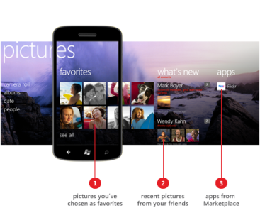
Actually Metro can have backgrounds like in the concept images. It's not too far from the Pictures hub in WP 7 and 8:

pictures-concept-hub.png

I miss when WP used to be simple and nice looking.
 
Last edited:

Members online

Forum statistics

Threads
338,519
Messages
2,261,533
Members
428,743
Latest member
daivikcart