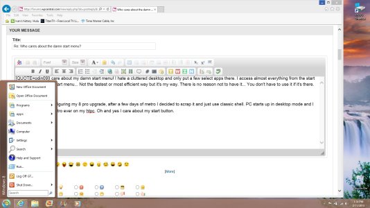
I like the start menu since Vista to Windows 7. Just hit Windows key and type away the program you want to open. Easy. I find it hard to believe that the Windows 8 start menu is faster or more convenient. It's filling up the whole screen, feeling bloated. And yes, the "damn start menu" is what has been keeping me away from Windows 8. It just feels so wrong for desktop. I'm not saying Windows 8 is worse than Windows 7 - I believe it has better features and so on. It is indeed a whole new version of this software. And I will probably update to it sometime, but I will probably investigate some means to get the old Start menu back.
Point is I fail to see how the new start menu is actually better than the old (Windows 7). I find it inferior, clearly designed tablets in mind. This said, I have not used Windows 8 yet and there might be something I don't know.
Windows 8 is even simpler yet - instead of hitting the Windows button and typing in the search box, you (in the Metro UI) click anywhere on the screen that isn't an app/shortcut and do the exact same thing (type to search what you are looking for).


