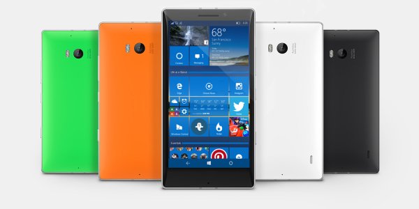
Windows 10 Mobile Concept

Cage Ata

New member
Mar 1, 2014
187
0
0
Visit site
*UPDATED FIRST POST IMAGE*
Hey guys! I'm currently working on a start screen concept but thought I would throw up the first draft of a slightly improved start screen. In reality, there is plenty more I would like to add such as interactive tiles etc but I don't think its possible for Microsoft to implement this feature at this development stage. Instead I am focusing on ideas and functionality that is still feasible! Such as the unification of PC to Mobile :)

https://windowsphone.uservoice.com/...e-add-the-functionality-of-the-windows-10-des
VQcS5BM.jpg
 
Last edited:

Ma Rio

New member
Sep 28, 2013
1,291
0
0
Visit site
So..basicly..tile grouping? That's cool, it definitely should be implemented, and I don't see why it isn't already.
Keep working on your concept, I'd like to see a better solution for the core apps (phone, calculator, camera maybe, people, etc.).
 

Cage Ata

New member
Mar 1, 2014
187
0
0
Visit site
Cheers! I have no idea either, I'm almost sure its coming! I also have never understood why app titles are forced to the left, I prefer it centered :)
 

Aurelink

New member
Jul 28, 2014
169
0
0
Visit site
You could "reproduce" something like this with an app called "Header tiles", which basically is a tile in which you can include a title. I'm not saying this doesn't need to be impleted, tho
 

Cage Ata

New member
Mar 1, 2014
187
0
0
Visit site
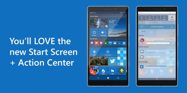
Made a quick mock-up with more refinements!

- Search icon has been changed to the Cortana symbol ( Only If the country supports Cortana)
- Added Bar aside Group Header to clearly define arrangements
- Larger Tile support for devices with screen 5" and up.

Windows 10 Desktop also supports multiple backgrounds as slideshows, should Mobile receive this too?

LT.jpg
 
Last edited:

Aurelink

New member
Jul 28, 2014
169
0
0
Visit site
Not gonna lie : That ISNT ugly at all. (And I'm not even sarcastic, in case you wonder)
They really should make the same notification center as the desktop version (transparent & blurry)
 

Steve Thackery

New member
Jun 23, 2015
271
0
0
Visit site
I like what you've done. The only thing against its adoption is that Microsoft are trying to get a coherent and consistent user experience across all platforms, which constrains them considerably in what they can do.

Personally I think they've gone too far. All the lovely innovations (side-swipes, animations, pivots, graphics and general design language) of W8.1 have been thrown away in order to make it work more like W10 on a tablet or desktop machine. Unfortunately it's left W10M looking and working far too much like Android.

I love W10 on my desktop, but on my tablet and phone it's a big disappointment - a big step backwards to before WP8.
 

Leonel Funes

Windows 10 & Xbox Champion
Mar 4, 2014
426
0
0
Visit site
Made a quick mock-up with more refinements!

- Search icon has been changed to the Cortana symbol ( Only If the country supports Cortana)
- Added Bar aside Group Header to clearly define arrangements
- Larger Tile support for devices with screen 5" and up.

Windows 10 Desktop also supports multiple backgrounds as slideshows, should Mobile receive this too?

View attachment 110997

If there's a bar on the section header, wouldn't it look too much like an opened folder?

And the search to Cortana icon change is genius!
 

Asskickulater

New member
Sep 20, 2013
572
0
0
Visit site
I like what you've done. The only thing against its adoption is that Microsoft are trying to get a coherent and consistent user experience across all platforms, which constrains them considerably in what they can do.

Personally I think they've gone too far. All the lovely innovations (side-swipes, animations, pivots, graphics and general design language) of W8.1 have been thrown away in order to make it work more like W10 on a tablet or desktop machine. Unfortunately it's left W10M looking and working far too much like Android.

I love W10 on my desktop, but on my tablet and phone it's a big disappointment - a big step backwards to before WP8.

and yet you ignore all the apps not using hamburger menus, and that microsoft is still working on removing hamburger menus as seen by the new photos app update, ever stop to think that maybe the reason hamburger menus are there was because Microsoft wanted to just get the apps working on mobile and stable after making them for desktop? then maybe they intend to fix the ui before launch...
 

Zachary Boddy

Staff member
Aug 3, 2014
2,413
15
38
www.windowscentral.com
I have no quarrels with the hamburger menus. Yes, I miss the pivots and navigational cues in Windows Phone 8.1 but with some improvements the hamburger menus could work just as well. It's not flawless, but it's the best we have now.
The pivots are barren, messy, and not apparent to new users. Whatever veteran users seem to think, it's important that we don't alienate potential users.
The hamburger menus provide one, centralized area to store large amounts of information and pages. In apps like Photos, where there aren't a whole lot of pages or information, pivots work better (same with Phone).
Microsoft definitely needs to improve them, but they're not terrible. More gesture support would be great, and use of pivots where pivots are more rational.
 

Zachary Boddy

Staff member
Aug 3, 2014
2,413
15
38
www.windowscentral.com
I love the change from the Search button to Cortana, although I wouldn't see it on my Lumia 830. I think Microsoft is severely reluctant to change the capacitive keys, however, as they work perfectly well and they don't want a division of design from hardware and software capacitive keys.
 

Cage Ata

New member
Mar 1, 2014
187
0
0
Visit site
Too right! It does look similar to an opened folder, ill red-draw some other concepts and see what I come up with! :) To be honest, I understand the new design cues that Microsoft are adopting and while some of those may be drawn from Android, I don't think the os looks anything like Android and I prefer it to Windows 8. With Microsoft try to merge PC to Mobile I cant help but feel like a lot of features are missing and with a few design changes could really make the ui beautiful. One of those is aero, to a degree, without it looking tacky. Its lackluster, void of colour throughout the os yet, the start screen is bright, sharp and stands out. I wish that was applied to hubs. I also think Microsoft is distancing itself from windows phone 8 and 8.1, so I don't think changing the search icon to the Cortana symbol would be out of the question considering any prior phones were made by Nokia and all of Microsofts hardware feature on screen navigation. Cortana would sit there perfectly, and if she was animated.. even cooler!
 
Last edited:

Cage Ata

New member
Mar 1, 2014
187
0
0
Visit site
To be honest I'm not sure what is being merged, is PC being merged to look like Mobile or the reverse. A lot of ui elements in PC is taken from mobile and the reverse is true too. Considering each start screen caters to specific requirements from the user, they should at least look similar? Should pc tiles be transparent too? Like mobile, or not? Should we have grouping like in PC, sure.
 

Steve Thackery

New member
Jun 23, 2015
271
0
0
Visit site
and yet you ignore all the apps not using hamburger menus, and that microsoft is still working on removing hamburger menus as seen by the new photos app update, ever stop to think that maybe the reason hamburger menus are there was because Microsoft wanted to just get the apps working on mobile and stable after making them for desktop? then maybe they intend to fix the ui before launch...

So you're saying that you think the hamburger menus are just interim until the apps are properly rewritten, and then they'll disappear again? That doesn't sound very convincing to me.

Having said that, their removal from the Photos app does give me some small hope - perhaps they've realised how poor they are.
 

Steve Thackery

New member
Jun 23, 2015
271
0
0
Visit site
The hamburger menus provide one, centralized area to store large amounts of information and pages.

Actually, I don't really agree. They seem to be a source of confusion. We now have three things: the hamburger menu, the '...' menu, and the gear menu. The distinction between them (especially the first two) seems to be very unclear, not only to users but also developers. Having a hamburger menu and a '...' menu on the same screen at the same time is a UI ****-up of significant proportions. The design language of WP8.1 was so much more elegant, with no such ambiguity.

Tell me, how do you know whether to press the hamburger or the '...' menu?
 

Slovenix

New member
Feb 24, 2014
878
0
0
Visit site
From my point of view, I never had any problems with Hamburger menu, but then I've met pivots and the dots and I though they are very good way of navigation and it was the first thing I liked about Windows phone.

However in the messaging apps I found the Dots "⚫⚫⚫ " to be very annoying as Apps couldn't use their specific chat boxes and send icons and so there is a lot of wasted space.. For example I prefer W10 Messaging app over 8.1 version.
Yet again it was not the Dots that really made be annoyed, but rather those big pivot TITLES that toke so much space for no good reason cutting a lot of text, and that applies to any app in Windows phone. So for me, All I ever wanted to see is smaller titles, smaller pivot text. -> see Photos app on W10M.


https://windows.uservoice.com/forum...ting-noting-doodling-for-windows-10-mobile-to
 

trivishal

Member
May 1, 2015
184
0
16
Visit site
Hey guys! I'm currently working on a start screen concept but thought I would throw up the first draft of a slightly improved start screen. In reality, there is plenty more I would like to add such as interactive tiles etc but I don't think its possible for Microsoft to implement this feature at this development stage. Instead I am focusing on ideas and functionality that is still feasible! Such as the unification of PC to Mobile :)

View attachment 110978

https://windowsphone.uservoice.com/...e-add-the-functionality-of-the-windows-10-des
Unification of design language of PC to Mobile is just impossible because the fundamental display of PC is of like a large rectangle with long side kept downwards and that of a Mobile is of small rectangle with smaller side kept downwards.
If I want something in similarity in PC and Mobile Start screen, the option of both transparent and coloured tiles should be in both Mobile and PC, not one in PC and another in Mobile. All the hamburger UX design should be eliminated in Mobile in core apps and other apps too being replaced by pivot and dot design, swipe functionality.
Your idea of grouping tiles is also great. Send feedback about this in feedback app in Windows 10 Mobile TP.
 
Last edited:

Members online

No members online now.

Forum statistics

Threads
327,309
Messages
2,249,778
Members
428,618
Latest member
priyarajput2367