Windows 10 Mobile Concept

TechnoReact-Site

New member
Aug 25, 2015
20
0
0
Visit site
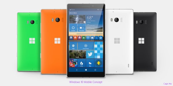
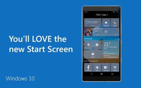
Made a quick mock-up with more refinements!

- Search icon has been changed to the Cortana symbol ( Only If the country supports Cortana)
- Added Bar aside Group Header to clearly define arrangements
- Larger Tile support for devices with screen 5" and up.

Windows 10 Desktop also supports multiple backgrounds as slideshows, should Mobile receive this too?

View attachment 110997

It looks awesome. These are some basics that Microsoft should keep in mind.
 

Zachary Boddy

Staff member
Aug 3, 2014
2,413
15
38
www.windowscentral.com
Actually, I don't really agree. They seem to be a source of confusion. We now have three things: the hamburger menu, the '...' menu, and the gear menu. The distinction between them (especially the first two) seems to be very unclear, not only to users but also developers. Having a hamburger menu and a '...' menu on the same screen at the same time is a UI ****-up of significant proportions. The design language of WP8.1 was so much more elegant, with no such ambiguity.

Tell me, how do you know whether to press the hamburger or the '...' menu?
Yes I do, because the hamburger menus are for navigation, and the ellipsis is for action.
Again, I never said the hamburger menus were perfect. They're not particularly elegant. But they're in the early stages, Microsoft is still experimenting, and they can only get better.
 

Asskickulater

New member
Sep 20, 2013
572
0
0
Visit site
So you're saying that you think the hamburger menus are just interim until the apps are properly rewritten, and then they'll disappear again? That doesn't sound very convincing to me.

Having said that, their removal from the Photos app does give me some small hope - perhaps they've realised how poor they are.

think of it like this:

> App gets developed as a universal app for desktop in the earliest previews of windows 10

> Down the road they start dropping them on the wp preview

> Since it's still a pre beta, what would you focus on first? changing the ui? or making the apps more optimized, which of those do you think negatively impacts the first impression of the OS, also, the UI is something they can throw on so quickly it doesn't really need attention so early

I'm not saying this is what happened, but considering how apps are slowly moving back to the pivot style, it's starting to seem more likely this is the case (also it makes perfect sense logically)


also, you cant talk as if this UI change for the photos app is something they just decided to do, they showed a mockup of how they wanted the photos app to look a LONG time ago... and it looked VERY similar to the new UI the photos app has..
 

Cage Ata

New member
Mar 1, 2014
187
0
0
Visit site
The reason I wanted to introduce grouping is not just to create seamless integration with PC, but also because while I love the os, and the tiles, I would prefer to keep it organized as opposed to having my apps cover my entire wallpaper. To me, it feels cluttered no matter how I arrange them.
 

Cage Ata

New member
Mar 1, 2014
187
0
0
Visit site
If you like this idea PLEASE don't forget to VOTE VOTE VOTE :D
https://windowsphone.uservoice.com/...e-add-the-functionality-of-the-windows-10-des

Yet another update!!

- Refined Groups (Smaller bar width with very slight drop shadow, and slightly lighter shade then accent) *with a swipe right on bar it disappears.
- Vertical Tiles
- Larger screen, smaller bezel
- Added Windows Logo (Glows very slightly, like Apple logo when on High Brightness unless specified not too)
- Larger App title text
- Smaller gap between tiles
- Individual app colour is coming :)

1396523624x.jpg
 
Last edited:

Zachary Boddy

Staff member
Aug 3, 2014
2,413
15
38
www.windowscentral.com
I'd make the Windows logo a tad smaller and slant it slightly. Also, silver instead of white. Just thoughts.
Also, how would you change the Action Center? The Action Center is one of the places I've seen most potential and one of the places I've sent loads of feedback to Microsoft for.
 

Cage Ata

New member
Mar 1, 2014
187
0
0
Visit site
Done! Although after making the logo slightly slanted I didn't like it :( Ill keep working on it. As far as the action center is concerned, Ill have a render up tomorrow!
 

Cage Ata

New member
Mar 1, 2014
187
0
0
Visit site
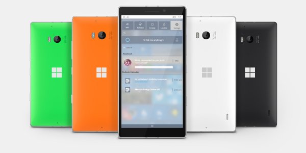
Hey everyone! Thanks for the enthusiasm :) Here is the first draft of my action center concept that I will continue to work on!

0mr3LBB.jpg
 

Zachary Boddy

Staff member
Aug 3, 2014
2,413
15
38
www.windowscentral.com
I can still see some improvements to be made though. In my opinion the Quick Actions aren't quite large enough, the search bar could use some improvements (or better yet just replace it with a brightness slider, as the search can be accessed with the press of one button at any time) and there's not a whole lot of color.
 

Cage Ata

New member
Mar 1, 2014
187
0
0
Visit site
Cheers guys! Ill revise this ideas tonight :)

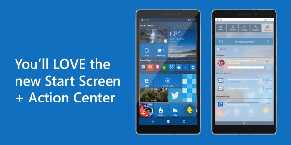
*UPDATE*

Quick mockup, changed a few small things on both images. Most noticeable would be the background downloads, and larger clear all, as well as a coloured Cortana Bar. Will make a new mockup including actionable widgets (Cortana Bar, Brightness etc)

VQcS5BM.jpg
 
Last edited:

Members online

No members online now.

Forum statistics

Threads
327,309
Messages
2,249,778
Members
428,618
Latest member
priyarajput2367