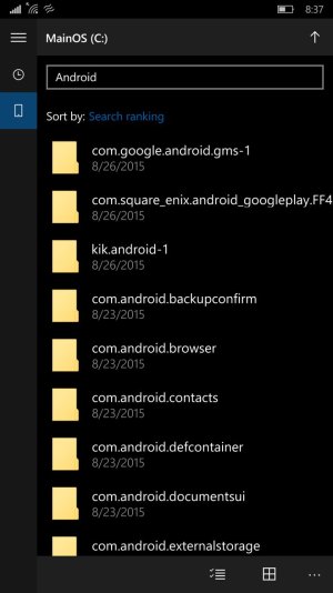
It's certainly happening, and I'm not a fan. This pop-out menu crap adds 1-2 steps to basically every function in the OS. What's more, it's ridiculous that the majority of folks are right-handed, so they put the button in the corner farthest from your hand. Given the increase in screen sizes in the last 3 years or so, I don't get that idea. They should have you select the menu button location, at the minimum, because ANY of the 3 corners not having it now would make more ergonomic sense.
I'm disappointed in the UI for apps now myself, that's what I'm getting at. On top of that, the music player's considerably worse, and the mail and calendar features are a bit bothersome to use as well. It's hard to tell what's unfinished/bugged and what's just going to either be a design change or left broken at release, because we know that we're not getting a complete OS at launch.


