Windows Phone 8 UI Concepts

Dustin Hodges

New member
Jan 22, 2013
464
0
0
Made some concept designs for what how i thought MS could improve, refine, and polish the Windows Phone UI, and wondered what you guys thought.

Due to large, page bloating size, images can be viewed on Imgur: Windows Phone Reborn - Imgur

Comments and suggestions welcome! :)


NEW: Updated concept design: #post2369379


Also made a uservoice thread asking microsoft to refine their UI (not necessarily in the way as shown in the concepts, but at least to do something {WP needs it}, while merely giving my images as a suggestion): Refine and Polish the Windows Phone UI - Feature Suggestions for Windows Phone
 
Last edited:
hmm I like the concepts:cool: except for the calendar .... don't tell imore but I think it looks like their ios7 calendar :wink:
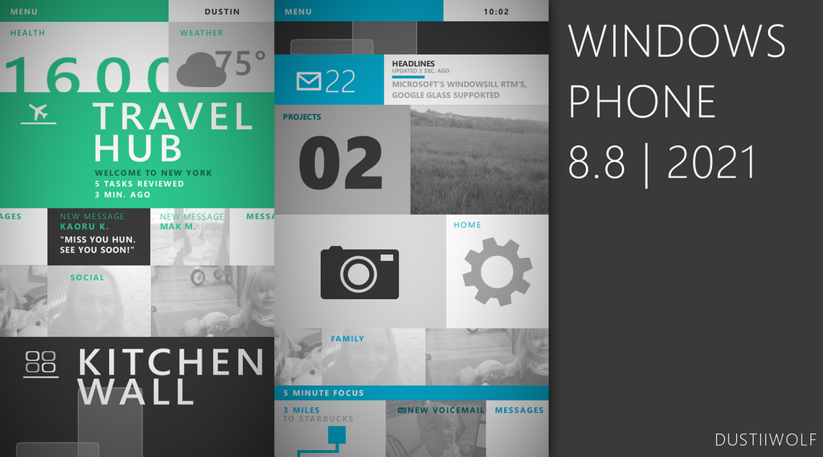
 
Interesting. Nothing too radical, I really like the home screen.

One of the features of WP I am a huge fan of that a lot of other posters do not seem to be is the calander. I love the WP calander, the way it syncs with Outlook, and all the options. The visual of yours is interesting, but I think it loses it's "business" type feel which you need to attract professionals to WP.

Otherwise, I like it. The background color to go with your accent color is a really neat idea.
I like how the calendar is now :smile:!!!!!!!!
 
I like the concepts, but they definitely shouldn't incorporate those colours that you have put. Its toooo ios7 like. And i hate iOS7. keep it simple. Keep em solid. No gradients please.
 
I like the concepts, but they definitely shouldn't incorporate those colours that you have put. Its toooo ios7 like. And i hate iOS7. keep it simple. Keep em solid. No gradients please.
I think WP needs gradients. Not much. Just a few. Look at XBOX. It has gradients. In fact, i'd go as far as to say XBOX has one of the best implementations of modernUI out of all of MS' products.

But thats just me i guess...
 
I like having backgrounds behind tiles, like a few of the hubs already have.
 
windows_phone_8_8___2021_by_saphfan32-d77ovex.png

[SUB]Posted via Deviantart[/SUB]

Based on this: Productivity Future Vision (2011) - YouTube from the Microsoft Office team
 

Members online

Forum statistics

Threads
334,072
Messages
2,257,041
Members
428,720
Latest member
pooja s