Wouldn't it be cool if...
- Thread starter WPmunkey
- Start date
You are using an out of date browser. It may not display this or other websites correctly.
You should upgrade or use an alternative browser.
You should upgrade or use an alternative browser.
Laura Knotek
Retired Moderator
montsa007
Ambassador
Just scroll down a little bit on the home screen and they'll start anywhere you want.
I really don't see a point in moving them up.
I really don't see a point in moving them up.
wut?Just scroll down a little bit on the home screen and they'll start anywhere you want.
I really don't see a point in moving them up.
montsa007
Ambassador
wut?
Sigh,
If you are on the home screen, place your finger on the screen and drag it a bit up and you'll achieve it.
rdubmu
Active member
Sigh,
If you are on the home screen, place your finger on the screen and drag it a bit up and you'll achieve it.
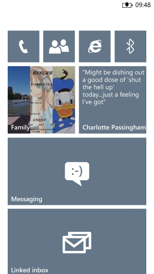
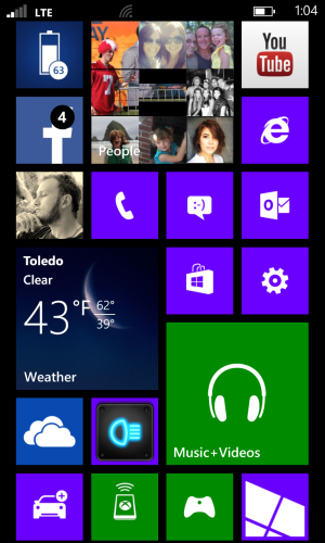
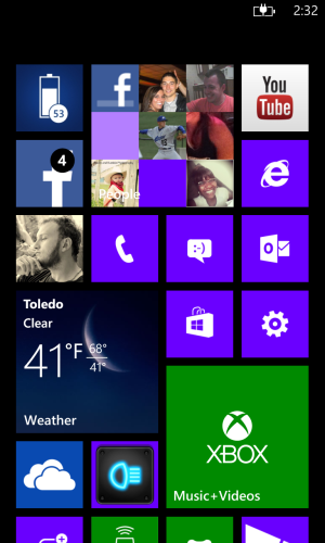
Oh I know what you said. Maybe you aren't understanding?. That's the whole point, I don't want to move it, it should be by default where it is in the first picture, not the second (which is default). How do u think I made the pictures? PhotoShop? Lol
multo
Active member
Definitely. Maybe I'm oc but at times when i put down the phone i make it a point to have them aligned just like in the first pic
sent from within the depths of my brain
sent from within the depths of my brain
martinmc78
New member
So what would happen to the notifications when they come in? Wouldn't they then block the top row of tiles?
montsa007
Ambassador
So what would happen to the notifications when they come in? Wouldn't they then block the top row of tiles?
Genius indeed.
This is what awesome posts like.
WanderingTraveler
New member
The point of that space is:
1. Push Notifications won't block tiles.
2. Considering the fact that there is little empty space with the current tile layout, it's there to give the design some space.
3. ...
But, being OC is enough to make me want an option for both.
1. Push Notifications won't block tiles.
2. Considering the fact that there is little empty space with the current tile layout, it's there to give the design some space.
3. ...
But, being OC is enough to make me want an option for both.
martinmc78
New member
Also - I don't know what phones you guys are rocking but on my 8X I can get 7 rows of tiles in perfectly as your top image and still have the gap at the top as in the second image.

Cant see how you managed to get full tiles in with them scrolled to the top. Maybe its just down to the 8X aspect ratio. but if I do that ive got like an 8th row showing 1/4 a tile


Cant see how you managed to get full tiles in with them scrolled to the top. Maybe its just down to the 8X aspect ratio. but if I do that ive got like an 8th row showing 1/4 a tile

Corepc
New member
martinmc78
New member
I can get 6 small tiles, with 1/4 of 7th showing on my 521 and still have the space at the top.
Well there you go then - everyone go out and buy the 8x and you can all be as happy with your phones as I am.
Well yes . But who cares? Are staring at your home screen waiting for notifications? The reality is the notifications block whatever is at the top no matter what app or menu you are in. All you have to do is swipe the notification to the right to get it off screen.So what would happen to the notifications when they come in? Wouldn't they then block the top row of tiles?
To me the problem is both the cut off tiles on non 720p phones and the space at the top.
Wilsen Hernandez
New member
I think that's because the 8X screen has a 16:9 aspect ratio while Lumias and other WPs have 15:9 aspect ratio screenAlso - I don't know what phones you guys are rocking but on my 8X I can get 7 rows of tiles in perfectly as your top image and still have the gap at the top as in the second image.
*image*
Cant see how you managed to get full tiles in with them scrolled to the top. Maybe its just down to the 8X aspect ratio. but if I do that ive got like an 8th row showing 1/4 a tile
*image 2*
xandros9
Active member
WP8fan
New member
The gap is good. I think this area gets filled in when you are on the phone and switch to the home screen. Keep the ideas coming.
kriz225
New member
I did wonder about that a bit when I first got my L928. From a purely aesthetic standpoint it is sometimes good to have some negative space (i.e. blank space). Even though the WP8 interface is very sleek and clean when I align my tiles the way you did in the first picture the screen looks busier, although it's really not. I'm perfectly fine with it as it is.
Verkunder
New member
Absolutely not. If the tiles were all the way to the top, notifications would block content, like others have said.
Personally, it looks like the screen is being choked. That space lets the design breathe.
Personally, it looks like the screen is being choked. That space lets the design breathe.
Similar threads
- Replies
- 1
- Views
- 107
- Replies
- 0
- Views
- 135
- Replies
- 0
- Views
- 66
- Replies
- 2
- Views
- 217
- Replies
- 0
- Views
- 200
Trending Posts
-
Did Bethesda's Todd Howard put a Fallout Vault in his hometown? 🤔
- Started by Windows Central
- Replies: 0
-
Microsoft rips passed earnings expectations with strong FY23 thanks to 'new era of AI transformation
- Started by Windows Central
- Replies: 1
-
The Fallout 4 next-gen update's one new PC feature sucks as is, but you can fix it — here's how
- Started by Windows Central
- Replies: 1
-
Xbox FY24 Q3 gaming revenue up 51% year-over-year thanks to the Activision Blizzard acquisition
- Started by Windows Central
- Replies: 0
Forum statistics

Windows Central is part of Future plc, an international media group and leading digital publisher. Visit our corporate site.
© Future Publishing Limited Quay House, The Ambury, Bath BA1 1UA. All rights reserved. England and Wales company registration number 2008885.


