What do you think of the new Xbox One update so far?

Matt Brown

New member
Jan 2, 2016
40
0
0
Visit site
So after a few weeks of testing, 1710 Xbox OS builds are now rolling to those in the Beta ring of the Xbox Insider program. A pretty nice range of features have already been added, so what are you guys thinking of the update so far? I know there was some controversy surrounding the Home menu at first, but some changes seem to have made some small, but welcome tweaks.

(Also, what are you Alpha ring guys thinking of the new Light theme so far? From what I've seen so far, it's looking really nice at the moment)
 

DOGC_Kyle

New member
Jun 19, 2013
289
0
0
Visit site
I'm really liking the new UI, although I do wish they'd simplify it by merging the home screen and Guide (there's really no need for them to be separate, you can do everything directly from the Guide now, it's basically a Start menu).

The home screen is a bit confusing still, although it's a massive improvement over the old one, which had so much wasted space. Although again, I don't really NEED the home screen anymore, I use the Guide to launch everything 90% of the time.

The new Guide is fantastic, massive improvement over the old one (which I personally think was awful, it introduced vertical tabs, when almost every OS screen, app, and game uses controller-friendly horizontal tabs).
I'd like to see the Friends and Multiplayer/Party tabs be merged (I rarely use either, and when I do it's one or the other), and a Cortana tab (move the Cortana app into the Guide, kinda like how it integrates into taskbar/Start on PC).
More audio settings would be nice too, like mic volume, speaker volume (to send up/down/mute signals to receiver).


Light theme is okay, I've always preferred dark themes though (on all my Windows devices). It certainly looks nice, a fresh change, but not for me. One thing I would like to see changed though, right now the setting affects ALL accounts. It should only affect the current account, like how accent colour does.


STill on my wish list are a redesigned Games and Apps screen. It's very inconsistent with the rest of the OS right now, being one of two remaining system menu to feature vertical tabs, and an unusual grey colour scheme.
I would love to see an alphabetical sorted list in the Guide (exactly like the Windows PC and mobile Start menus), but keeping the filters and sorting options (which should really be added back to PC/mobile), and keeping apps and games separate.

I'd also love to get Kinect navigation back, since it worked so well for me, and I used it all the time, but that's looking unlikely...

The web browser needs an updated UI too, it still has the Win8.1 IE11 look (which was awesome with Kinect, but awful with controller).
 

DJCBS

New member
Nov 19, 2012
719
0
0
Visit site
So after a few weeks of testing, 1710 Xbox OS builds are now rolling to those in the Beta ring of the Xbox Insider program. A pretty nice range of features have already been added, so what are you guys thinking of the update so far? I know there was some controversy surrounding the Home menu at first, but some changes seem to have made some small, but welcome tweaks.

(Also, what are you Alpha ring guys thinking of the new Light theme so far? From what I've seen so far, it's looking really nice at the moment)

I absolutely hate it. I've always hated the ads (be it for Gold - which I already have - or features or whatever) but they're making the entire UX unbearable.

They had already ruined the usability of the UI with that horrible side menu that forces us to click 3 times to return Home instead of just one), but now they're spamming the UI with ads. Ads next to the "recents" tiles, ads, next to the active tile, ads on the bottom of the screen, ads on the side menu. It's downright disgusting.

The experience is so horrible in fact that I went and bought myself a PS4. I had opted for the Xbox One for the first time ever because it was more media-centred than the PS4 was. But after all these updates, Microsoft managed to completely ruin the Xbox One.

If I had to pick today, I would have never left the PlayStation for an Xbox as I did. So as it is, I've back mainly using the PS4 for gaming. The Xbox is now mainly used only for 4K Blu-Ray playing. By the end of the year, when my Xbox Gold subscription expires I shall not be renewed and by 2018 I expect to have fully transitioned all my gaming back to the PlayStation where I'll patiently wait for the PS5. When Sony releases that one with a UHD player (or if they release a PS4 with a UHD player) I will likely just sell (or store away) my Xbox's and be done with the entire system for good.
 

DOGC_Kyle

New member
Jun 19, 2013
289
0
0
Visit site
Out of curiosity, what do you need the home screen for? I've found it to be obsolete so I'm wondering what others use it for.

There are two ads on the home screen but one is pretty small and they're off to the side so I'm not concerned about it (usually the big one is controller design lab, small one is a new game). I would like if they could be turned off or made smaller but it doesn't get in the way for me.
The top row items next to the most recent game are actually pretty useful now. Occasionally its a LFG post (useless to me), but besides that its always an option to join friends in games, or download progress. Looks like they removed suggested friends or made it way less common, I haven't seen it at all since the last update.
 

DJCBS

New member
Nov 19, 2012
719
0
0
Visit site
Out of curiosity, what do you need the home screen for? I've found it to be obsolete so I'm wondering what others use it for.

There are two ads on the home screen but one is pretty small and they're off to the side so I'm not concerned about it (usually the big one is controller design lab, small one is a new game). I would like if they could be turned off or made smaller but it doesn't get in the way for me.
The top row items next to the most recent game are actually pretty useful now. Occasionally its a LFG post (useless to me), but besides that its always an option to join friends in games, or download progress. Looks like they removed suggested friends or made it way less common, I haven't seen it at all since the last update.

I'll try to answer as clearly as possible.

Home Screen:
- Believe it or not, I actually like to exit apps. Not just switch between them. And I do use the pins quite a lot. That side menu, not only is it terrible to use, it has everything all over the place in an endless list of stuff, compacted to one side. Not to mention, back before they ruined the Home UI, the large tile on Home would allow me to have the active tile "minimized" but still active while checking things like controller battery or the time.
Plus it was much more organized and the pins weren't squished (even though they were hidden which is downright stupid) to one side.

Ads:
You have TWO ads next to the 4 recent tiles, disguised as tiles themselves to trick you into clicking their crap. None of them small at all 1710_Home_Screenshot-003-hero.png
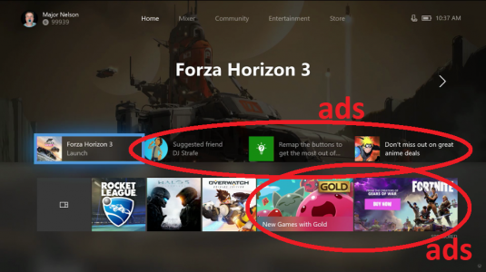
And then you have even more ads on top of them. Ads aren't only advertisements for the store, they're also advertisement for features or any pointless stuff you don't want.
I don't care about the "algorithm" to recommend me games or friends or clubs or whatever comes to mind. I don't use any of the Xbox's social crap. So I don't want to EVER see any of that. Yet, I'm forced to.

I'm sorry but I paid a lot for both Xbox's I own, plus a Gold Membership. If I have to put up with ads, then I expect to get the console and the Gold membership for free. But I will not put up with a console that takes 300€-500€ out of my pocket, then another 50€ for a Gold Membership to unlock the rest of its functionality and THEN SPAM ME with ads on top of that. Period.

Ads have one place: the store.
And friend suggestions have one place: the Hellhole that is the social tab.

I shouldn't be forced to have to put up with their of them if I don't want to. Yet I am.


The PlayStation 4 has ads. On the store. And on the "What's New" section which is NOT the main section of the console and that you have to willingly access. THAT is how you do a good UI. Microsoft has been ruining Xbox's since the first version. With each update they've made the Xbox more unbearable to use TO ME and I've had it with it.

If it works for you and you don't mind some stuff, that's fine. Great. To me, it doesn't. So I'm completely jumping out as soon as I can (I'm obviously not going to throw away money on the Gold Membership I already paid. But if they offered refunds for the remaining of the time I still have of it, you can be sure I'd be getting it).

The Xbox UI has reached a point where I hate to use it.
So I'm out to something better.
It really is just that simple ;)


(PS. Oh and don't even make me start on the replacement of every black background with grey crap. This has been infuriating in Windows as well. They are butchering a beautiful black UI for some grey crap that, on the case of my OLED TV, just makes everything even worse since the console not only doesn't respect the TV's screensaver (it forces the TV to remain running, preventing the safeguard that LG has built into their OLED TVs that, after the TV remains with the image still for a certain amount of time, it turns off the picture and puts it in screen saver mode where everything is turned off apart from a sort of firework that moves around the display. This helps preventing burn in on the OLED panel...something Microsoft apparently forgets. Users with Xbox's and OLED TVs should be aware of this as well since their console *might* put in risk the lifespan of their TVs)
 

JasonH81

New member
May 17, 2012
27
0
0
Visit site
Alpha ring. I like the update because it shows they are listening to feedback. The previous updates had this huge gray bar that took up a significant portion of the home screen. It was rightfully criticized and the problems been addressed in the following updates. The light theme is a little buggy and not fully supported in all parts of the OS.
 

JasonH81

New member
May 17, 2012
27
0
0
Visit site
I have a PS4 Pro, and i hate the UI. Everything is in an endless scroll, and it is much slower; especially when going to the store. The Xbox UI is far more customizable.

The mini guide was brought back because people hated going to the home screen everytime they hit the Xbox button on their controller. But not only is your controller battery and time on display on the home screen, so is it when the mini guide pops up.

I do agree about the gray background though. I understand it's part of the new Windows fluent design, i like the acrylic look, i just wished you could make it more transparent. Ads, i could care less about, i don't pay them any mind. The gold tile is for anything pertaining to Games with Gold which i find useful because i don't want to miss out on my free games. It's the same as the PS+ tab, except I don't have to go to another screen to access it.

Everything is far easier to access with the Xbox UI, than the PS UI. Especially since you can pin things in the guide, and/or add them to your home screen if you want more information about your app/game before you go into it.

PS UI, I'm constantly scrolling left and right, up and down to access what i want.

Xbox UI, i can simply utilize the guide with all my pinned apps and games, or just scroll down for anything I've added to home. That is by far, way more intuitive.
 

JasonH81

New member
May 17, 2012
27
0
0
Visit site
If you have the Xbox media remote, you can control the volume and mute from it. If you've programmed your receive, Kinect can also control the volume when you hit the home button and go to the settings tab, there's options for audio controls; also, some audio controls don't take affect unless you have a headset in or set it so you use the Kinect mike. You can also adjust how much the Xbox adjusts your volume by in the settings menu. I'm not home right now, but you can check the preferences options or the audio/video options in the settings menu.
 

DOGC_Kyle

New member
Jun 19, 2013
289
0
0
Visit site
Audio options don't have an option to adjust speaker volume, just headset. Talking to Cortana (my usual choice) or picking up the remote is fine, but it'd be convenient to do it straight from the controller.
Small things, but it'd be noticed.

Oh and I think the grey backgrounds are a side effect, not an intended feature. Acrylic is technically grey, so it would need further logic to set it to black. I'm guessing it'd be a (relatively) large amount of code for something so minor, so It's probly low on their priority list. Don't really know for sure, but that's my guess.
Either way, it should definitely be black, it looks nicer, has better contrast, and looks more transparent, like its floating (the whole effect that acrylic is meant to represent).
Also burn-in is only caused by still images staying on the screen, causing them to slowly be "burned into" the display. Colour won't affect that (only a totally black screen would, literally turning the pixels off on OLED). TV screensavers should work fine, and the Xbox has a built-in screensaver (dims the screen if there's no interaction and not watching video) as well as an auto-off feature.


The pic you showed has a small two-line ad with a tiny picture (this slot always shows the newest released game, two days ago it was showing Destiny 2). Directly below that is the closest thing to an ad that most people would recognize (always shows Xbox design lab for me). Would I like the option to turn it off? Yes. Do I care that I can't? Not really. They're off to the side, take up barely any screen space, don't animate or play sound, and are always either games or accessories in the store. I have no problem with a game console telling me about new games.

The other spaces are the contextual ones, which are actually excellent as of the last update, they don't show suggestions at all (nice to see they're listening to feedback, suggested friends seems to be totally gone from both home and the guide), it's just friend's gameplay and download status.
The Games with Gold tile shows me the games that I'm literally paying for.

Although I guess it doesn't really matter, I'm guessing that an alpha test of a UI update isn't the only reason you're dropping Xbox for PS. Don't mean to attack you or anything, I'm just looking at this from a UX design perspective and wondering how it could be improved.
 

Jan Lehotsky

New member
Aug 15, 2017
5
0
0
Visit site
what´s with the bugs posted on the first page, i.e.4K UHD playback issues via Movies/TV app and Bluray app unability to play 3D??? are you serious???

and where is the long-awaited genuine BITSTREAM audio option?? finally implement it to the Movies/TV app or Media Player app...I´m still unable to play back DTS-HD or any other files...
 

Members online

Forum statistics

Threads
327,396
Messages
2,249,974
Members
428,639
Latest member
oliverchan