Disable "visor blog view"
- Thread starter anon(3463402)
- Start date
You are using an out of date browser. It may not display this or other websites correctly.
You should upgrade or use an alternative browser.
You should upgrade or use an alternative browser.
Vic Ayala
New member
primortal
New member
"ugly as hell"
"site looks terrible"
"this abomination"
We are currently A/B testing blogroll designs, so only some of you see the new layout. However, we would need more information as to what exactly you do not like as we cannot use your above feedback to adjust things.
"site looks terrible"
"this abomination"
We are currently A/B testing blogroll designs, so only some of you see the new layout. However, we would need more information as to what exactly you do not like as we cannot use your above feedback to adjust things.
primortal
New member
For starters
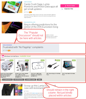
The page just doesn't flow with these interruptions; particularly with the every so often "Popular Discussion" inserts. What's the point of adding these to the main page? Discussion popularity is up for debate being popularity could be just "noise" (meaningless posts) in the discussion then actual meaningful content.
Image zooming when hovering over the article is to me a little annoying and muted color overly adds nothing. Actually makes the image uglier.
How the site was before was perfectly fine and don't see why it needed to change.
Thanks for the feedback.
"Discussion popularity is up for debate"
Not really, it is based on view counts, participation, and other metrics to surface that information.
"What's the point of adding these to the main page? "
I mean, I thought this would be obvious: to raise awareness about our forums and community building. Since comments are often highjacked by people with off-topic or unrelated issues, this is how we bring it their attention. Since inserting those yesterday, we have seen a massive increase in forum and pass through traffic.
As to the rest, we will take it under consideration but these seem more like personal opinions/against changes you do not want. We understand that, but it is not a main driver of our decision-making process, which is engagement and building the community up.
Also, for these few complaints we have also had compliments on the new layout, so we cannot just use one person's experience. We will continue our A/B testing and measuring of site behavior to gauge effectiveness of site design while taking into consideration feedback. However, we must try to weed out "I hate this, it's new" from long-term dissatisfaction.
primortal
New member
I completely understand Daniel and my comment was more reactionary because it seemed the site took a step backwards instead of forward in site design and content. Don't get me wrong I don't mind change at all and don't expect the site to revert back because a few people don't like it. But there is nothing wrong with expressing ones opinions  We do want the site to grow in popularity...
It's nice to see that the changes drove up traffic to the forms and such but there's gotta be a better way to display that information to flow better with the actual articles. When seeing "Popular Discussion" it's formatting reeked of an ad verse something site related being it stands out more than the actual articles that are written by your writers; you want more views/comments to those than form posts one would think.
Popular forum topics could reside in the right side column, floating so it's always in view. Same goes for advertising the store sales and such. Right now that's just wasted space. If you take a look at Neowin.net it sort of the same way, articles on the left posts on the right (displaying post last activity)
Last edited:
aximtreo
New member
I am getting the new page layout and I like it. Things aren't so cluttered and I am able to find items easier. Just my 2 cents.
Vic Ayala
New member
primortal
New member
I know it's just me. I came from a desktop publishing world and the way the articles, popular discussions, store injection and the other articles that have larger images with indented teaser for some reason hurts the eye (eyes are bouncing all over the place) reading through the page. There's no symmetry where as the previous incarnation of the site flowed nice.
Last edited:
I know it's just me. I came from a desktop publishing world and the way the articles, popular discussions, store injection and the other articles that have larger images with indented teaser for some reason hurts the eye (eyes are bouncing all over the place) reading through the page. There's no symmetry where as the prevision incarnation of the site flowed nice.
Criticism is good, it's why we have these sub-forums
primortal
New member
Personally site redesigns shouldn't be done to a live site as a test bed till you get the kinks out and are happy with it. Nothing sucks more than alienating visitors because your "playing" with a site.
Something like beta.windowscenteral.com would be ideal for stuff like this till your done tweaking the look and feed. Could even promote , 'Hey, check our new design and vote/comment on it'. Drive up more visits to site and forum
Something like beta.windowscenteral.com would be ideal for stuff like this till your done tweaking the look and feed. Could even promote , 'Hey, check our new design and vote/comment on it'. Drive up more visits to site and forum
TheMiseryOfMe
New member
It's looks very messy and there's a lot of horrible white space. All of the different sizes mess up the flow as well, it feels very cluttered and difficult to navigate.
MajesticPanda89
New member
I agree with primortal. It looked really awkward when I first saw it and I actually switched browsers so I wouldn't be logged in and see it. It just looks strange to see a small photo, small photo, GIANT photo that's bigger than the last 3 articles combined, etc, then have all those mixed in with forum and wincentral store banners.
For someone like me, who uses this site 99% of the time to read articles, it's not as simple as it was. It's harder to quickly scroll through articles since the pictures aren't uniform.
I have to say, once I hit a series of articles that do have a uniform display, it looks fine. I think the giant images (Literally 10'' x 5.5'' on my screen) take away from the flow and are the biggest issue with this change.
frylock
New member
I agree with primortal. The new design popped up for me and I about left the page. The flow on the site is bad now. The interjection of ads and discussions into the middle of the news is disruptive. Perhaps move it to the bottom of the page?
I understand the desire to drive people to the forums. And many/most comments on news posts devolve quickly. Why not provide links at the bottom of news stories to related forum(s) so people who wanted a real discussion could go there? That would seem to drive the traffic that you want while keeping the layout that most desire.
The old layout was a nice, clean look. It's what many popular tech sites use. Familiarity can be a good thing. While I enjoy reading this site, if the view of the site changed to this new look, I would not remain a reader. That's not meant as a threat. Just that the layout is not appealing to me, but distracting, and I'd rather not read it that way. Just my 2 cents.
Personally site redesigns shouldn't be done to a live site as a test bed till you get the kinks out and are happy with it. Nothing sucks more than alienating visitors because your "playing" with a site.
Something like beta.windowscenteral.com would be ideal for stuff like this till your done tweaking the look and feed. Could even promote , 'Hey, check our new design and vote/comment on it'. Drive up more visits to site and forum
Oh, this has been internally tested for months. We are certainly not playing with things live and there is a reason we did an A/B test. When I say some of us are not happy it is a simple personal opinion/it's new thing. It is very unlikely you will be able to sit 10 people down and all agree on site design, that was not the goal. This is why we are not driving design on pure opinion, but rather data and metrics (how people are using the site).
Tweaking will always happen, even on a live site. No different than when a developer releases a "1.0" app only to release "1.01", "1.02", "1.03" over the next week as more bugs are caught due to the larger audience.
primortal
New member
Internally testing is still a limited audience whereas publically you can get a better temperature of how users feel; poll and comments. Plus again better marketing (twitter) and making users feel included in the say of the design and drive up visits.
Of course there will always be minor tweaking but personally the look and feel looks like it's a 0.1 release compared to the pervious version. Sorry....
I'm running at 1680X1050 and the article with the large image take up the space of at least two smaller articles. The screendshot is of FireFox maximized.
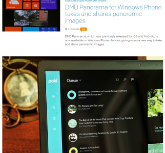
You can't honestly tell me you like the chaotic listing of articles (small and large image ones) with weird indents, advertising posts that seem more dominate that the articles, wasted white space on the right...
If you look at neowin.net and your favorite WMPoweruser.com the layout is so much better and flows so nicely in comparison. Just like the previous incarnation of Windows Central.
Of course there will always be minor tweaking but personally the look and feel looks like it's a 0.1 release compared to the pervious version. Sorry....
I'm running at 1680X1050 and the article with the large image take up the space of at least two smaller articles. The screendshot is of FireFox maximized.

You can't honestly tell me you like the chaotic listing of articles (small and large image ones) with weird indents, advertising posts that seem more dominate that the articles, wasted white space on the right...
If you look at neowin.net and your favorite WMPoweruser.com the layout is so much better and flows so nicely in comparison. Just like the previous incarnation of Windows Central.
Last edited:
danwc
New member
It is really hard to distinguish site content from ads on the new layout. It is a confusing mess. The first article is almost entirely lost sandwiched between ads on the left, right, and top -- and the photo for the article below. In part it could be a white space issue. There might be some ways some more attention to design could differentiate. But as it is, the site become laborious to try and wade through.
wuiyang
New member
The website became faster now, and more elegant, and similar to current post design. The only bad thing is scaling problem, large screen will get large picture.
I suggest that Windows Central Store put on the top of all post, or keep it at the right side, or a button which will expand and show the store. For forum post, it would be better to put it on the right side, about 35%, and has its own scroll holder (so scrolling the post will not move the forum post, and can display lots of post while viewing post)
I suggest that Windows Central Store put on the top of all post, or keep it at the right side, or a button which will expand and show the store. For forum post, it would be better to put it on the right side, about 35%, and has its own scroll holder (so scrolling the post will not move the forum post, and can display lots of post while viewing post)
TheArcaneFlame
New member
I have to agree with the complaints about the new site layout. It's really bothering me as it feels like everything is haphazardly thrown together. It's hard to distinguish the content I/we want to see from the ads and inserted forum posts. It makes the site much harder to navigate and quickly scan through the new articles. I am viewing it currently on a 1920x1080 monitor and I can see 1 news article (in blue) on the main page yet there are 4 ads for LG (in red). I don't count the areas in grey as "active content" in terms of browsing because I look for the latest articles in the content area of the main page since that is the all inclusive lists of all articles. As it is now, ads and other clutter get more attention than the actual content (articles) of the site.
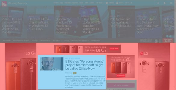
Things don't get any better as you scroll down the page either...
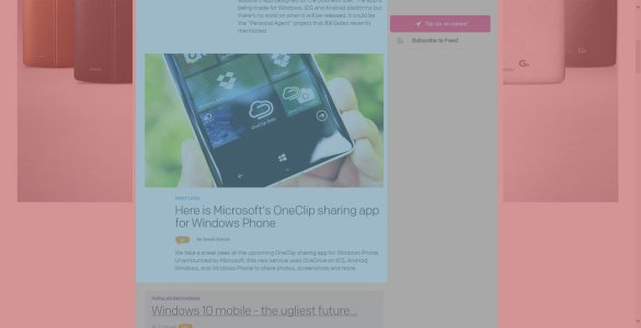
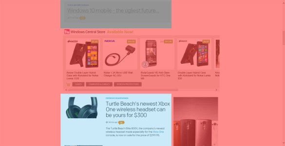
Please consider trying something different.

Things don't get any better as you scroll down the page either...


Please consider trying something different.
Last edited:
Similar threads
- Replies
- 0
- Views
- 404
- Replies
- 1
- Views
- 445
- Replies
- 0
- Views
- 404
- Replies
- 0
- Views
- 125
Trending Posts
-
Microsoft might not realize its iPhone moment with AI if regulators continue to reign down on its parade
- Started by Windows Central
- Replies: 0
-
Escape From Tarkov has alienated its entire community over broken promises and new pay-to-win mechanics
- Started by Windows Central
- Replies: 0
-
Microsoft rips passed earnings expectations with strong FY23 thanks to 'new era of AI transformation
- Started by Windows Central
- Replies: 2
-
Post pictures of your latest purchase
- Started by Laura Knotek
- Replies: 3K
Forum statistics

Windows Central is part of Future plc, an international media group and leading digital publisher. Visit our corporate site.
© Future Publishing Limited Quay House, The Ambury, Bath BA1 1UA. All rights reserved. England and Wales company registration number 2008885.

