Disable "visor blog view"

eekaspider

New member
Oct 30, 2012
66
0
0
Visit site
I too think that the new design is a step backward.

Text flow has been seriously compromised by the random mixture of full width pictures with under-captions, 1/3-width pictures with side captions, ads, and the "popular discussion" callouts.

I would switch all of the pictures to 1/3-width with side captions, and see how that looks. That might reduce the chaos sufficiently.
 

TheBanjomatic

New member
Mar 20, 2015
2
0
0
Visit site
Honestly, I only come to this site (and quite frequently) to keep up to date on Microsoft and Windows related news, the most important thing to me is to be able to quickly scan the site to see if there are any new articles, read the headlines and maybe read the article if it interests me. The new site layout has been a huge turnoff for me.

With the new site layout, I can only see one and a half headlines (if the first article doesn't have a huge image). If I then hit page down, I can see the rest of the second headline and then one more.... its a very poor use of space for gleaming information. Ignoring the wasted space, its visually very confusing. The intermixing of different types of content makes it again harder to read, and process. Things such as the giant banner ad for the "Windows Central Store" placed between articles, links to forum posts, etc. They all detract from the actual content of the site. I'm sure these internal ads do drive engagement, but they shouldn't do so at the expense of users who are there to periodically check in on news.

Aside from that, many of the headline images are much too large, I'd really prefer a 200px width max (if that). The most important part of a headline is the actual headline text, the image is just fluff really, it certainly doesn't need to be that large.

Once you actually click into an article, literally all I see is an article and a giant stock image of a windows start screen, etc. (for example here: /new-windows-10-insider-preview-pc-10122-bug-update-should-fix-amd-gpu-issues). I need to then scroll down to see any text from the article at all.... what ever happened to that design philosophy where your content should be up front and where scrolling is 'considered evil'.

As for the mobile site... I haven't tried the new site layout on mobile, but I HATE HATE HATE that scrolling ad that forces you to keep swiping while it scrolls by in slow motion.

I have preferred windowscentral for a long time now because your articles usually cite sources (unlike neowin a lot of times), and until now had a simple site layout, but I'll admit, the best site design you had was before that giant bar was added to the top of the screen, and the current design you are testing is my least favorite yet. I will likely take my browsing elsewhere if reading the content is no longer comfortable.
 
Last edited:

ttsoldier

Retired Ambassador
Dec 4, 2012
4,351
0
0
Visit site
Agreed. Makes it very difficult to find what you are looking at. it's not streamlined. Everything is just jumping out at you from all angles.

What do I read?

Where do I click?

Where is the news?

Is this an article? It is an ad?

And the animated pictures on the articles too. They are not adding any benefit either.

I have to agree with the complaints about the new site layout. It's really bothering me as it feels like everything is haphazardly thrown together. It's hard to distinguish the content I/we want to see from the ads and inserted forum posts. It makes the site much harder to navigate and quickly scan through the new articles. I am viewing it currently on a 1920x1080 monitor and I can see 1 news article (in blue) on the main page yet there are 4 ads for LG (in red). I don't count the areas in grey as "active content" in terms of browsing because I look for the latest articles in the content area of the main page since that is the all inclusive lists of all articles. As it is now, ads and other clutter get more attention than the actual content (articles) of the site.

View attachment 105088

Things don't get any better as you scroll down the page either...

View attachment 105089

View attachment 105090

Please consider trying something different.
 

Makubex1980

New member
Apr 15, 2014
35
0
0
Visit site
there was nothing wrong with the old website, now it's one big mess and it's NOT a pleasure to view it anymore. So only here at WC for the forums and my articles i get from WMPU for the meantime.
 

ianeruk

New member
Jan 23, 2013
4
0
0
Visit site
Yep agree with the comments above, the site redesign isn't consistent and make navigation a chore to work out what you are reading. The different layouts of the news stories into Big Picture with tagline below, then medium Picture with tagline at side just confuses everything.

Reading on an 8" tablet is virtually impossible, so I'll end up just using the RSS feed in Flipboard or going to WMPU also. Love WindowsCentral but not the new look......sorry.
 

KevinM1

New member
Oct 14, 2013
27
0
0
Visit site
+1 in the do not like category. Popular discussions and ads simply look out of place. It reads like:

Blog post
Blog post
Link to a discussion that has absolutely nothing to do with the posts above
Blog post
Ad, likely for things not related to what was mentioned above
Blog post
Blog post

Moreover, the post listings themselves aren't uniform. Compare those posts that have small pictures to those with large, feature story pictures. The entire content section of the main layout has this repeated hourglass shape that isn't suited to reading. My eyes simply can't anticipate what's coming next.

I also dislike infinite scroll. Pages make it easier for me to tell when I've caught up to the news I read the previous day.

A/B testing is fine and good, but it's not a holy grail: https://iterativepath.wordpress.com/2010/06/26/8-flaws-in-ab-split-testing/
 

michail71

New member
Nov 29, 2012
1,822
0
0
Visit site
Well, the new redesign actually works much faster in IE and Spartan. The old design was so clunky I don't care how it looks. I'd say the old look was better, but the performance gains are worth 1,000,000,000x any aesthetics. Now IE and Chrome can render and scroll in the same amount of time. My guess is chrome users are the ones that don't like the redesign.

I also like the popular forum threads interspersed. It makes it feel like more of a community where members can make posts that hit the home page. Not sure why some hate it so much. But it does drive in extra responses which cause the mods to then close the threads.

Paging is sooo old fashioned! To infinity and beyond! I make all my apps these days use virtual and infinite scrolling. Any way to avoid an extra click is a good thing. If you really want the old fashioned paging experience make the user select the page number from a combo box then hit "go" (as if the combo box doesn't support auto postback).
 
Last edited:

KevinM1

New member
Oct 14, 2013
27
0
0
Visit site
Performance gains can be had without making a horrible design. The problem is unoptimized assets and poor JavaScript.

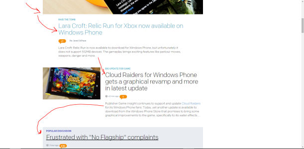
And here's a screenshot that illustrates my point:

wc.PNG

The arrows represent eye movement. Notice how nothing is actually aligned well. Other sites (Ars Technica, Engadget to name a couple) do something similar to what WC is trying to imitate, but they do it better because things are uniform and predictable. These eye jump issues are things that any novice desginer should notice. Sites are designed in either an F or Z pattern. WC is currently a sine wave with its unaligned feature story images, headline text, and featured story text. It's objectively poor design.

Like I said above, A/B testing isn't a holy grail. Windows 8 relied on user data for its UI decisions. Windows 10 is largely reverting back to the classic Windows start button for a reason. Data doesn't always tell the entire story.
 

Daniel Rubino

Editor-in-chief
Staff member
Jan 19, 2006
1,031
14
38
Visit site
The problem is unoptimized assets and poor JavaScript.

Actually, in this case, it is the ads, which we do not have direct control over. The website itself is actually very well optimized, and even better with the redesign. Trust me, I complain about them all the time. But we have to pay the bills too. Still, there is room here for improvement on our end.

things are uniform and predictable. These eye jump issues are things that any novice desginer should notice.

Oh we know. It was done on purpose, not on accident. Not something we missed and it has nothing to do with being novice. Saying things like "objectively poor" does not actually make it objectively poor. You need a little more meat on that argument and saying what the majority of other sites are doing is not that kind of evidence.

"Uniform and predictable" also has a downside, including causing the reader to be lazy, skimming over content and missing things.

Regardless, as of right now the current design will be staying. Besides this forum with its handful of complaints, most people either are enjoying it or have not said anything. Put it another way, we had much, much, much more pushback when we changed the color scheme last year than this redesign.

In fact, we are not getting any pushback whatsoever. This thread represents the grand total of the complaints we have received either by Twitter, email, p.c. or comments. At just two pages deep, it does not signal a rebellion out of the nearly 4 million uniques we do a month.

Put it another way, if our data collected shows higher time on site, more engagement, higher forum participation and I am barely hearing a peep in terms of complaints, yeah, then it is a winner. Driving our website by personal opinion is something we are trying to avoid.

From Alexa's latest numbers (plus i have some internal ones):

alexa-up.PNG

The whole "horrible design" thing means very little without numbers. If there is one thing I have learned in the 8 years on this site, it is that none of you agree on design, what makes a good ad, what Windows Phone should look like, or if a flagship phone is good looking. Aesthetic opinions are a complete mess. Just look at this morning with everyone freaking out over circle icons in Xbox Music.

alexa-may.PNG

I want to be very clear on this: If we saw our analytics crashing, people not staying on the site, people not clicking through articles, not heading to the forums, etc. in comparison to old design, we would not keep it. It was so successful though after 24-hours and a 50% rollout, we flipped the switch for everyone.

Site design is very important to us and will continue to monitor and tweak things going forward. But so far, we are happy with the results and as far as we can tell, most of our readers are too.
 
Last edited:

stokes1510

New member
Jul 13, 2014
108
0
0
Visit site
Cant argue there but tbh honest I do actually like the site and have a mental block on the advertising where its a simple case I just don't see them anymore
 

eekaspider

New member
Oct 30, 2012
66
0
0
Visit site
In fact, we are not getting any pushback whatsoever. This thread represents the grand total of the complaints we have received either by Twitter, email, p.c. or comments. At just two pages deep, it does not signal a rebellion out of the nearly 4 million uniques we do a month.
Where have you solicited feedback? I'm surprised that more than handful of people discovered the "visor blog view" thread and identified it as an interface critique opportunity.
 

primortal

New member
Dec 5, 2011
212
0
0
Visit site
In fact, we are not getting any pushback whatsoever. This thread represents the grand total of the complaints we have received either by Twitter, email, p.c. or comments. At just two pages deep, it does not signal a rebellion out of the nearly 4 million uniques we do a month.

Put it another way, if our data collected shows higher time on site, more engagement, higher forum participation and I am barely hearing a peep in terms of complaints, yeah, then it is a winner. Driving our website by personal opinion is something we are trying to avoid.

The whole "horrible design" thing means very little without numbers. If there is one thing I have learned in the 8 years on this site, it is that none of you agree on design, what makes a good ad, what Windows Phone should look like, or if a flagship phone is good looking. Aesthetic opinions are a complete mess. Just look at this morning with everyone freaking out over circle icons in Xbox Music.

View attachment 105332

I want to be very clear on this: If we saw our analytics crashing, people not staying on the site, people not clicking through articles, not heading to the forums, etc. in comparison to old design, we would not keep it. It was so successful though after 24-hours and a 50% rollout, we flipped the switch for everyone.

Site design is very important to us and will continue to monitor and tweak things going forward. But so far, we are happy with the results and as far as we can tell, most of our readers are too.

Daniel If you are so confident in the new design then why not a article on the front page announcing the new design and put a poll asking if the users like it or not?
 

michail71

New member
Nov 29, 2012
1,822
0
0
Visit site
I think the ad issues were what was probably driving visitors away on the previous design. Right now I'm still finding an occasional clunky load but most of the time it's good.

I wish there was a way to police ads for being resource hogs, going full screen, misleading, tacky, etc. Those tactics just make people ignore them altogether. That would probably be up to google to fix.
 

BryceMD

New member
Jun 23, 2014
166
0
0
Visit site
In fact, we are not getting any pushback whatsoever. This thread represents the grand total of the complaints we have received either by Twitter, email, p.c. or comments. At just two pages deep, it does not signal a rebellion out of the nearly 4 million uniques we do a month.

Personally I was searching for a forum thread or post on the main page explaining the changes. Was waiting for one, but it never came. I didn't know what 'visor blog view' was to comment on my distaste for the new layout.

It's difficult to read and with all the unrelated items like forum posts and the store peppered in it just feels like there's less of what I actually come here for, the articles.

To me, personally, it looks like a website from the 90's where they just throw things at you in hopes of getting clicks. Not like a credible news source.

It's very unlikely to stop me from coming back, but it is a less enjoyable experience.
 

Daniel Rubino

Editor-in-chief
Staff member
Jan 19, 2006
1,031
14
38
Visit site
Daniel If you are so confident in the new design then why not a article on the front page announcing the new design and put a poll asking if the users like it or not?

Funny thing, I did have a full draft announcing the change but determined (1) it would disrupt the A/B testing during the initial rollout and (2) It was not really necessary.

It has nothing to do with confidence, we have the numbers. Same goes with a survey. I see no value in a front-page poll on design as that is exactly the thing we are trying to get away from "designed by a committee". Furthermore, I see no need for one as we are just not getting any significant negative feedback. The transition has been so smooth you would have thought we didn't change anything.
 

Daniel Rubino

Editor-in-chief
Staff member
Jan 19, 2006
1,031
14
38
Visit site
Where have you solicited feedback? I'm surprised that more than handful of people discovered the "visor blog view" thread and identified it as an interface critique opportunity.

Oh this is easy. When people hate change, they will (1) Say it in comments, even when off-topic (2) Ping me on Twitter directly to tell me.

This is exactly what has happened in the past like when we changed the color scheme, or the slow site loads before the update (especially on the latter, where I would get numerous complaints weekly to pass on to our dev team).

We also have very active forums. True, you could argue that someone may not "discover" this very thread, but that is irrelevant. When someone really is pissed about an issue or want to vent, they're going to create another thread/topic to address it. So if people in our forums were truly upset, we would have multiple threads on the topic that we would then move/merge.

We are just not seeing that happen.
 

michail71

New member
Nov 29, 2012
1,822
0
0
Visit site
Well, I'm one of the vocal ones hating on the round profile pictures but I actually like the redesign on here. I don't mind hamburgers too much either but I'm a two hands user.

I've accepted that round profile pictures are here to stay until some brave designer sets the community back to square in 5-10 years.
 

primortal

New member
Dec 5, 2011
212
0
0
Visit site
It will be interesting to see how the numbers shake out in the coming weeks. A surge in numbers on a site redesign normally means users are kicking the tires to see what else has changed.

I find it interesting that the numbers increased without any type of announcements. Are those numbers based on new unique victors or the usual suspects just clicking around more?

It has nothing to do with confidence, we have the numbers. Same goes with a survey. I see no value in a front-page poll on design as that is exactly the thing we are trying to get away from "designed by a committee". Furthermore, I see no need for one as we are just not getting any significant negative feedback. The transition has been so smooth you would have thought we didn't change anything.
Seeing no value in a front-page poll sounds like you don't want to see the actual results :D Also it's not a "designed by a committee" it's getting valuable feedback from visitors on how to make the site better which would drive up viewer count and ad revenue even more. You might not get any significant negative feedback if you don't provide an easy avenue for feedback or provoke the conversation; front page article. Not everyone scrolls to the bottom of the forum to find this area to submit a comment.

As for me I'll be sticking to RSS and the Windows Phone app to get my content being the current design IMHO is done by someone that doesn't know how to layout data properly and needs to go back to design school.
 

michail71

New member
Nov 29, 2012
1,822
0
0
Visit site
Same goes with a survey. I see no value in a front-page poll on design as that is exactly the thing we are trying to get away from "designed by a committee".

I've seen way too many projects go down hill after committees getting ahold of them. Usually it's the internal executive committees that muck things up instead of trusting in the designers. Every giant home page header I've ever seen was the result of executive committees and made the designer ashamed of their own work.
 

Members online

Forum statistics

Threads
323,444
Messages
2,243,807
Members
428,074
Latest member
abigial