2 Colums vs 3 Colums: What do you prefer?
- Thread starter abel920
- Start date
You are using an out of date browser. It may not display this or other websites correctly.
You should upgrade or use an alternative browser.
You should upgrade or use an alternative browser.
CharlieBoy1894
New member
- Feb 18, 2014
- 92
- 0
- 0
AV2RY
New member
- Sep 14, 2013
- 1,284
- 0
- 0
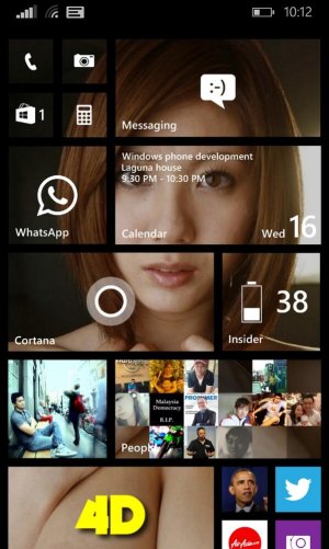
Checked 3 columns. Tiles were very small and went back to normal..the normal (2) seemed way too big.now went back to 3. The most frequently using apps I made middle size, 3big, the rest is small. I wish whatsapps pinned contact could also be big sized, its bit smaller than I had on 2 columns (format/look)
prateekj1993
New member
- May 29, 2013
- 103
- 0
- 0
KrisJoeEll
New member
- Aug 11, 2013
- 570
- 0
- 0
Kram Sacul
New member
- Mar 4, 2013
- 750
- 0
- 0
randomscandinavian
New member
- Dec 1, 2012
- 186
- 0
- 0
When I first saw screenshots of three columns I thought it looked horrible. To the point of not wanting a newer Windows Phone. Then it arrived for my Lumia 920 as well and I discovered that it looks a lot better in real life. And it is a lot more practical.
As for a new phone I no longer need to buy one. It came in the form of a download.
As for a new phone I no longer need to buy one. It came in the form of a download.
imbasaurus
New member
- Sep 14, 2013
- 75
- 0
- 0
At first i thought 3 columns was ugly on my 920 as the fonts was small, but then after some time with it, i became used to it and end up loving i
Davingtons
New member
- Sep 9, 2013
- 75
- 0
- 0
Definitely 3 columns on my 920. I thought the text on 3 columns would be far too small, but its actually very readable.
Going back to 2 columns looks huge!
Going back to 2 columns looks huge!
CharlieBoy1894
New member
- Feb 18, 2014
- 92
- 0
- 0
Hey the fb app is from microsoft. But there's an app called Transparency Tiles which makes the xbox, here and some social apps like fb and twitter transparent. Look it up on the store 
Which facebook app do you use mike13ftw?
I use the stock one and made it transparent with system tiles
rculver9056
New member
- Oct 26, 2013
- 73
- 0
- 0
3 here too. Mainly medium with a couple of doubles and a few small.
Makes the screen look prettier, I think lol. Mostly transparent as well. Loving this new stuff!
Makes the screen look prettier, I think lol. Mostly transparent as well. Loving this new stuff!
Ahmad Aleid
New member
- Apr 16, 2014
- 7
- 0
- 0
based on your phone really, if you are going large as I did (Lumia 1520) then 3 column is the best thing for it
Similar threads
- Replies
- 0
- Views
- 3K
- Replies
- 2
- Views
- 42K
- Replies
- 7
- Views
- 15K
- Replies
- 0
- Views
- 32K
Trending Posts
-
-
Windows 10 Themes no longer working...
- Started by DocCovington
- Replies: 6
Forum statistics

Space.com is part of Future plc, an international media group and leading digital publisher. Visit our corporate site.
© Future Publishing Limited Quay House, The Ambury, Bath BA1 1UA. All rights reserved. England and Wales company registration number 2008885.


