A Newer Design: Apps List + Notification Center Concept, Take Two

KorJax

New member
Feb 17, 2013
59
0
0
Visit site
AFAIK Aren't the live tiles supposed to be the notficiation center?

I.E. you get a notification. This shows up now as a number on your live tiles, next to whichever app/tile the notification was for. If you use large tiles then you get more detailed information.

It hasn't been a big issue for me to simply "hit the home screen" once I get several notifications in and then check my live tiles to see exactly what I got. It's the same purpose as this notification center idea, except all it does is require me to go to my home page. Thats why there is no notification hub built in - it's all integrated into the live tiles. If you don't want to see "notficiations" of a specific app then you simply don't have it pinned to your start screen or you have it on the bottom where you can't see it without scrolling.
 

Flagz

New member
Jan 26, 2012
852
0
0
Visit site
The Live tiles only work if app is pinned to home screen. Only live tiles I keep is Weave, Family Group, Coworker Group, People, my Faince, Emails and WP Central. I want a notification center for all my other apps.
 

arsenur

New member
Feb 10, 2013
3
0
0
Visit site
Having notification is great, it helps a lot to see all what's happening in a glance. Verdict: I like
Grouping the apps with categories, or even better in folders would be much appreciated specially by those who like to be very organised. Verdict: I like.
Having an X to terminate an app, it's another great option to add.
 

olivercorb

New member
Mar 26, 2012
32
0
0
Visit site
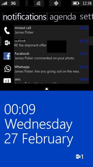
Hi there, just thought i'd contribute to the notification center effort with my own idea:
notification center windows phone.jpg

It's simple, it has Metro elements, and i just thought it looked quite good! To access, swipe down from the top (i know i KNOW it's copying the other platforms, but 1. iOS and Android both copied the dropdown menus from webOS, so it is only fair for us too... 2. We already use a swipe gesture to access Status Bar so it's not radically different!)

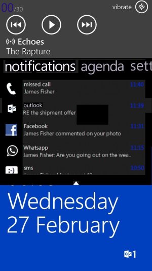
notification center Media windows phone.jpg

And this is the same notification centre but with media controls. Like i said, simple, adheres to metro, and doesn't alter the current setup all that much. Any ideas or suggestions would be great, lets all hope we get the promised notification center in Apollo Plus!
 

AgentTheGreat

Member
Aug 3, 2012
193
0
16
Visit site
Again I think you're not following Windows Phone 8 Live Tile idea. This is what I like at this OS that is no bundled up with all the info from 100 apps in one place. It's more refreshing to see each app separated with its own info. I don't like when people lean towards android..the drop down bar or the side menu notification center..I just don't like it. This is why I bought WP8 and I hope MS doesn't get tricked by the people that want smth that is already there.

I don't like Android's idea either. That's why I didn't go for a drop down menu. I thought we can have the functionality, with WP's form.
 

AgentTheGreat

Member
Aug 3, 2012
193
0
16
Visit site
Hi there, just thought i'd contribute to the notification center effort with my own idea:
View attachment 29547

It's simple, it has Metro elements, and i just thought it looked quite good! To access, swipe down from the top (i know i KNOW it's copying the other platforms, but 1. iOS and Android both copied the dropdown menus from webOS, so it is only fair for us too... 2. We already use a swipe gesture to access Status Bar so it's not radically different!)

View attachment 29548

And this is the same notification centre but with media controls. Like i said, simple, adheres to metro, and doesn't alter the current setup all that much. Any ideas or suggestions would be great, lets all hope we get the promised notification center in Apollo Plus!

I kinda feel like it's too...busy. I haven't seen lists on WP that show so much information, with so many elements present on the screen, with such small font. Microsoft is focusing on typography and its beauty, so the text needs to have some "personality" for itself, and pretend like it's not just there to give you information. It is also there to make your phone look good. So I think some more white space is needed in your design. :)
 

Members online

Forum statistics

Threads
326,586
Messages
2,248,596
Members
428,515
Latest member
vl909