I saw your concept yesterday but there are some points that I dislike:
1. Big back/forward buttons
The reason i choose big back button is for touch users, if you put small tiny button, it will be hard for people to touch, and they are taken from IE, I made the design so that the button should be reasonable and big enough for both desktop and tablets, i kept the design minimal, while consuming less space so it can display more content and also be a touch friendly UI.
2. Lack of the current honeycomb address field
yes, i thought about it too, and i had some newer ideas to improve it, but right now, l don't have time to do that.
4. I don't like the three standing icons in the right for quite some reasons:
i don't like either, i made changes two or three times and i had some better plans for it, but then windows 10 TP was released and i don't feel like doing it :|
4a. They are giant, notifications icon in tray is better, it only should be easier to spot if there are unread notifications
yes, i did tha, in my very first design, but things change(remember it is still in Beta

).
4c. The number bubbles are horrible, why a red-orange bubble? Why not the same green as the user's default colour? Why black text if everything else goes to white?
i have not paid much attention to it, i had plans, but never come to reality.... i guess.
Things that I find stronger in this concept over yours:
1. The use of bolder and bigger fonts to separate groups is stronger than yours with a different background colour
i agree, but i hate the fact that there is no icons!! with icons it would be cool.
2. The player is nicer than yours, I never liked the Zune look
i completely disagree! Zune still holds the better design and function. and btw, in my concept i showed only the music player! which has the looks of zune and also the functionality and design decision of Musicbee. btw I never made my video player design to public.
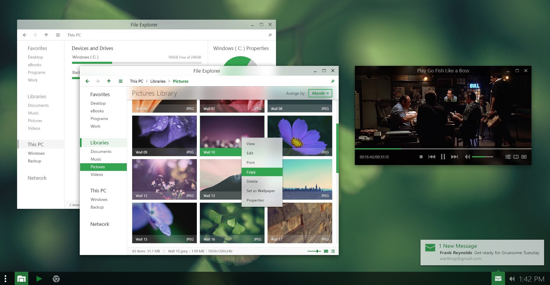
3. The way it presents the images and their names and types is just sweet
yup, it is really nice! i love it.

 Twitter