I don't really understand what you're talking about in terms of UI aesthetics between the two. I've got my 920 with 8.1 and my 640 with W10 mobile up. I'm looking at the stuff you mentioned and I don't get it.
Notification center is basically the same but with more options. The fonts are a little different, but they're consistent throughout all the native W10 apps.
Pivots vs Hamburgers - Sorry, pivots don't really work.
Icons - A lot of people like the wireframe icons. A lot of people don't even notice the difference.
Settings - New settings is 1000x better than the the old settings. I can actually find stuff now.
Not really sure what you're talking about with random grey bars?
Some of my points are applicable to both Windows 10 and Windows 10 Mobile...
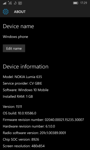
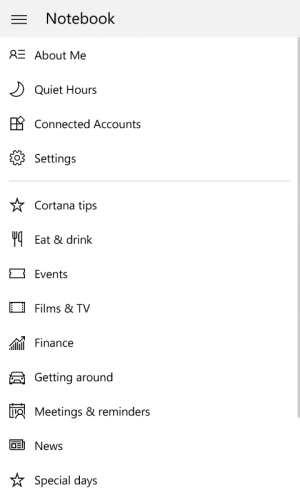
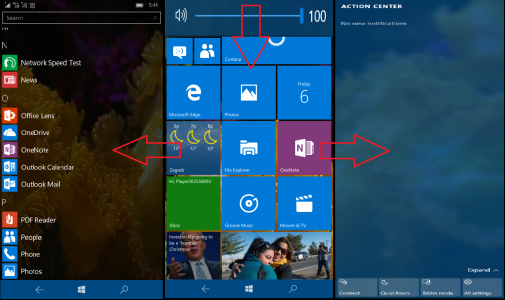
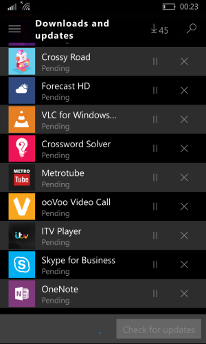
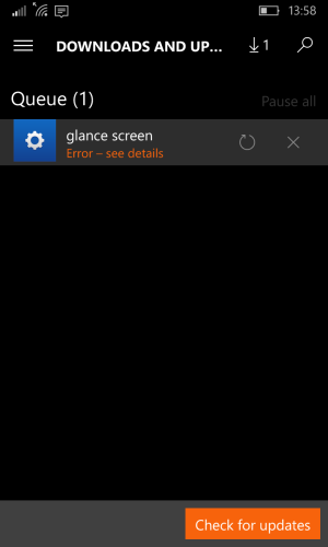
Perhaps the attached screenshots from build 10586 would help explain my points ..
- As far as the notification center goes, I only mentioned the toggles - they take up way too much real estate and look a little too big when compared to the other links and icons in there.
- I don't favour pivots over hamburgers - don't think I mentioned that but I'd like to clear that up as well, in case I implied it.
I do support a middle ground though , similar to the current 8.1 OneDrive app, that makes good use of both implementations - with the hamburger hiding away the least used settings.
- Icons : A case of personal preference I guess , my point is that they currently lack the sophistication of a finished or final OS ( which I hope is the case for W10M)
- Settings : Totally agree with you on the usability being vastly superior than 8.1.
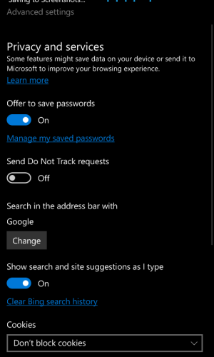
My point, is regarding the visuals ( E.g the attached screenshot 1 ) . Text is being presented in white , grey and blue hyperlinks , with grey buttons and blue toggles.. it's better than it WAS, but I think they can do a better job of making it more coherent.
Grey bars - To be fair , the grey bars seem to have turned into grey bands on top for both black and white themes now - which is an improvement ( Attached screenshots 2/3/4) .. I'm not on the insider build , so I can't pull up specific examples..
I'm pretty sure earlier builds had these bars in messaging and photos.. that's probably where my observations came from.
