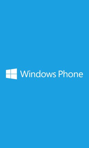
Boot Logo for WP. 8.1 (they should change)
- Thread starter Zapella Tiago
- Start date
You are using an out of date browser. It may not display this or other websites correctly.
You should upgrade or use an alternative browser.
You should upgrade or use an alternative browser.
It would be cool if the window rotated like the live tiles showing some significance to windows. It would have symbols for example. Maybe a phone, office, people, explorer. Something's that represent the OS as a whole, so people get a quick comprehension of its a capabilities. What do you guys think?
Laura Knotek
Retired Moderator
- Mar 31, 2012
- 29,451
- 63
- 48
I like the current blue boot screen. The phone (ATIV S) boots so quickly, that it doesn't even matter anyway.
I agree.
ShreyansShah
New member
- Aug 12, 2013
- 1,105
- 0
- 0
they are heading towards it. that's why they call it Windows Blue.
but in my opinion, i like old logo of 4 colors of MSN (butterfly).
i really love it.
but in my opinion, i like old logo of 4 colors of MSN (butterfly).
i really love it.
How often you see bootlogo ? I saw it about 1 month ago when i buy my L920, and after that it runs 24/7/365 ... So Bootlogo is that last thing I need change.
The guy just wanted something new. Hes obviously a detailed oriented person.
- Dec 5, 2013
- 315
- 0
- 0
The guy just wanted something new. Hes obviously a detailed oriented person.
Yeap. Maybe WP9 =(
anon(5969054)
New member
- May 7, 2013
- 685
- 0
- 0
The guy just wanted something new. Hes obviously a detailed oriented person.
You are such a kind and understanding person.
HerronScott
New member
- Sep 29, 2011
- 143
- 0
- 0
I don't see anything wrong with this
View attachment 59336
Windows Phone 7.8 changed to the blue bootscreen too.
Scott
AngryNil
New member
- Mar 3, 2012
- 1,383
- 0
- 0
The current logo follows the metro guidelines to the point - it's simple and clean.
Can we please stop with the "this is Metro" crap? Whenever any change is suggested, there's always someone who says the current way is perfect and adheres to arbitrary guidelines. There isn't even any understanding of the guidelines anymore, it's just buzzwords. No, Metro doesn't mean bootscreens must be static images with bright backgrounds. The old bootscreen was less blinding with a black background, while it was more pleasant with its use of standard transition animations.
Oh, and to the people saying WP8 boots fast so it doesn't matter ? Mango booted faster.
AngryNil
New member
- Mar 3, 2012
- 1,383
- 0
- 0
I just posted what I think, that the change isn't necessary IMO.
Rather pointless. What is truly necessary in the luxury items that are smartphones? This is not about necessity, it's about improvement.
Didn't mean to direct my statement solely at you, but rather the collective knee-jerk reactions from many members whenever a change is proposed. Windows Phone isn't perfect, and sometimes it's the little things that count.
Adriaan NL
New member
- Mar 10, 2014
- 138
- 0
- 0
I don't see much problem of the boot screen either, though when you turn your phone on in a dark room, the screen turns VERY bright for a few seconds...
ShreyansShah
New member
- Aug 12, 2013
- 1,105
- 0
- 0
that is bcoz at the time of boot up, screen goes to high brightness and generally we have kept our phone brightness to low or auto mode.I don't see much problem of the boot screen either, though when you turn your phone on in a dark room, the screen turns VERY bright for a few seconds...
thus screen goes very bright for a few moments.
eruptflail
New member
- Aug 12, 2012
- 326
- 0
- 0
I think they need to get rid of OEM and Carrier boot screens. I don't know why they're there. I already have "Nokia" stamped across the front of my phone and a little ATT globe at the top as well.
ShreyansShah
New member
- Aug 12, 2013
- 1,105
- 0
- 0
this is bcoz they want to remind u that u r with us and we r giving u good time (or bad time - casewise), so that to stick with them or not in future. :winktongue:I think they need to get rid of OEM and Carrier boot screens. I don't know why they're there. I already have "Nokia" stamped across the front of my phone and a little ATT globe at the top as well.
wuiyang
New member
- Oct 2, 2013
- 405
- 0
- 0
maybe a boot logo like this ( just a demo, i dont know how to set text to "fly in" while keep logo next to the word)
http://jsfiddle.net/BQR8Z/1/embedded/result/
http://jsfiddle.net/BQR8Z/1/embedded/result/
Similar threads
- Replies
- 2
- Views
- 36K
- Replies
- 0
- Views
- 3K
- Replies
- 0
- Views
- 32K
- Replies
- 2
- Views
- 42K
Trending Posts
-
-
-
Windows 10 Themes no longer working...
- Started by DocCovington
- Replies: 6
-
I'm looking for a CalDAV, CardDAV client for Windows
- Started by xandros9
- Replies: 1
Forum statistics

Space.com is part of Future plc, an international media group and leading digital publisher. Visit our corporate site.
© Future Publishing Limited Quay House, The Ambury, Bath BA1 1UA. All rights reserved. England and Wales company registration number 2008885.


