- Nov 19, 2013
- 111
- 0
- 0
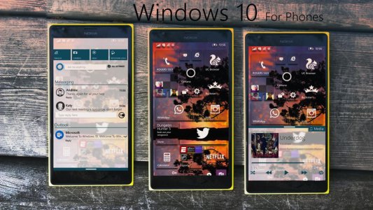
Hi guys! This is my concept of how i think and would Windows Phone 10 to look like! I really love (parts) of the IOS and Android Lollipop UI! There are things i would take from both and implement them into our wonderful Windows Phone platform which HAD the best UI but now feels a bit dated. This is a way to keep the taste of windows phone with what i like to call Transparency UI. Take a look and give me some feedback, it's not done yet but i'd live to hear your thoughts. Now without further adieu here's.....
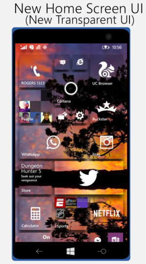
The first part of this re-design is the start screen, my favorite part of windows phones has to be the start screen and i just add a little bit of a mix of the Windows Phone 10 Technical preview transparency with the Windows Phone 8.1 start screen design. Also added a bit of the Material design from Android L.
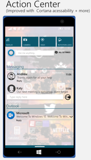
The Next Part is the new Action Center. With extra Cortana integration, Expandable Notifications and Reply-able Emails and Texts. Also added in a bit of an IOS 8-esque transparency and blurring. Just a tad
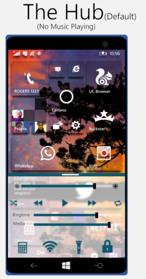
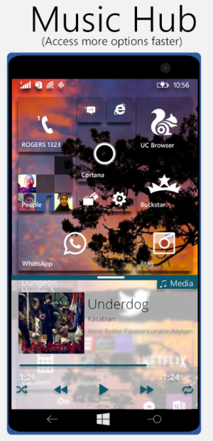
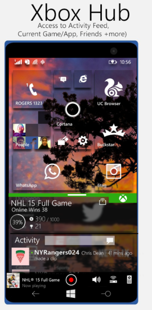
Now for THE HUB, which is my Windows Phone version of the IOS Control Center but BETTER with A lot more features. We have the default hub, similar to the regular control center on IOS. You get to adjust your brightness and volume(s), a toggle to turn on/off Wifi without going to Settings. Access to Light, Lock (incase your lock button doesn't work anymore like me) and Calculator (all buttons are customizable). Once you start playing Music or watching a music vi Than you have your Media Hub for all things music with quick access to everything you need! Just swipe to the right and you have your Xbox Hub. A place you can access your Xbox Friends, Xbox Activity, Recent games and Apps, SmartGlass, Remote Control and record your Xbox wirelessly and effortlessly as well as an easy access to your FULL Xbox app with the Launch button at the top right! More Hubs will be coming.
Thank you for reading, let me know what you think about all of this and maybe even make a User Voice for it? Let me know

The first part of this re-design is the start screen, my favorite part of windows phones has to be the start screen and i just add a little bit of a mix of the Windows Phone 10 Technical preview transparency with the Windows Phone 8.1 start screen design. Also added a bit of the Material design from Android L.

The Next Part is the new Action Center. With extra Cortana integration, Expandable Notifications and Reply-able Emails and Texts. Also added in a bit of an IOS 8-esque transparency and blurring. Just a tad

Now for THE HUB, which is my Windows Phone version of the IOS Control Center but BETTER with A lot more features. We have the default hub, similar to the regular control center on IOS. You get to adjust your brightness and volume(s), a toggle to turn on/off Wifi without going to Settings. Access to Light, Lock (incase your lock button doesn't work anymore like me) and Calculator (all buttons are customizable). Once you start playing Music or watching a music vi Than you have your Media Hub for all things music with quick access to everything you need! Just swipe to the right and you have your Xbox Hub. A place you can access your Xbox Friends, Xbox Activity, Recent games and Apps, SmartGlass, Remote Control and record your Xbox wirelessly and effortlessly as well as an easy access to your FULL Xbox app with the Launch button at the top right! More Hubs will be coming.


Thank you for reading, let me know what you think about all of this and maybe even make a User Voice for it? Let me know

