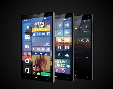
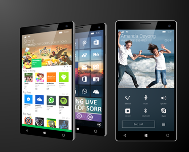
[Concept] Windows Phone 10 Concept! (New Start Screen, Action Center and "Hubs")
- Thread starter m3tv
- Start date
You are using an out of date browser. It may not display this or other websites correctly.
You should upgrade or use an alternative browser.
You should upgrade or use an alternative browser.
alexander0311
New member
- May 28, 2014
- 112
- 0
- 0
The new background option is well, OPTIONAL. An option that I personally prefer when done tastefully (which is subjective).You still have the option to use the 8.0/8.1 style UI in Windows 10 for phones. Shadows under tiles? No thanks. There's nothing flat or modern about that.
@ OP, as for the music hub,which is straight from iOS 7+. Something to consider, how would this work with phones with on-screen Back / Home / Search buttons that are set to auto-hide & unhide with a swipe up?
lol, you just speak out my mind. strange thing
SlickShoesRUCrazy
New member
- Oct 4, 2012
- 67
- 0
- 0
anon(5969054)
New member
- May 7, 2013
- 685
- 0
- 0
Shobin Drogan
New member
- Apr 5, 2014
- 192
- 0
- 0
If you have nothing nice to say then don't say anything at all.No offence dude but this is horrible design. Just being honest.
someone2639
Active member
- Sep 25, 2014
- 3,070
- 0
- 36
If you have nothing nice to say then don't say anything at all.
No wonder I'm so silent
matt john2
New member
- Apr 14, 2014
- 372
- 0
- 0
I have a feeling that this(most of the designs) will look better than what Microsoft will come up with
TechFreak1
Active member
- May 15, 2013
- 4,627
- 21
- 38
To the OP, maybe use the quote button? 
As it is hard to tell you who you are replying to lol and as for the concept... decent effort but not really a fan.
There are quite a lot of things which have gone wrong :grin::
1) The search box is far too high up, it should be nearer to the bottom (not exactly at the bottom, perhaps 10 to 15 pixels before the drawer?)
2) It is not evident if speech to text has been omitted or not.
3) All Settings has been replaced by the expand / collapse option in Windows X for Phones.
4) The swipe-up-hubs are far too cramped it wouldn't work in practise on a small device like the 620. It would only work best on a large screen, not a healthy compromise.
5) The biggest flaw of all is the swipe up hubs as with on screen buttons, this does not work at all. Replacing it with side swipe gestures left or right breaks functionality i.e try using that in an app like metro tube, tapatalk it would be fustrating to use as you would inevitable swipe away from current screen when trying to bring up the onscreen buttons or the app bar (try swiping right in an app where it is not persistent, you will get the app bar popping up and down)
nohra
New member
- Jun 10, 2013
- 246
- 0
- 0
Brian Farkas
New member
- May 29, 2014
- 14
- 0
- 0
It does look nice at first glance. But after looking longer, it does not have a consistent design behind it since your pulling from different languages. In addition I think it loses its flexibility as well as would look nearly as good if you start changing the background image. In addition any concept going forward needs to be reflected on phone, tablet, and monitor screen versions as this is what will need to happen.
TASWinFan
New member
- Apr 3, 2015
- 41
- 0
- 0
That looks great if you want take a look at a concept I found for Win 10 and head to a uservoice for it
https://windowsphone.uservoice.com/...7438894-beautiful-stand-out-os-design-concept


https://windowsphone.uservoice.com/...7438894-beautiful-stand-out-os-design-concept


Similar threads
- Replies
- 0
- Views
- 3K
- Replies
- 0
- Views
- 2K
- Replies
- 0
- Views
- 23K
- Question
- Replies
- 1
- Views
- 8K
Trending Posts
-
-
-
Windows 10 Themes no longer working...
- Started by DocCovington
- Replies: 6
-
I'm looking for a CalDAV, CardDAV client for Windows
- Started by xandros9
- Replies: 1
Forum statistics

Space.com is part of Future plc, an international media group and leading digital publisher. Visit our corporate site.
© Future Publishing Limited Quay House, The Ambury, Bath BA1 1UA. All rights reserved. England and Wales company registration number 2008885.
