emperor_skull
New member
- Oct 25, 2013
- 443
- 0
- 0
They just updated Booklet today with a new look inspired by the OP design. It is very sweet.
They just updated Booklet today with a new look inspired by the OP design. It is very sweet. http://img.tapatalk.com/d/14/06/09/huvavuqu.png
Sent from my Nokia Lumia 928 using Tapatalk
.png")
The MockUp looks great on my 1520 and on my 520. and the performance is great too. I would really like to see this app published and I would really like to help you delevop on this.

Made some edits to the original concept try to reduce wasted space and some other weeks let me know what you guys think but you were definitely on to sum thing
View attachment 68865
Two ideas I had:
Put the "News Feed" header into the status bar so you have a few more pixels for the actuall content. Problem: You lose the burger control. A solution I thought might be okay, is to put more buttons in the top navigation by adding horizontal scrolling. Unfortunatly your design is so great at having a lot of space for the content that I dont have much space to put in controls.
View attachment 68889
Made some edits to the original concept try to reduce wasted space and some other weeks let me know what you guys think but you were definitely on to sum thing
View attachment 68865

As mentioned in one of my previous posts, the top portion of the app is intended to collapse when user starts scrolling, I just didn't get to making that work in the concept app. This means we shouldn't worry about conserving space when the user has almost the whole screen for content when user is actually focusing on the content. You can see this is the image below:
View attachment 69038
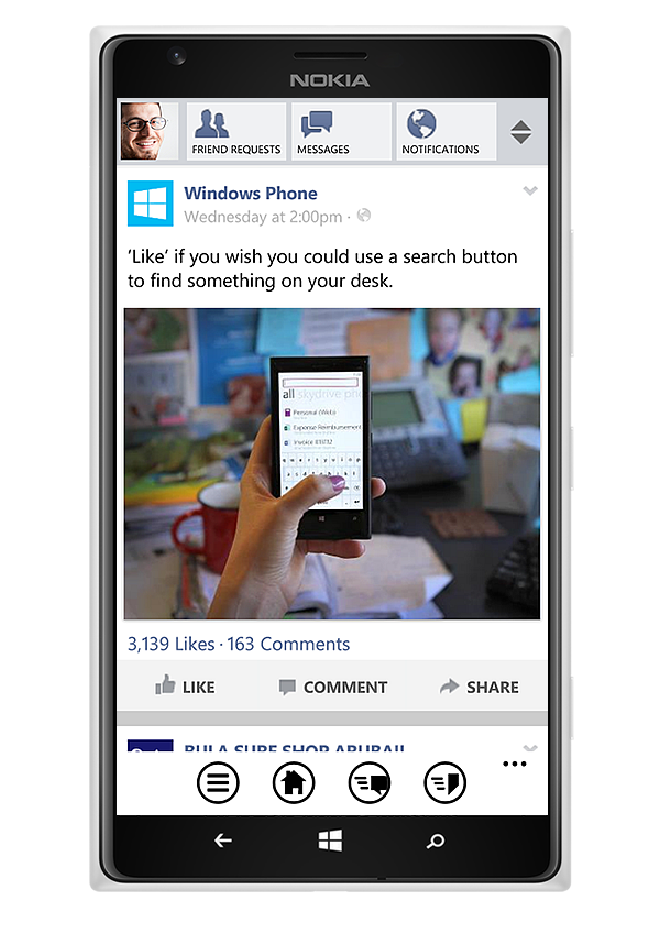
Also, Windows Phone's design language is pretty consistent on the side margins. Notice how everything lines up on the left and right side from the system tray to all of the content. I try to avoid extending content to the edge of the screen unless it's necessary. This is extra important when you use little to no chrome in your UI. Notice that the posts aren't boxed in (this is what I mean by no chrome). Again, this is core to WP's design language. Doing this also allows an inline image viewer that users can flip left and right if it's a multi-image post.
I do agree that the icons should be a bit smaller. I just didn't want to spend too much time on them so I went with the first size that seemed to work well enough.

 . Definitely speedier as well and I'm not getting 50 alerts about the same notification, so far at least lol.
 Twitter