Thanks TechFreak1 for the detailed opinion.
Coming directly to sections where I can improve:
1) The app has a really real simple layout as you noticed with just three buttons. One for color, one for patterns and one to save so a tutorial simply for three buttons doesn't seem right. It's intutive and takes less than a minute to grasp.
2) In app option coming soon
3) Regarding 3,4,5 I'll give a common solution. As you liked the RGB model there are quite some limitations to it. Not all the colors follow the same wavelength so as we go down the chart the distance keeps on decreasing between colors and its difficult to maintain the simplified 3d layout you see in other designs. As a result the algorithm starts multiplexing colors and you see combinations. For the same reason the first color is set by user and the second is generated by algorithm itself to get the best complementary color 95% of the time
4) Couldn't understand point 6 as the given features are already in ellipsis menu(AppBar).
5) Opacity slider will be bought to ellipsis menu in next update instead of one time adjustment.
6) Back button foloowed wp8 design guidelines of exiting. A confirmation will be put up in coming update.
7) Live Camera filters currently not possible in wp8 but will put Camera function straight from app in next update
Answers:
1) That's a predefined system message. Not controlled by me.
2) Color selections work in the same way as I mentioned.
Your welcome, didn't realise this was a Wp8 app.
Thanks for confirming that, the limitations make sense now

.
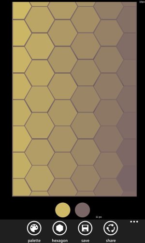
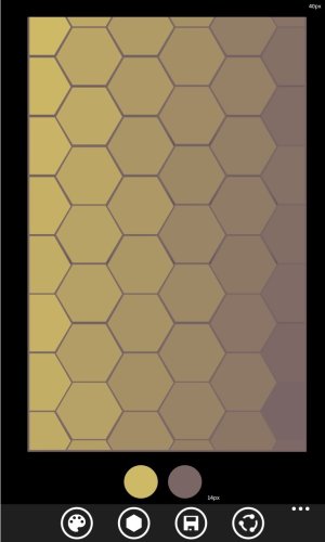
In regards to point 6, [see the rushed mockups] took me a few minutes in photo editor with two screenshots, I'm sure it will take you less than that

.
As you can see from the 1st image, a lot of deadspace has been removed from the top (62px) along with a just over half of the pixels (14px) from the original shaved from the bottom.

In the second a smaller amount from the top (32px) and just under half (14px) removed from the bottom.

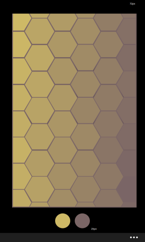
And here is the original:

I'm aware you want to keep the UX pretty simple, hence why suggested an alternative option - being an toggle in the settings which would enable the placement in the app bar.
You can keep the share option in the ellipsis menu and bring up swatches pallette, save, hexagon toggle, photo filter.
Personally I would arrange them in this order:
- Photo Filter
- Opacity Toggle
- Hexagon Toggle
- Swatches Pallette
- Save
I hope this helps

.
Edit: PS, It's easier for individuals like us to grasp however not everyone is the same

.


