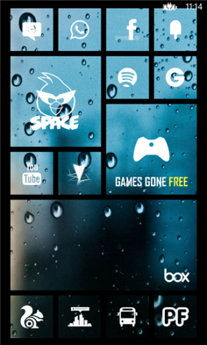
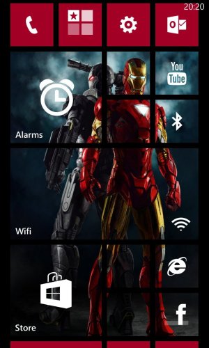
I was Pro Transparent tiles, now I'm not.
- Thread starter taymur
- Start date
You are using an out of date browser. It may not display this or other websites correctly.
You should upgrade or use an alternative browser.
You should upgrade or use an alternative browser.
AngrySprintUser
New member
- Jun 13, 2013
- 201
- 0
- 0
Have the flight attendant make an announcement over the loud speaker that you're using a Windows Phone, and all your problems will be solved.
MARKjotep
New member
- Mar 31, 2014
- 128
- 0
- 0
When the tiles will flip , he would get a glimpse it's a windows phone , those square can be seen easily
True new backgrounds will disappoint lot of people including my mom , she would stick with old crimson color with black theme . But hey we are getting something different
we want customization option.. other users would appreciate the new BG addition on "THEME hub" at the same time some would not care at all! they would stick with the same option they had been using since the first time they created their startscreen..
- Aug 22, 2012
- 1,321
- 0
- 0
TBH, it is still very recognizable. Regardless of the kind of background image I have, people know right away that it is a WP. The tiles are still very vibrant and easy to distinguish. Everyone that ha seen it has thought it was very cool. I have run into a couple people that did not like it and thought that since it was an option, it's okay either way.
are you running WP8.1?
anon(7900571)
New member
- Aug 5, 2013
- 8,032
- 0
- 0
we want customization option.. other users would appreciate the new BG addition on "THEME hub" at the same time some would not care at all! they would stick with the same option they had been using since the first time they created their startscreen..
21 hour more and you will see live what Microsoft will bring new for live tiles
- Aug 22, 2012
- 1,321
- 0
- 0
Users will get the choice.
Sent from my Xbox One using WPCentral Forums
how do you have a choice of what will I use as a background?
Laura Knotek
Retired Moderator
- Mar 31, 2012
- 29,451
- 63
- 48
anon(7900571)
New member
- Aug 5, 2013
- 8,032
- 0
- 0
how do you have a choice of what will I use as a background?
you will still be able to choose solid colours. 21 hours left and you all will be able to see the new start screen
Rodrigo Mendes
New member
- Jul 9, 2013
- 676
- 0
- 0
Better than background change. I like that solution found by Microsoft to customize Windows Phone.
For these who don't like, well, just put a solid file or use old options.
For these who don't like, well, just put a solid file or use old options.
anon(7900571)
New member
- Aug 5, 2013
- 8,032
- 0
- 0
I'd like transparent tiles on Windows 8.1 desktop.
[url]http://i642.photobucket.com/albums/uu150/lak611/Screenshot11.png~original[/URL]
I like to see my wallpaper beneath the tiles here.
but Laura windows 8.1 is a desktop OS which works on big canvas\monitors or tablets , live tiles scroll horizontally where as windows phone works on phones (ranging from 4-6 inch ) , live tiles scroll vertically. again I will say 21 more hours , have patience all
I am quiet sure Microsoft will not disappoint this time :smile:
Rodrigo Mendes
New member
- Jul 9, 2013
- 676
- 0
- 0
TBH, it is still very recognizable. Regardless of the kind of background image I have, people know right away that it is a WP. The tiles are still very vibrant and easy to distinguish. Everyone that ha seen it has thought it was very cool. I have run into a couple people that did not like it and thought that since it was an option, it's okay either way.
Some people think that vibrant colours are too much exaggerated. This new option is a good solution for it.
Bruno Arphenia1
New member
- Feb 18, 2014
- 13
- 0
- 0
They won't get W8 style backgrounds, that's not a choice, that's limitation
That's what I've been talking to several days, Microsoft will own the inverse of the style she cherishes, nothing would be more obvious than the following design windows 8.1. And still does remain with a limitation.
Jaskys
Banned
- Jan 23, 2013
- 603
- 0
- 0
That would be awfull, you know that visibility of your information on certain tile would depend on background? It would criple usability of start menuI'd like transparent tiles on Windows 8.1 desktop.
[url]http://i642.photobucket.com/albums/uu150/lak611/Screenshot11.png~original[/URL]
I like to see my wallpaper beneath the tiles here.
Laura Knotek
Retired Moderator
- Mar 31, 2012
- 29,451
- 63
- 48
You probably notice most of my tiles are small anyway. I really don't use the tiles for information other than for calendar and weather apps. I'm usually in desktop anyway so I don't see much of the start menu.That would be awfull, you know that visibility of your information on certain tile would depend on background? It would criple usability of start menu
- Aug 22, 2012
- 1,321
- 0
- 0
I don't care what my phone looks like from two meters away, I care how it looks when I'm holding it.
of course you don't, that's why this thread isn't about personal experiences..... Its about brand identity.
AngrySprintUser
New member
- Jun 13, 2013
- 201
- 0
- 0
I'd like transparent tiles on Windows 8.1 desktop.
[url]http://i642.photobucket.com/albums/uu150/lak611/Screenshot11.png~original[/URL]
I like to see my wallpaper beneath the tiles here.
How did you do that with 8.1? I can't find it
LillWicke
New member
- Oct 11, 2013
- 113
- 0
- 0
Hey guys what's the fuzz?
You have been able to do this for ages now with the help of certain apps.
How to create awesomely artistic Windows Phone Start screens - Nokia Conversations
:smile:


You have been able to do this for ages now with the help of certain apps.
How to create awesomely artistic Windows Phone Start screens - Nokia Conversations
:smile:


Indistinguishable
Active member
- Nov 16, 2012
- 4,669
- 1
- 38
of course you don't, that's why this thread isn't about personal experiences..... Its about brand identity.
I actually agree with you. I think that solid colored tiles are simply truer to the metro design language that Zune, WP7/8, and Windows 8 have heralded. I'm not going to use translucent tiles except to maybe introduce another solid color.
Similar threads
- Replies
- 3
- Views
- 13K
- Replies
- 2
- Views
- 9K
- Replies
- 85
- Views
- 27K
- Replies
- 13
- Views
- 4K
Trending Posts
-
-
Question Windows 11 and Linux on separate drives?
- Started by Verax
- Replies: 2
-
Question Win-11 - Problem with moving files from C: to New Partition on E:
- Started by fasteddie01
- Replies: 2
-
-
I'm looking for a CalDAV, CardDAV client for Windows
- Started by xandros9
- Replies: 1
Forum statistics

Space.com is part of Future plc, an international media group and leading digital publisher. Visit our corporate site.
© Future Publishing Limited Quay House, The Ambury, Bath BA1 1UA. All rights reserved. England and Wales company registration number 2008885.

