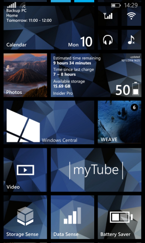
Is it me or are three column tiles ugly on Windows phone.

anon(9057135)

New member
Sep 1, 2014
547
0
0
Like on the 635 it looks hideous.

I think I'd like it more if I had a bigger phone..

Posted Via Tapatalk for Windows Phone.
 
Depends on the person. Some like to maximize the screen estate thus they opt for more columns. I myself would like to have four column tiles in my 1520 in future updates.
 
I like them on my 920.
f2b30ad3e4a06cf6b7b50b8825a997b8.png

Sent from my Nokia Lumia 920 via Tapatalk
 
True it would look nicer on a lager phone but I love it. I like having all the apps I use on a daily basis all visible on the start screen without having to scroll a lot every time. But to each their own, my wife prefers sticking with two and having the tiles bigger. I like having the choice.
 
I think there should be a bigger format of tiles... For 5'' screens & +...
Everything looks small ...on my 830
 
I think there should be a bigger format of tiles... For 5'' screens & +...
Everything looks small ...on my 830
I don't understand the problem. The user can go under options and change it to two medium size tiles wide instead of three.
 
I also don't like the 3 columns on my 920. I tried it for a couple of days but it looked wrong to me. I'm glad we have the option though.
 
I think that's because of the screen size, I have a 630 and also prefer two columns. But I believe I would use it if I had a bigger phone.
 
I don't understand the problem. The user can go under options and change it to two medium size tiles wide instead of three.

They removed that option from the 830 for some reason. You have to use three columns. I was annoyed at first, but now I'm used to it.
 
I really want four column tiles in 1520. That 1030 mock up shows four column tiles. MS should give us the option to have less or more tiles like in Windows 8.
 

Latest posts

Trending Posts

Members online

Forum statistics

Threads
336,814
Messages
2,259,869
Members
428,857
Latest member
adamcole