Microsoft Health App Wastes Screen Real Estate

deejohdumb

New member
Mar 2, 2014
54
0
0
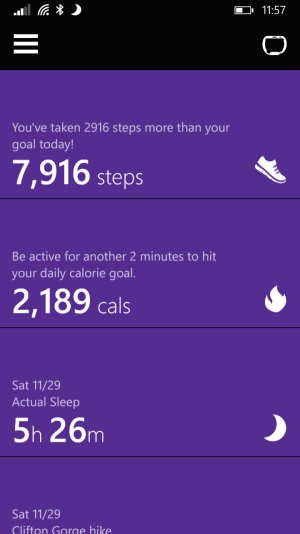
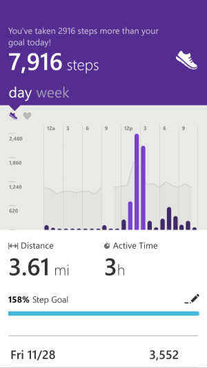
I am using an Icon and the top of the Health app easily takes up a quarter of the screen of blank purple and a title. It seems that's it's a really inefficient use of the large screen on my phone. Is this simply a scaling issue it is it like that on all phones? If so, that's a pretty poor design.
 
I haven't seen it, so I can't really judge, but I've noticed a trend of people thinking apps should be designed so as to cram as much data onscreen at once as possible. Sure, its inefficient, but it gives things space to breathe, negative space, the giant titles of stuff and whatnot seems stupid, but I actually like the design decisions. But that's just me.
 
not seeing what you are I think on my L830. see below.
possibly your font size settings in system that make it expand the tiles?
one tile is about a quarter of the screen. however, it contains more than just the title...

wp_ss_20141129_0002.png

wp_ss_20141129_0003.png
 
Last edited:
I have an L925 and this is what I thought too. Too much wasted space. I mean 3 years of research and this is all they can come up.
A live tile would be nice.
 
It is pretty poor. I'm using a 1520 and take screen captures... It would be GREAT for all of the info, for example the night time screen, to fit on the one screen. Seems a bit silly as people will want to keep this stuff and not just on the phone.
 
That's what I mean, I would rather look at the info than a lot of purple space above. Instead, we have the dead space and have to scroll to see all the sleep info.
 

Members online

Forum statistics

Threads
339,206
Messages
2,262,233
Members
428,753
Latest member
Romilio