MusicNow

mzetko

New member
Jun 16, 2012
142
0
0
Visit site
4/7/2014 to 5/11/2014 (EDIT: 4/07/2014 to 11/11/2014) you taking too much time bro. I don't know anything about the development process but you really need to work fast. Xbox music sucks. You gave us a small hope please develop your app fast. Why don't you release beta version(private) and not public and after that continue your development

Nokia Lumia 925 India

Hello Aniket,

I know, you are completely right. I am blaming myself all the time that it takes me so long... School and work interrupted me for a long time and this was the result. I am working on the app whenever I can. It is very important to me. I promised you to bring this app to life and it is definitely not acceptable to disappoint. I am doing my best.
I will release the beta version publicly (but under "MusicNow Beta" name, so that the app can then be released as "MusicNow" when it gets full release), because I want as much feedback as possible. Private release would be an option but limiting the access...

As soon as it is ready, I will get the beta version out. Please, just a bit more patience, I am really doing what I can.

Thank you all for understanding
Martin Zikmund
 

Shodan_HR

New member
Nov 25, 2012
170
0
0
Visit site
well, the longer the wait the better the chances are that Xbox music fill be fixed.. and yes, its on a good way of doing so... dude, you got to give us something... at least a screenshot.
 

jomarr

New member
Sep 12, 2012
585
0
0
Visit site
Hello Aniket,

I know, you are completely right. I am blaming myself all the time that it takes me so long... School and work interrupted me for a long time and this was the result. I am working on the app whenever I can. It is very important to me. I promised you to bring this app to life and it is definitely not acceptable to disappoint. I am doing my best.
I will release the beta version publicly (but under "MusicNow Beta" name, so that the app can then be released as "MusicNow" when it gets full release), because I want as much feedback as possible. Private release would be an option but limiting the access...

As soon as it is ready, I will get the beta version out. Please, just a bit more patience, I am really doing what I can.

Thank you all for understanding
Martin Zikmund

Thank you, Martin.

Please hand us over the BETA as soon as possible. The Xbox Music debacle is truly disappointing.
 

mzetko

New member
Jun 16, 2012
142
0
0
Visit site
Hello friends,

I know I am working slow... The design and analysis for the app has taken me more than I expected and I made a lot of big changes that caused me to change big parts of the project. However I think it is on a good track.
Starting this weekend, I will start posting screenshots from the app, as requested :) . While the development continues, I will let you feedback on the visuals and layout so that we can improve it.

Have a nice week :) !
Martin Zikmund
 

mzetko

New member
Jun 16, 2012
142
0
0
Visit site
Hello friends!

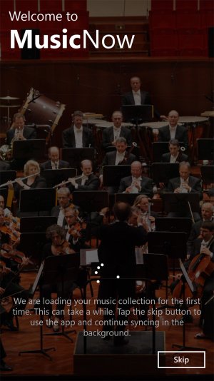
As I promised, today I am posting the first quick screenshot from the app - this is the screen that you will se when you first run the app. On this screen the initial music library syncing takes place. The background image is animated. Because waiting for very large libraries to sync can be painful (whatever optimizations I tried, and there was a lot of them, listing complete folder structure of the music library and its files from SD card and retrieving music properties of each file there takes a moment, that is ok for normal sized collections, but not for a music lover with thousands of songs :) ), I decided to include a skip button, that will allow you to jump into the app right away and let the collection sync in the background. The new songs will continually appear in batches of 50 in the lists. This screen will only appear the first time you run the app, next time the app will run the incremental syncing in the background directly. You will also be able to see the current background syncing process/stats in the settings.

Next time screenshots will be of the app's core main page, I will post them on Thursday/Friday, depending on your time zone :) .

If you have any suggestions, ideas, anything - please let me know :) .
Thank you all!

Sincerely
Martin Zikmund

wp_ss_20141123_0005.jpgwp_ss_20141123_0007.jpgwp_ss_20141123_0008.jpgwp_ss_20141123_0009.jpg
 

mzetko

New member
Jun 16, 2012
142
0
0
Visit site
Hi friends,

I am here with the second batch of screenshots. This time I will show you a bit of the personalization options MusicNow offers.

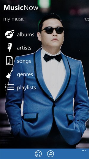
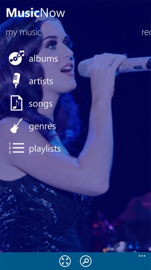
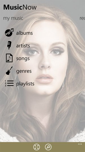
There are four main settings you are able to adjust - background image with opacity, background color tint, accent color and dark/light theme.

wp_ss_20141129_0006.jpg wp_ss_20141129_0003.jpg

You can set a static background image and can also see the currently playing song's image in case MusicNow is currently playing music (this is a option, if you want to keep just the static background, you can do that too).

You can change the opacity of the background image, so you if you want just a less distracting visual setting, that is fully possible.

wp_ss_20141129_0008.jpg wp_ss_20141129_0009.jpg wp_ss_20141129_0007.jpg

Because all Windows users love colors, I added an option to also adjust the underlying background color. This creates nice effects with semi-transparent images.

wp_ss_20141129_0004.jpg wp_ss_20141129_0005.jpg

Of course, if you prefer the really clean Windows design, without any images, that option is here too - you can set the image's opacity to 0 and get just the colors :) .

wp_ss_20141129_0001.jpg wp_ss_20141129_0013.jpg

The accent color setting is used for app bar and selection highlighting throughout the app.

wp_ss_20141129_0010.jpg wp_ss_20141129_0012.jpg

Finally, you can also select between the dark and light theme, similarly to the system's settings, although MusicNow allows you to change this independently on the system.

wp_ss_20141129_0017.jpg wp_ss_20141129_0016.jpg

I will report to you again during next week and bring more images from the app :) .
In the meantime, please send me any feedback :) !

Sincerely
Martin Zikmund
 

123gettothechopper

New member
Jan 21, 2014
84
0
0
Visit site
Well from the screenshots you have posted, this thing looks pretty darn good
I was wondering if you could make a design change. I really think that you should get rid of the nav bar at the bottom if possible. It breaks the fluidity of the whole app.
And there could be another major change. Make the interface more Windows. Try to change the 'my music' into a swiping interface to get a look as stock as possible
These are my 2 pence.
Thanks!
 

Members online

Forum statistics

Threads
326,609
Messages
2,248,629
Members
428,522
Latest member
BarkerJarrod