- Apr 7, 2014
- 27
- 0
- 0
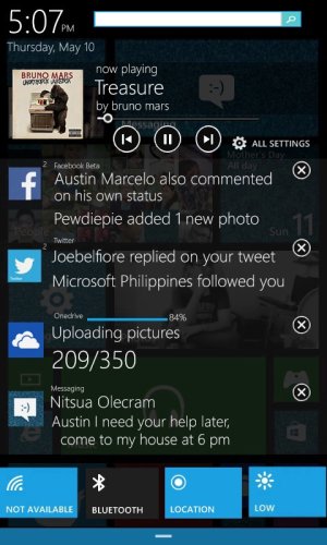
This is my second Action Center concept! Hope you like the new one! 
The first one is this - https://www.youtube.com/watch?v=LYcVTbzjBEo
https://www.youtube.com/watch?v=f-GPdcRNsuk&feature=youtu.be

Features
-A.C is now transparent.
-Has an "X" button now like to close notifications the multitasking. Swiping right is still there.
-Time and Search
-Music support
-Quick Settings are now at the bottom of the A.C
https://www.facebook.com/nitsuA.xD
https://twitter.com/xOfficialAustin
The first one is this - https://www.youtube.com/watch?v=LYcVTbzjBEo
https://www.youtube.com/watch?v=f-GPdcRNsuk&feature=youtu.be

Features
-A.C is now transparent.
-Has an "X" button now like to close notifications the multitasking. Swiping right is still there.
-Time and Search
-Music support
-Quick Settings are now at the bottom of the A.C
https://www.facebook.com/nitsuA.xD
https://twitter.com/xOfficialAustin

