- May 28, 2014
- 112
- 0
- 0
MS changed/iterated the navigation buttons' behavior on windows phone several times...yet i still find them a little bad thought.
Currently you have back home search, every one with its behavior on tap and on hold. i believe they should make them more logical since right now they are not so good arranged. I will break my idea of suggestion for them per button, after that, if you like it, you are free to send it on uservoice/feedback app/both.(actually you're welcomed and encouraged to do so, to make us heard)
Back button:
1. Tap: Goes back one page in an opened app. If i pressed Home button, doesnt go back to an app, this way we are able to pause an app exaclty where we want it.(right now if i press home then back, the OS goes back to that app where i was when i pressed home)
2. Hold: Lowers the upper portion of the screen, how right now the OS behaves when you hold the Home button. Since back button is for navigation INSIDE an app, having this function of lowering the screen on back button instead of home button, makes perfect sense.
3. Double-tap: None. Since people always spam back button, having a double-tap behavior would make no sense.
Home button:
1. Tap: Goes on the start screen. Again, is "unbackable", so now when home is pressed, back button doesnt return you to a previous app.(you have to use task manager)
2. Hold: Task- view. Removed from the holding back button, now i believe this is where task view should be present(even the icon of home button suggest it). And as a bonus, having the task-view on the holding home button, MS can span this behavior across devices(imagine tablets with physical home button, laptops, desktops, all having the home button and users knowing that if they hold on home button, the task-view is triggered)
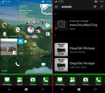
3. Double-tap: Quick-apps. Its ok that now we quick actions, but that area should remain for "Actions". Since camera button from there opens the camera and does not takes a photo, i would say that that is more a shortcut not an action. So here is a solution for shortcuts, "quick-apps". A setting inside the settings app lets you to turn it on or off and to set 4-5 apps, so when you hold home button, even if you are inside an app, these 4-5 apps icons show, allowing you to quick access them, without going to the start screen. (ps: ios and android always had 4 generic apps at the bottom of their home screen. now, we have something better) (Screenshot

Search button/Cortana:
1.Tap: opens text-based search/cortana
2.Hold: opens speech-based search/cortana
3.Double-tap: "Bing on Tap". Recently, google announced "Now on Tap"(search WCentral for details). More recently, MS announced "Bing on Tap" (for android -_-). I believe we should enjoy this feature too, and now i told you how i think it should work.
So, what do you think?? if you like it, please submit to feedback app/uservoice page. its time to have our navigation bar better organised.
Currently you have back home search, every one with its behavior on tap and on hold. i believe they should make them more logical since right now they are not so good arranged. I will break my idea of suggestion for them per button, after that, if you like it, you are free to send it on uservoice/feedback app/both.(actually you're welcomed and encouraged to do so, to make us heard)
Back button:
1. Tap: Goes back one page in an opened app. If i pressed Home button, doesnt go back to an app, this way we are able to pause an app exaclty where we want it.(right now if i press home then back, the OS goes back to that app where i was when i pressed home)
2. Hold: Lowers the upper portion of the screen, how right now the OS behaves when you hold the Home button. Since back button is for navigation INSIDE an app, having this function of lowering the screen on back button instead of home button, makes perfect sense.
3. Double-tap: None. Since people always spam back button, having a double-tap behavior would make no sense.
Home button:
1. Tap: Goes on the start screen. Again, is "unbackable", so now when home is pressed, back button doesnt return you to a previous app.(you have to use task manager)
2. Hold: Task- view. Removed from the holding back button, now i believe this is where task view should be present(even the icon of home button suggest it). And as a bonus, having the task-view on the holding home button, MS can span this behavior across devices(imagine tablets with physical home button, laptops, desktops, all having the home button and users knowing that if they hold on home button, the task-view is triggered)
3. Double-tap: Quick-apps. Its ok that now we quick actions, but that area should remain for "Actions". Since camera button from there opens the camera and does not takes a photo, i would say that that is more a shortcut not an action. So here is a solution for shortcuts, "quick-apps". A setting inside the settings app lets you to turn it on or off and to set 4-5 apps, so when you hold home button, even if you are inside an app, these 4-5 apps icons show, allowing you to quick access them, without going to the start screen. (ps: ios and android always had 4 generic apps at the bottom of their home screen. now, we have something better) (Screenshot

Search button/Cortana:
1.Tap: opens text-based search/cortana
2.Hold: opens speech-based search/cortana
3.Double-tap: "Bing on Tap". Recently, google announced "Now on Tap"(search WCentral for details). More recently, MS announced "Bing on Tap" (for android -_-). I believe we should enjoy this feature too, and now i told you how i think it should work.
So, what do you think?? if you like it, please submit to feedback app/uservoice page. its time to have our navigation bar better organised.

