- May 6, 2014
- 3
- 0
- 0

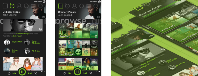
The 'now playing' page will be place permanently at the top with the page navigation. Giving end-user more control over the app. New now playing page shows the progress bar, album cover, artist name, track name at all time.
All the icons are taken from the desktop version, for user to have small learning curve to use the app.

The controller also designed to be place at the bottom of the page and will slide up along with the hidden menu as the '...' is tapped.


This new design stands for simple and direct approach for listening music and enable end-user to get things done (spotify related) not more than 3 steps. What do you guys think of it? :smile:
Attachments
Last edited:
 Twitter