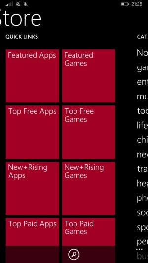
hi my name is marco and i'm a new wp user because i've just bought one nokia 1520. yesterday i update my new phone to wp 8.1 and now i've a problem with the windows size because linkedin and others app or windows in general go out of windows. Excuse me for my english in attach the photos
nokia 1520 wp8.1 windows size problem
- Thread starter raffutz85
- Start date
You are using an out of date browser. It may not display this or other websites correctly.
You should upgrade or use an alternative browser.
You should upgrade or use an alternative browser.
primortal
New member
- Dec 5, 2011
- 212
- 0
- 0
Welcome Marco 
This is normal for Windows Phone being some apps use what's called a pivot control. The control basically take a large horizontal screen and divides up into multiple "page" the you can swipe left or right to see other parts of the screen/page.
Seeing parts of another "page" is just a visual cue to tell you there is more information.
GabrielStorm
New member
- Dec 3, 2012
- 299
- 0
- 0
mine look similar.
lumia 1520 with Dev. Perview 8.1 Upadate (GDR1).
i don't think there's much you/we can do about it.
lumia 1520 with Dev. Perview 8.1 Upadate (GDR1).
i don't think there's much you/we can do about it.
manicottiK
Member
- Nov 24, 2011
- 661
- 3
- 18
The idea for "panorama apps" is that there's usually a large photographic background that spans all of the panels. Only one panel name (or "tab name," if you prefer that) is visible at a time, but a little bit of the next panel's content is visible. The idea is to be visually immersive and to encourage exploration of the app (sort of like the cover of a magazine where there's a main photo, headlines, and smaller photos and/or headlines to interest you). The main app header, the foreground content, and the background all scroll sideways at different speeds, giving an interesting parallax effect when swiping.
I generally point out DrexelOne, our portal app for students, faculty, and staff as a nice pano app. Find it at DrexelOne | Windows Phone Apps+Games Store (United States). In that app, we've extended the normal design in three ways:
1) to allow changing the background photo (tab the header text to change photos),
2) to hide the foreground to see what you're looking at in the background (tap the DrexelOne logo in the header), and
3) to better support landscape views and increase information density via a "compressed header" (drag the header up to compress or down to restore).
The other common type of app is a "pivot" where multiple headers (or tab names) are visible along the top, but only one panel of content is visible. There's typically no background image and no parallax effect when swiping sideways. Generally speaking, each panel shows the same kind of information, but with a different view or filter (think about the mail app where there are panels for All, Unread, Urgent, etc.).
Similar threads
- Replies
- 0
- Views
- 3K
- Replies
- 4
- Views
- 21K
- Replies
- 3
- Views
- 13K
- Replies
- 0
- Views
- 33K
Trending Posts
-
-
Question Win-11 - Problem with moving files from C: to New Partition on E:
- Started by fasteddie01
- Replies: 2
-
Question Windows 11 and Linux on separate drives?
- Started by Verax
- Replies: 2
-
-
I'm looking for a CalDAV, CardDAV client for Windows
- Started by xandros9
- Replies: 1
Forum statistics

Space.com is part of Future plc, an international media group and leading digital publisher. Visit our corporate site.
© Future Publishing Limited Quay House, The Ambury, Bath BA1 1UA. All rights reserved. England and Wales company registration number 2008885.

