(Official) What WP needs to succeed

Windows Phone "NEEDS" a more consistent design language with apps. Developers are designing apps that don't adhere to the overall language which is disconcerting.
 
Re: Windows Phone 8 NEEDS backgrounds! WP8 is getting boring!

Windows Phone "NEEDS" a more consistent design language with apps. Developers are designing apps that don't adhere to the overall language which is disconcerting.

Which ones other than lame game ports?
 
Re: Windows Phone 8 NEEDS backgrounds! WP8 is getting boring!

Oh, Jesus Christ. I find it hard to imagine why any of you would have even chosen Windows Phone. The beauty of WP is it's minimalist design. Windows 8 is disappointingly ugly compared to WP. That concept design posted is more atrocious than Android 1.0. I really hope Microsoft sticks with the strict "Metro" design language.
 
Re: Windows Phone 8 NEEDS backgrounds! WP8 is getting boring!

I am happy with the way WP home screen is right now but more customization are always welcomed but let everything be simple and straightforward. Other platforms are too cluttered.
 
Which ones other than lame game ports?
So tool apps, timers, cloud storage apps, video download apps, etc. which ones? Most of them? They ddon'tlook like they were made specifically for this phone.
Each app should llook like its a preinstalled app. Meaning the design is fluent with the rest of the OS.
 
Re: Windows Phone 8 NEEDS backgrounds! WP8 is getting boring!

I agree it would be cool if we could get something other than Dark and Light, though I've gotten used to it I remember when I first got my phone and was playing with it, it was kinda disappointing, I'm not saying lets add a **** ton of effects and live backgrounds, but it would be nice if you want your tiles to be Dark Blue with a Light blue background?
Still love my phone, and I don't lose sleep over this, but it is something to point out.
 
Re: Windows Phone 8 NEEDS backgrounds! WP8 is getting boring!

I think customization options are only good. Beside the option presented above I'd like to have one where the negative space around the tiles is solid/textured and the tiles are holes in that surface. Use parallax to a BG image behind the text so that you get a simulated 3d effect as you scroll, based on nothing more than one image scrolling faster than the other.
 
Re: Windows Phone 8 NEEDS backgrounds! WP8 is getting boring!

No, no, no. Microsoft removed the gutter to make the tiles bigger because some people complained about white space. Now if you add a background picture, it would only show between the tiles which would look even worse. And I've had a 7.8 custom rom as well, the custom background colors just make the phone look awful!
 
No, no, no. Microsoft removed the gutter to make the tiles bigger because some people complained about white space. Now if you add a background picture, it would only show between the tiles which would look even worse. And I've had a 7.8 custom rom as well, the custom background colors just make the phone look awful!

Then make the tiles transparent like Aero theme, or make the tiles smaller.
 
Then make the tiles transparent like Aero theme, or make the tiles smaller.

The problem is, WP's design is based on Metro UI and not Aero. And if MS makes the tiles smaller there will be a huge cluster**** of people complaining and another 2000 threads saying that "I'm moving back to iPhone" or whatever.
 
Re: Windows Phone 8 NEEDS backgrounds! WP8 is getting boring!

i agree with an option to allow customized background especially if you are going categorize your apps into different groups or even allow your live tiles to be transparent
as for your purposed concept i will be the first person to say No
 
Re: Windows Phone 8 NEEDS backgrounds! WP8 is getting boring!

I agree with others on the white space, backgrounds work in W8 because of all the white space present. To add more personality try adding more live tiles together and in different arrangements.
 
Re: Windows Phone 8 NEEDS backgrounds! WP8 is getting boring!

I agree with others on the white space, backgrounds work in W8 because of all the white space present. To add more personality try adding more live tiles together and in different arrangements.

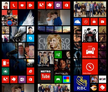
Like mine =D!!! It SCREAMS personality and me.

wp screen.jpg
 
Like mine =D!!! It SCREAMS personality and me.

View attachment 28391

Now that's a home screen!!!
In all honesty from a design stand point what Microsoft has done was made it harder for the user to f up the home screen. The OP says his home screen is boring but in all honesty if you study his layout it looks beautiful. I would rearrange the tiles a bit but the way it sits is fine.
People really cannot understand how ugly the tile with image idea would look. The image with the transparent tiles wasn't bad but it looks like BB10. Allowing colored backgrounds isn't bad but this is another way for the user to f up the look. Many people are unaware of color pallets and I could see a lot of people going down the wrong road with too many options at their disposal. I've seen some really nice android home screens on the internet but if I grab my coworkers GS3 I will be greeted by a hot mess...
 
Re: Windows Phone 8 NEEDS backgrounds! WP8 is getting boring!

I would love to see Windows 8 style background come to WP8. By that I mean specifically tailored themes that nicely fit around the edges of the screen.... it would really give the OS a lot more of a colorful look without sacrificing readability of the tiles.
 
Re: Windows Phone 8 NEEDS backgrounds! WP8 is getting boring!

WavingReds you've done it again! I really love your home screen, it's awesome. Although I love mine for how accessible everything is :D and btw, what I'm really curious is, how'd u get that RBC APP?! :O I can't find it anywhere

Thanks =) the Tyrael angel tiles flips to change into Gandalf btw.

Sadly, the RBC app isn't out yet, I just used wiztiles to create the image and link it to the site.

Now, I just wish WP8 small tiles would flip as well.
 
Re: Windows Phone 8 NEEDS backgrounds! WP8 is getting boring!

Yeah; I believe Brandon Minneman of Pocketnow.com created this concept/image when WP7 first hit back in 2010. Microsoft hasn't implemented it after all of this time, and probably won't, which is fine with me. But it is a nice concept.
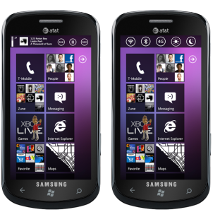
The one I looked to for amazing WP7 concepts was Jozef Kocur. I personally don't like Pocketnow mockups, they are a bit of a loose cannon. Right ideas, but poorly executed with a general disregard for proportions and balance.

This is what Kocur made back in 2011:

control_bar.png

Compact music controls, connectivity toggles, start screen backgrounds, start screen folders. Two years on, still no dice.
 

Members online

Forum statistics

Threads
332,423
Messages
2,255,357
Members
428,707
Latest member
fg45df6546