My (small) Gripes with Windows Phone 8
As a long-time Android user who switched over to a Nokia Lumia 928 about 3 weeks ago, I can honestly say that I do not regret the switch one bit. However, having come from a long line of Android phones (HTC Hero > HTC Evo Shift > HTC Evo 3D) to the 928 I have a few gripes that I can't quite come to terms with.
Notifications?
It's not what it sounds like, really! I actually thought that a centralized notifications menu would be my biggest gripe with WP8. To my surprise, I actually like not having one. Gone are the days of being enslaved to clearing all those pesky notifications just to keep the space clutter free. Now I just organize my tiles and respond to them with varying levels of urgency.
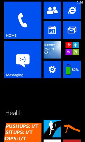
So, what do I mean then? Well, with Android the "notification area" at the top of the screen is persistent across all applications. While I don't really care for the actual notifications themselves I hate that most apps prevent me from seeing my battery level, WiFi and mobile network state, etc.
No Picture Password
This is something that disappointed me right away. Picture password is something that I'm a big fan of on my desktop PC. I don't want to have to type a password every time I want to get into my desktop, but having a password means my 2 year old can't get in and mess with stuff when the mood strikes her. Cue in picture password! I'd love for this to be available in my phone, and am highly disappointed that it isn't.
Oversimplified Volume Controls
Simplified is a word I'd use often if describing Windows Phone 8 when coming from Android. In almost every instance this is a very welcome change. Most tasks are made much more enjoyable by this. Volume control is not one of them. Android has a volume menu within settings that allows you to independently set the volume level for different activities such as your ringtone and media playback. I really hate that WP8 doesn't have similar functionality. It may seem silly, but for someone who likes to have his phone on vibrate so it doesn't go off at work but enjoys listening to podcasts from his phone via bluetooth in the car it's annoying not to have a menu where I can ensure both levels are properly configured.
Internet Explorer's Problem with the Back Button
I don't really get this one. I'm on the internet, reading some interesting article, and spot a word I don't recognize. No biggie, I press the search button and in a few taps Bing has the answer. Great! Now I get back to my article, finish reading it, and press back expecting to return to the original Bing search the article came from... only to find that I'm taken to another app instead. Why this works this way, I will never know.
First Party Apps with Limited Functionality
Skype and Calendar are my biggest issues here. I thought integration with Skype would be both rich and seamless. Instead I've got an app that doesn't work as expected (won't show me online unless I'm actually looking at the app) and just doesn't feel as revolutionary as it should. While I admit I find the calendar to be more helpful than Google's version, it's missing features that are available to me in Outlook.com's web interface! Why can't I set an end time for recurring events? Why can't I color code events? There's some disparity on how e-mail works across the different platforms (Outlook.com, W8 app, WP8 app) also, which doesn't make a lot of sense.
/ENDRANT
To conclude, please don't take this as a hate post. That's by no means what I'm getting at here, I love my Lumia 928. I can't even conceive going back to Android after using it. It's just that I feel like there's some really basic, and admittedly small, functionality issues that can be quite irritating.


