Agent-P
New member
- Oct 11, 2011
- 190
- 0
- 0
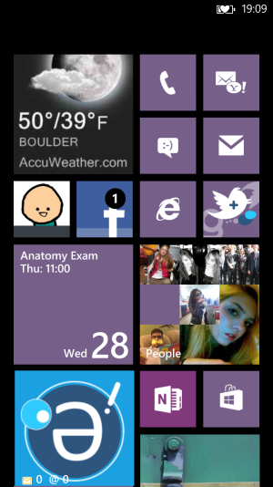
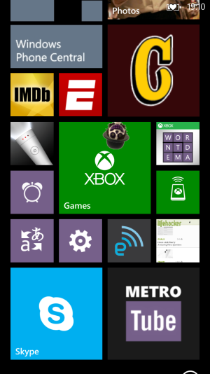
I've been following this thread since the beginning and gotten great ideas from your guys' home screen layouts. I've been constantly changing mine, and now that I've settled on something I like, I will post it. The accent colour I'm using is mauve. My start screen is a tad too long for two screenshots, so I moved the second one up a bit. Just know the WPCentral tile is right below the Gleek tile and the alignment will make more sense.
Attachments
Last edited:


