View attachment 66375
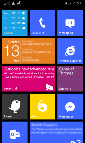
I'm really starting to like this layout. It's perfect for my daily use, and it looks pretty good. I've got "Forecast" and "Cal" up in the far left corner for quick information about the weather and upcoming events. In the top right corner I have "Phone", "Messaging" and "Internet Explorer", which come in handy very often for obvious reasons. Further down we find "WPCentral" for news about Windows Phone, and a OneNote document for keeping track of which "Game of Thrones" episodes I've watched :wink: Then there's "Tweet It!", "6snap" and Facebook's "Messenger", which are my most used social apps, and they're placed so that they can be easily reached when using my phone with only one hand. At the bottom I have two tiles for my Email; the wide tile is the "Outlook" app itself, while the medium sized tile is a shortcut to the trash.
I usually run with the green theme, but it looked horribly lime when I looked at it at my computer, so I went with cobalt for the screenshot's sake.


